
Headwires (2024) depicts a concrete wall with small cables through a photograph of a small section, allowing us to see the textures of the wall. The greyscale monochromatic tone of the work allows the viewer to examine between the shadows and the lights of the work. The shadow covers around a third of the wall and up to the halfway crack within the centre of the wall. This allows the viewer to guide themselves across the wall’s texture and draws attention to the cracks, grooves and weariness.
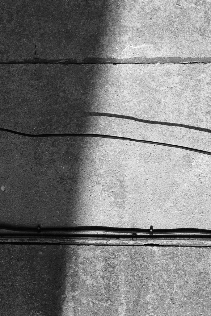
The cable splits the photograph into two sections: one uniform and perfect (the bottom half) and the other imperfect and showcasing the damage of the concrete. To explore the “noticed banality,” we are to look for elements that we do not see as we pass through these textures or structures every day.
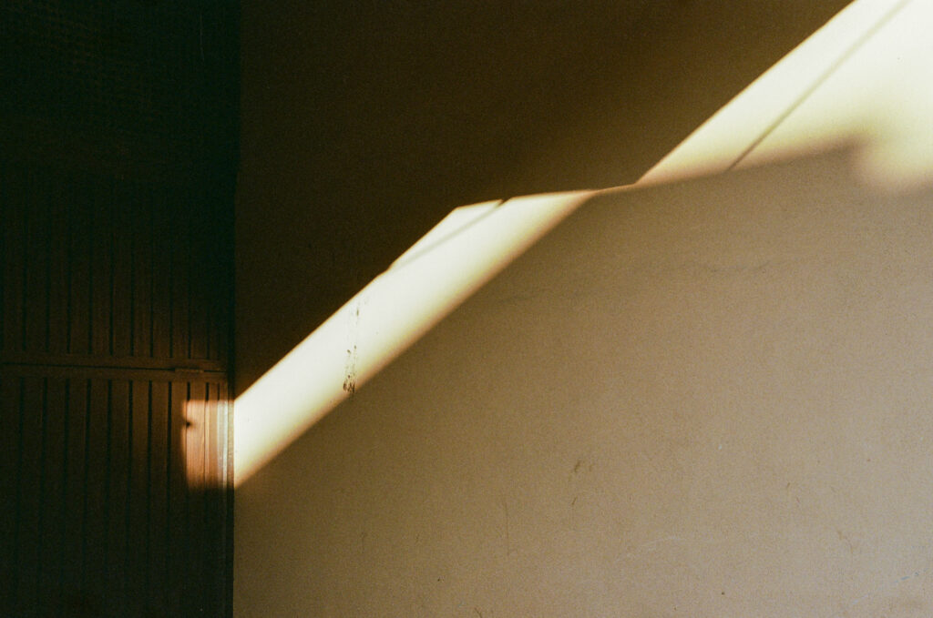
Pockets (2024) contrasts light against a dark architectural scene. The photograph itself is minimal, and the warm yellows in the photograph give the work a feeling of homeliness. As with the previous work, Headwires (2024), great attention is paid to the slight textures of a would-be perfect wall. These textures give the wall personality and allow the home to be more human. The scuffs on the wall thus showcase it as a lived structure.

Hollywood 1989 (2017) instantly takes the viewer’s eye to the sticker, which humorously declares that it is “Hello, my name is Hollywood”. This creates an irony as the bus station has been demolished or may have been derelict prior, and it is sarcastically compared to the glamour of Hollywood. The red sticker greatly contrasts with the green metal surface of the panel- the panel is marked by long periods of human use, which is evident from the scratches, graffiti, and its being weathered in general. These are also signs of decay, and the structure starts to be abandoned, followed by its inevitable demolishment.
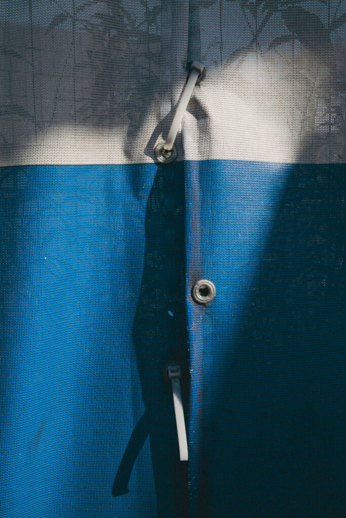
Tethered to Light (2024) contrasts with the blue and the muted grey-white of the demolition site tent. The mesh material of the tent creates great texture and allows the viewer to see through the tent, which implies contrast as the tent itself is a form of industrialism due to demolition sites using machinery while behind, there are plants which are taking over the area reverting it back to nature. The canvas of the tent is a temporary object which serves as a marker for the transformation of an area. In which one part is destroyed- perhaps nothing will be built, or a new building will take its place. Thus, the photograph serves as a documentation of the change within the area.
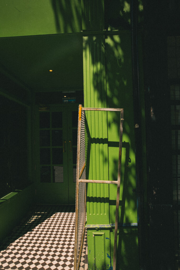
Pogo (2024) faces the viewer immediately with a green facade which is both vibrant and intense and guides the viewers eye around the photograph. The vibrancy of the green facade contrasts extremely greatly against the monochrome chequered tiles of the restaurant’s entrance. On the right side of the photograph, there are shadows created from folliage which cannot be seen- this helps to add some life into the photograph while the strong sunlight pairs to create a comforting scene.
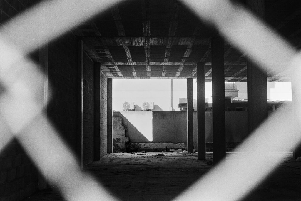
At first glance, you will notice that Construction (2024) is framed by wire mesh fencing. This guides and points out the main features of the composition, which the construction site brings us to the end of. The reflective walls of the site bounce the light from the other side, creating a slight illusion that the other side continues into the building from the right.
The wire mesh fencing makes the viewer feel distant from the site, which gives the composition a great field of depth. The photograph and the place, with their graininess, create a liminal space. It is empty when one would expect activity on a construction site, giving the work a slight eeriness as though it has been abandoned.