CONTRAST ISSUE 4
@
META SPACE
GALLERY
ARTISts
SEAN BW PARKER
lewis andrews
mia upton
gary dempsey
maximilian vermilye
leanne violet
ELENA GORN
MARYAM FARDINFARD
ANDREA LONDON
SIMONE FIGUS
THOMAS MORGAN
Uliana Novak
XINGYU DAI

Contrast! is an online and virtual exhibition and a publication surrounding the theme and concept of contrast- what it means in art and how it is portrayed. The artists in this fourth and final issue of Contrast tackle the concept with artistic integrity and through thought-provoking means.
If you would like to navigate the online exhibition easily; you can press the artists name at the top to go to their section of the exhibition.
1ST OF MAY TO THE 14TH OF JULY 2025
FOLLOW OUR :: INSTAGRAM
Sean Bw Parker
Artist Statement
My visual art mode is largely painting, with occasional deviations into graphic design, photography, short films and book and album covers. The ten years I spent living and working in Istanbul 2004-14 influence my work, as does the work I have done in justice reform since 2018. My paintings are generally in acrylic, ink and watercolour, and are sometimes associated with surrealism and neo-impressionism. Faces, bodies and shapes form new relationships via colour juxtapositions and freehand lines. The moment is more important than literal representation, and verisimilitude is sensed by the viewer, not imposed by the artist. My work in painting and poetry tends to be ‘make, then see what I’ve made’ – concept follows production, via the subconscious. My new motto is if ‘it doesn’t look like it could have been made by AI, then it’s successful’.
Sean Bw Parker (MA) is an artist, writer and musician specialising in art, cultural theory and justice reform. After gaining a Masters degree in Fine Art from the University for the Creative Arts in 2003 he lived and recorded in Istanbul for ten years, has published a number of books, albums and articles, performed at or curated festivals, given a TED talk, had paintings displayed at London’s South Bank and other exhibitions, and won awards for his work. He was born in Exeter in 1975 and currently lives on the West Sussex coast.
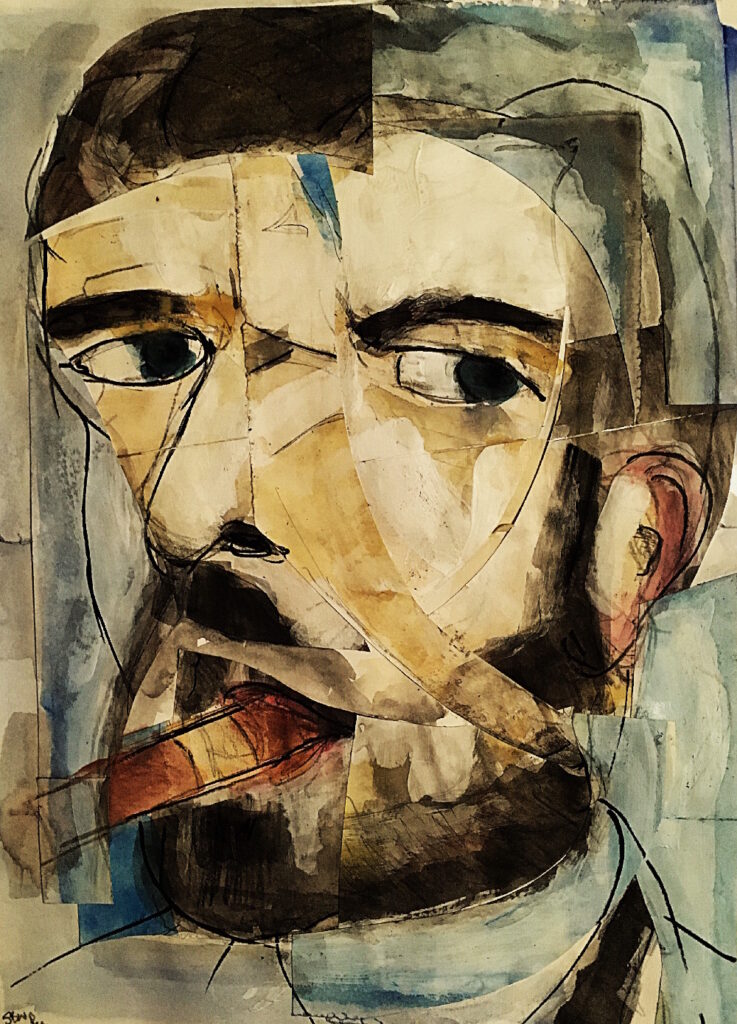
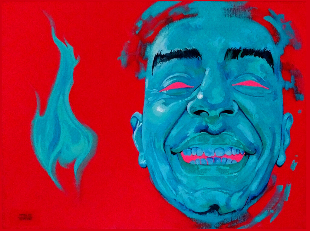
Ricky Gervais (2024)
Painting
Portrait impression of the British comedian, which he shared with his 14 million X followers, and will be part of an exhibition at the Gerald Moore Gallery, London, from March 2025.
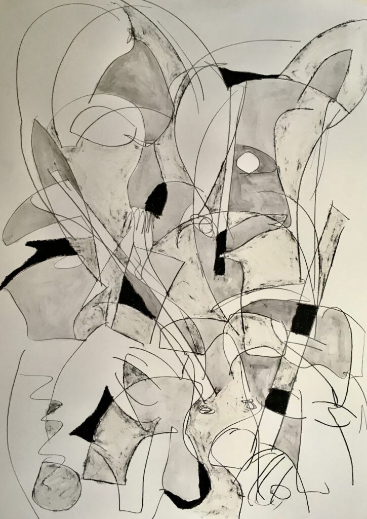
Aria (2024)
Painting
Abstracted black and white impression of still life and animals.
Curatorial Review
Ricky Gervais (2024) is a very stylised, possibly Cubist-influenced approach to a portrait of Ricky Gervais. The structure of the face has been fragmented and slightly overlapping each other yet still retains the base facial structure. However, what sets it apart from a more Cubist style is that it seems to be more organically shifted rather than a geometric analytical Cubist style. The shifting of the face gives movement and fluidity to the painting rather than distraction.
Lewis Andrews
Artist Statement
Lewis’s work acts as a conduit between art and science. The supply of information from science fuels the production of visual material, which communicates the knowledge of a scientific endeavour. In short, Lewis’s work focuses on dealing with complex thoughts, ideas and facts within nature and science. Some explore those in which we seem to be overshadowed and overpowered in comparison by the vast distances, size or quantities. Others investigate moments of extreme power, creation and rebirth on a molecular scale or on a scale comparable to that of the universe. Questioning our relationships, place and role within the universe, environment and natural spaces.
The work aims to transport the audience away billions of light years to witness these cataclysmic events happening in the depths of the cosmos. To do this, the work employs an approach of attempting to visualise these cosmic phenomena through the use of inverted Indian ink drawings followed by some editing processes to produce the final digital work. The super high contrast between the void of space and the energy in the whites attempts to visually communicate the amount of power released in these events through the glowing jets of the GRBs. The work encapsulates the moment this enormous amount of energy is released during the star’s supernova and the resulting GRB firing into the night. The negative space lights up the darkest parts of the work to communicate once again that these jets have the equivalent output of energy that our sun will produce over its entire 10 billion lifespan in a single second.
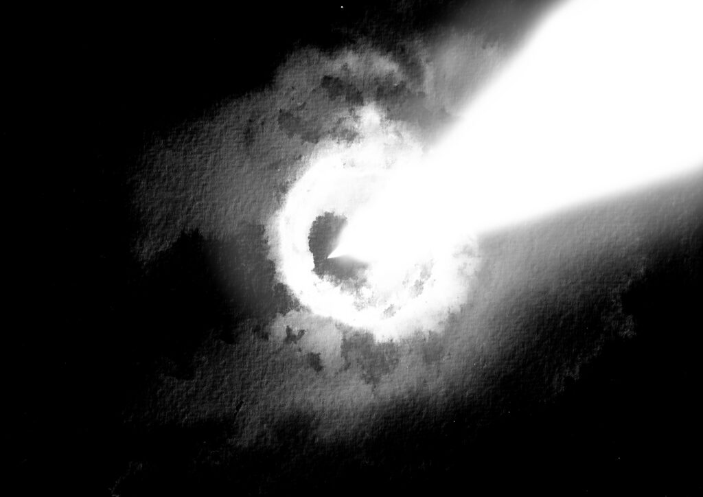
GRB V (2025)
Digital Drawing
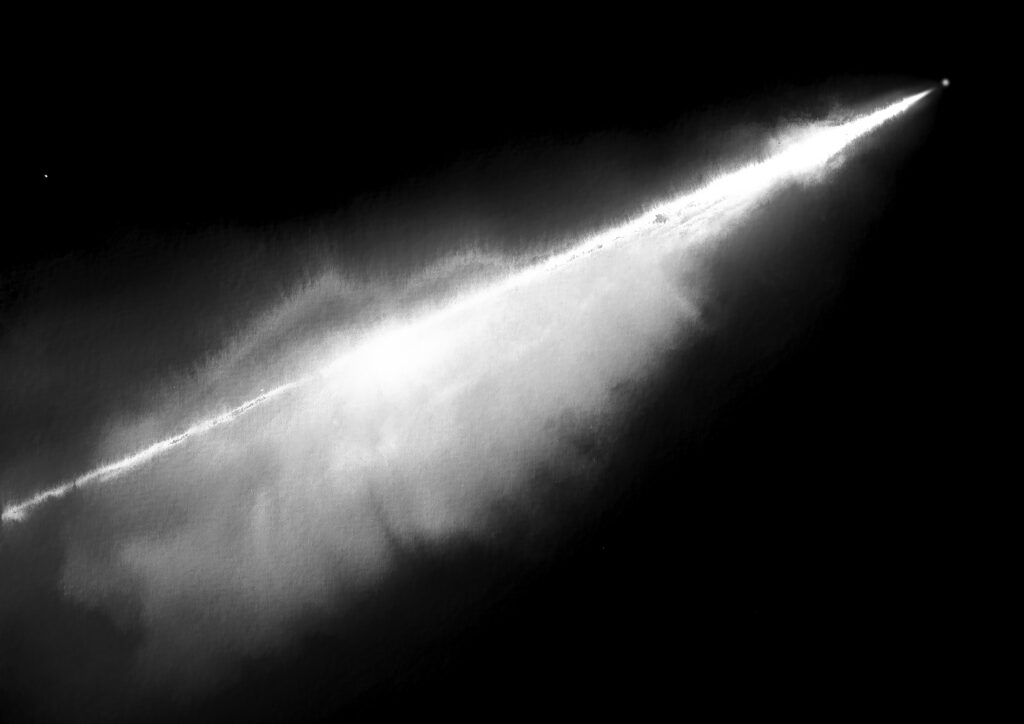
GRB VII (2025)
Digital Drawing
‘Cosmic Snipers’ visualises the most explosions, second only to the big bang in the cosmos: Gamma-Ray Bursts. Gamma-ray bursts (GRB) are titanic explosions caused when the most massive stars in the cosmos end their lives in supernovae and birth baby black holes at their cores. When this happens, enormous amounts of energy in the form of gamma rays are released into space in the form of two beams tearing through the star’s poles and shooting out into the cosmos. The universe’s equivalent of a Sniper bullet, if you like, as these high-powered jets of energy fire out into the cosmos, outshining the supernova by a factor of a hundred and containing the equivalent energy in a single second that our Sun will produce in its 10 billion-year lifespan.
If aimed correctly and close enough, a GRB can be an extinction-level event for a planet harbouring life. GRBs could overload Earth’s ozone layer, rendering it useless against the trickle of Gamma Rays coming from the sun whilst simultaneously delivering a lethal dose of Gamma Rays on the planet. This is probably happening all the time in the distant cosmos, with these cosmic sniper bullets washing over entire solar systems and stripping their planets of life. However, there’s no need to worry. Earth gets struck by GRBs at least once a day for a few seconds, but they originate so far away in distant galaxies that their energy is of no harm to us. However, a GRB may be responsible for an early mass extinction here on Earth. 450 million years ago, a GRB may have been the cause of the late Ordovician extinction, which wiped out 85% of marine species. No GRBs have been observed in our galaxy, and there may only be a handful of candidates of stars that could potentially release GRBs. However, we wouldn’t know if one was on the way for a strike on Earth until it was too late since they travel at the speed of light. And you would be dead.
Curatorial Review
GRB V and VII is an explosion of energy that occupies the vast space of the composition violently with the power of the explosion while also offering a reminder of what was once a massive star and engagement with this power. Before being turned into digital works- these were inverted Indian ink drawings before they were refined which gives foundation to the work conceptually.
Interview
Your work explores cosmic phenomena on both molecular and cosmic scales- what drew you to these and how do you think it reflects on humanity’s existence and perhaps our experience?
I’ve always had a natural curiosity for science and the cosmos since I was young. The idea to combine my artistic practice and the exploration of cosmic phenomena was only implemented during my bachelors degree. I feel that our species is incredibly curious and strives to understand our surroundings as much as possible. When it comes to the cosmos, we are incredibly curious and I believe that looking outward gives us a new perspective of ourselves in a few different ways. One of these is the delicate nature of our planet, being the only known planet to harbour intelligent life and the need to protect it as we are not capable of leaving it yet for another home.
You mentioned that you ‘conduit between art and science’ How do you balance science and artistic interpretation together?
My artworks aim to generate an ‘Informative Encounter’ with my audience. Whereby my audience gains new knowledge from the artwork communicating a scientific endeavour. It’s important to remain true to scientific sources but then also add a little interpretation to it which makes the artwork its own. A good example would be most of my cosmos work is not of an actual cosmic phenomena e.g. a black hole. However, it employs similar mechanics in terms of gravity and light to generate the image. The overall aesthetic is created to break down the distance between the audience and an imagined viewpoint emulating what it would be like to view a black hole on the edge of its event horizon. That was the process of creating the ‘Singularity’ series of photographic works.
Mia Upton
Artist Statement
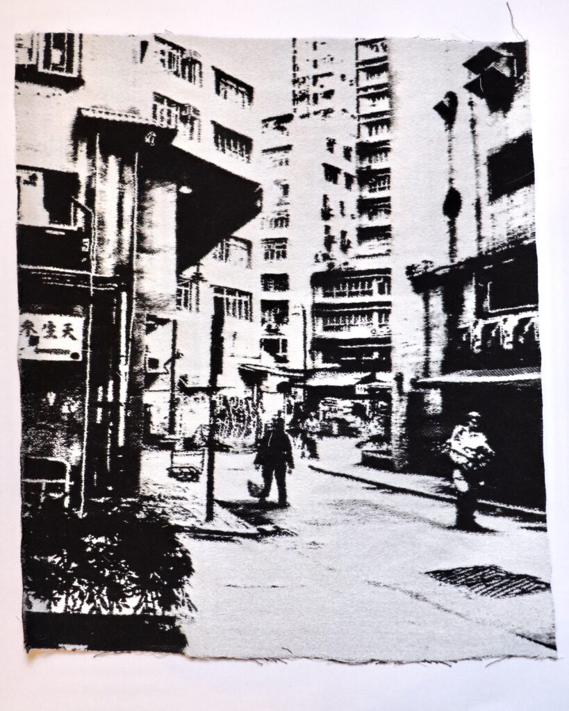
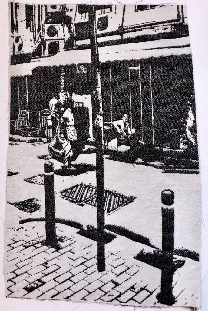
Mia Upton is a weaver and textile artist whose work explores cultural identity, history, and feminism. Drawing from her Scottish ancestry and Hong Kong heritage, she uses textiles to translate memory and storytelling into woven form. During her Master’s at the Royal College of Art, she researched personal and collective histories, blending photography, illustration, and graphic elements through Jacquard weaving. Her work captures overlooked everyday scenes, preserving the textures of lived experience.
Beyond her woven studies of urban life, Upton also works with tartan, continuing her exploration of tradition and modernity. In other pieces, she embraces bold color, pushing the boundaries of textile design with a fresh, contemporary approach. Her ability to merge historical references with modern techniques makes her a dynamic and innovative force in the field.
A young and exciting textile designer, Upton’s work has already gained recognition. At her graduation show, legendary print designer Zandra Rhodes remarked, “I am interested to see how your career progresses.” With a practice that bridges heritage and experimentation, Upton is shaping a distinctive voice in contemporary textile art.
Concrete Paths (2024)
Textiles, cashmere and cotton
Quiet Hours (2024)
Textiles, cashmere and cotton
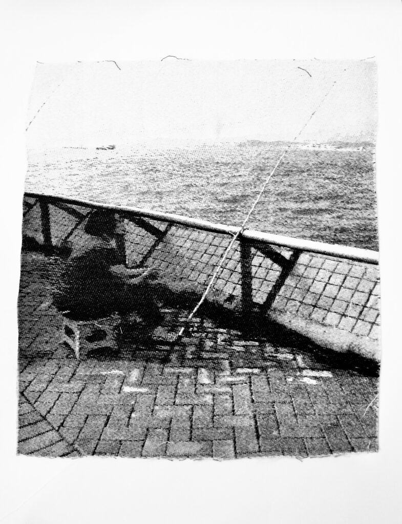
Salt and Time (2024)
Textiles, cashmere and cotton
Hong Kong: A Study in Material, Memory, and Place
Mia Upton’s woven series is a study of past and present, permanence and impermanence, value and waste. Created from cashmere using soft black and white-cream yarn sourced from industry waste, the pieces transform discarded material into intricate compositions that capture the fleeting textures of city life. Through Jacquard weaving, Upton merges photography, illustration, and textile craftsmanship to explore overlooked urban spaces and the quiet moments that define them.
At its core, this body of work is an inquiry into memory and materiality. Inspired by photographs her grandfather shared—images of the Hong Kong he knew in his youth—Upton reinterprets these glimpses of the past through the tactile language of weaving. The softness of cashmere contrasts with the rigid structures of the city, just as the act of weaving itself preserves ephemeral moments, turning them into something enduring.
The series challenges dominant visual narratives of Hong Kong, shifting attention from spectacle and commerce to the rhythms of daily life. Each woven piece offers a different perspective, yet together, they form a collective meditation on place and identity. The repetition of motifs—architectural details, figures at rest, traces of movement—mirrors the ebb and flow of urban existence, where the past lingers within the present.
By working with reclaimed materials, Upton also examines the tension between disposability and preservation. In a world of fast consumption, her practice transforms waste into something valuable, just as memory and history are continually rewoven into contemporary experience. This series is not just a representation of city life but a reimagining of it—an intricate study of contrast, material, and the quiet significance of the everyday.
Curatorial Review
Quiet Hours (2024) is a composition of a street scene in Hong Kong which has been transferred from photography to a textile. By transferring the image into textile it becomes an entirely different image entirely as it is no longer a photograph but more of an impression and has been imbued with the softness of the fabric offsetting the hard geometry of the city. Thus it has balanced the more geometric elements of the city against the soft weaving and thus allowing us to explore this memory slowly.
Interview
The works you’ve presented in this publication are still and contemplative moments—can you share the stories behind the original images that inspired these woven scenes?
The images came from a mix of family photographs, street photography, and pictures I took during my last visit to Hong Kong. I was walking through Central with a friend and their dog, and something about being a visitor allowed me to notice and appreciate the small, everyday moments more deeply. It was the ordinary things—the backs of restaurant workers on break, someone heading home with shopping bags, the worn texture of old signage—that compelled me to take the photos.
There’s also a strong personal thread. My great-grandfather moved to Hong Kong after World War I to work as a diver, and I recently learned that my family has been in the city for nearly a century. My grandfather was a keen photographer, capturing 1950s and ’60s Hong Kong in black and white film. Those images—quiet, observational, full of stillness—inspired me to create my own version of that memory, but in woven form. I wanted to explore how textiles could carry the same emotional weight as a photograph. These moments aren’t grand or posed—they’re honest, contemplative glimpses of a city and a heritage I’m still discovering.
Gary Dempsey
Artist Statement
My work is deeply influenced by the rich cultural traditions and stories passed down through generations. I find inspiration in the landscape, folklore, people’s stories, and the world around me. These traditions—whether in art, music, or storytelling—carry a sense of timelessness and continuity that I strive to learn from. I’m especially drawn to how cultural heritage is maintained and transformed, subtly evolving with each generation. As a father of two young children of mixed heritage, this has become even more important to me. Watching them grow, I find myself reflecting on what I want to pass on to them.
Each artwork explores the tension between opposing forces—whether it’s the old and new, the spiritual and physical, or the living and the dead. They reflect how traditions are simultaneously preserved and transformed through time. The contrast in each piece serves as a lens through which the viewer can examine how rituals and cultural practices evolve, adapt, and remain relevant, while also maintaining their roots in history and collective memory. These contrasts speak to the fluidity of identity, culture, and tradition, where the past and present are in constant dialogue, challenging perceptions and shaping new understandings.
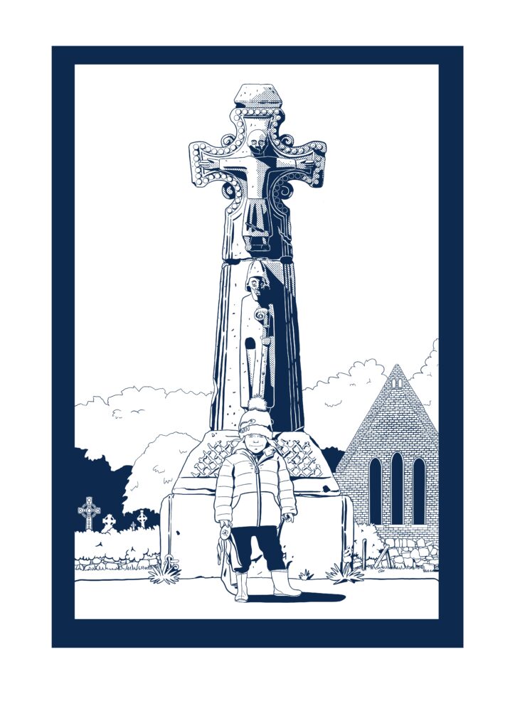
Zente at St. Tola’s Cross (2025)
Digital
This artwork captures the quiet tension between tradition and individuality. A young child stands before a towering high cross, aligned with the figures on it, symbolising the continuity of cultural heritage. The child, however, wears a playful dinosaur hat, contrasting with the sacred, timeless nature of the cross. In one hand, the child holds a handmade soft toy, crafted by their parent, a symbol of familial love and personal identity. The juxtaposition of the child’s modern elements with the ancient symbol speaks to how traditions are passed down, yet shaped by personal experiences. The child, aligned with the cross, suggests a connection to the past, while their unique touches remind us that cultural practices evolve with each new generation.
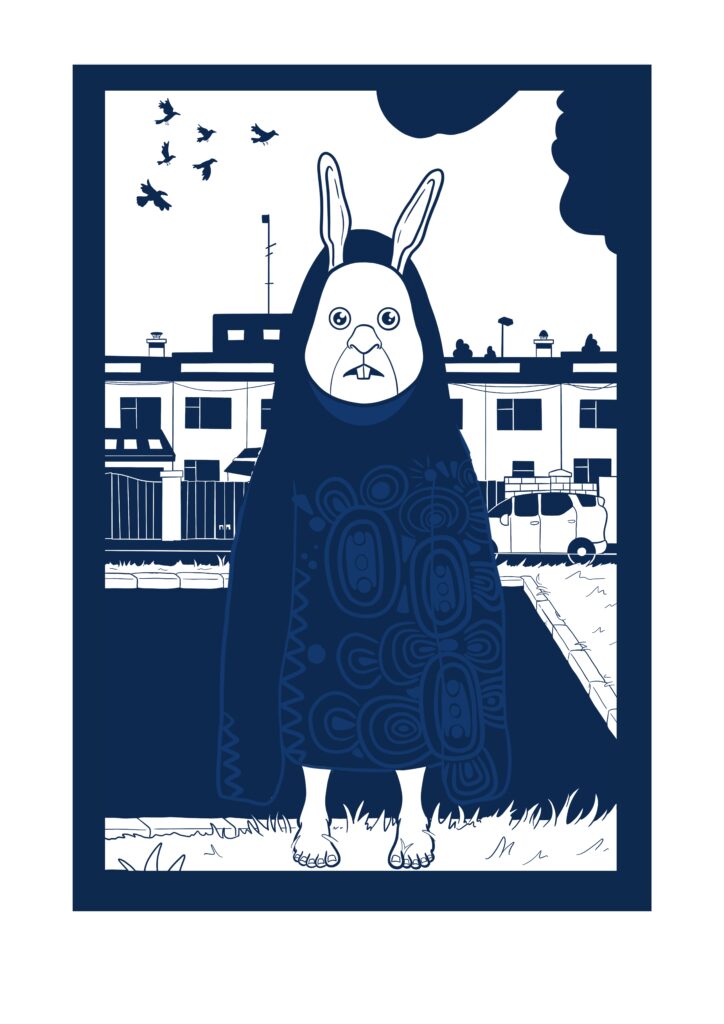
Samhain (2025)
Digital
A barefoot child stands in the grass of a housing estate, dressed as a rabbit—or perhaps a Púca, a mythical creature from Celtic lore—almost as if posing for a family photograph. The simple costume, complemented by an oversized coat, likely borrowed from a parent, connects the child to the ancient tradition of Samhain, when the veil between the living and the dead was believed to be thinnest. Once worn to confuse or protect against wandering spirits, costumes today serve as a playful homage to that spiritual past. The oversized coat, a hand-me-down from another generation, subtly suggests the passing on of traditions, with one generation dressing the next in the same rituals that have endured. This child embodies how old customs live on, reimagined through the modern practice of trick-or-treating, bridging the gap between ancient rites and contemporary community celebration.
Curatorial Review
Zente at St. Tola’s Cross (2025) shows a child standing before the Cross. The child is aligned centrally beneath the carved figures on the cross, which establishes a clear line between the past and the present. However, where the cross has been chiselled in stone, the child wears a padded coat and a beanie, which takes the past to the present.
Interview
Can you share a specific cultural tradition or story that has had a lasting impact on your practice?
One tradition that’s deeply influenced my work is the Irish practice of seanchaí—the traditional storyteller. The way stories were passed down orally, shaped by the teller’s rhythm and personal tone, taught me that narrative isn’t fixed. That’s fed into how I approach visual storytelling: not as something static, but as something open, evolving, and shaped by whoever’s engaging with it.
I’m fascinated by the storytelling tradition of the Blasket Islands, especially through figures like Peig Sayers, Tomás O’Crohan, and Maurice O’Sullivan. It amazes me that their stories have survived, considering the isolation of the islands and the time they were living in. When I read their stories translated from Irish into English, i’m struck not just by what they say, but how they say it. There’s a rhythm and warmth that feels so familiar and homely. It really contrasts with how many people sound today. Sometimes it’s hard to grasp just how important these storytellers were to their communities, especially now when we have endless entertainment and distractions. Their stories weren’t just for passing the time, they were central to memory, identity, and connection. That sense of depth is something I try to carry with me in my own work.
Maximilian Vermilye
Artist Statement
My work explores the emotional tensions hidden within visual structure — a process I call psychodynamic photography. Each image begins as a mobile phone photograph, then is mirrored and digitally altered using only in-device editing tools. My intent is to evoke unconscious perception through patterns of symmetry, inversion, and dissonance.
I am drawn to contrast as both subject and method: light vs. shadow, nature vs. artifice, emotion vs. order. These works use monochrome palettes, visual splitting, and textural opposition to explore how perception can be fractured or fused. I’m interested in how contrast sharpens awareness — not to resolve difference, but to make it vibrate.
These three works explore contrast as both a visual mechanism and a conceptual thread. I am drawn to the interplay between symmetry and disruption, the organic and the digital, light and darkness — not as oppositions to resolve, but as forces that activate perception.
In A Thousand Hands, natural tree branches are mirrored and restructured, creating tension between the organic rhythm of nature and the rigid structure of symmetry. The flanking negative spaces introduce a literal light/dark contrast, but also a deeper play between presence and absence — something familiar pulled into a fractured dimension.
Negative Trance pushes this further by inverting the tonal range, transforming trees into electric-white phantoms against a black void. The contrast here becomes psychological: clarity versus distortion, waking versus dream. The branches appear both real and impossible.
Lost in Transmission uses glitch effects to create a chromatic contrast atop a symmetrical winter landscape. Here, the visual harmony of the mirrored trees is interrupted by digital interference, revealing how modern experience is shaped by the push and pull between reality and signal.
Across all three, contrast is not merely aesthetic — it becomes a way to surface unconscious tensions and emotional layers beneath what the camera captures. Each piece holds an unresolved energy: something between control and chaos, reflection and dissonance.
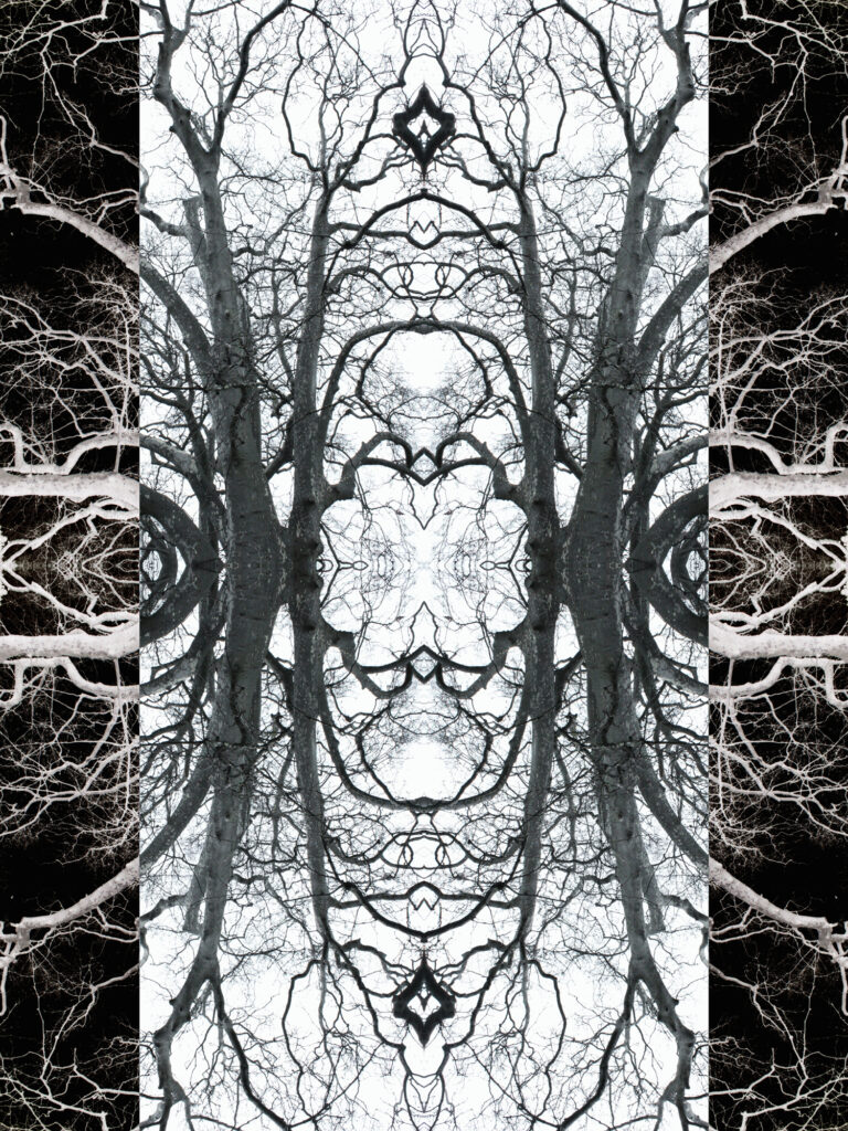
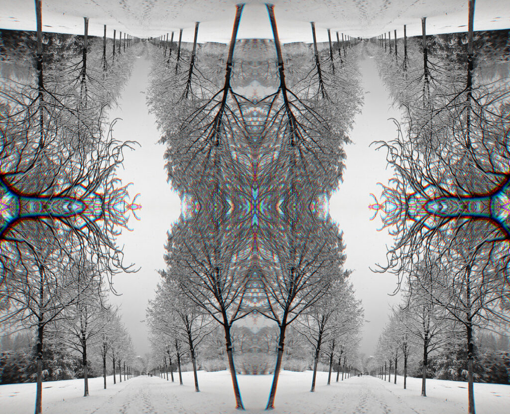
A Thousand Hands (2024)
digital art, inkjet print on photo paper
This mirrored tree composition evokes a visceral forest of reaching limbs — both natural and spectral. The central column of black-and-white trees is flanked by negative-space inversions, creating a visual corridor of balance and disorientation. The piece explores contrast not only in value (light vs. dark) but also in directionality and scale, drawing the viewer between reflection and rupture.
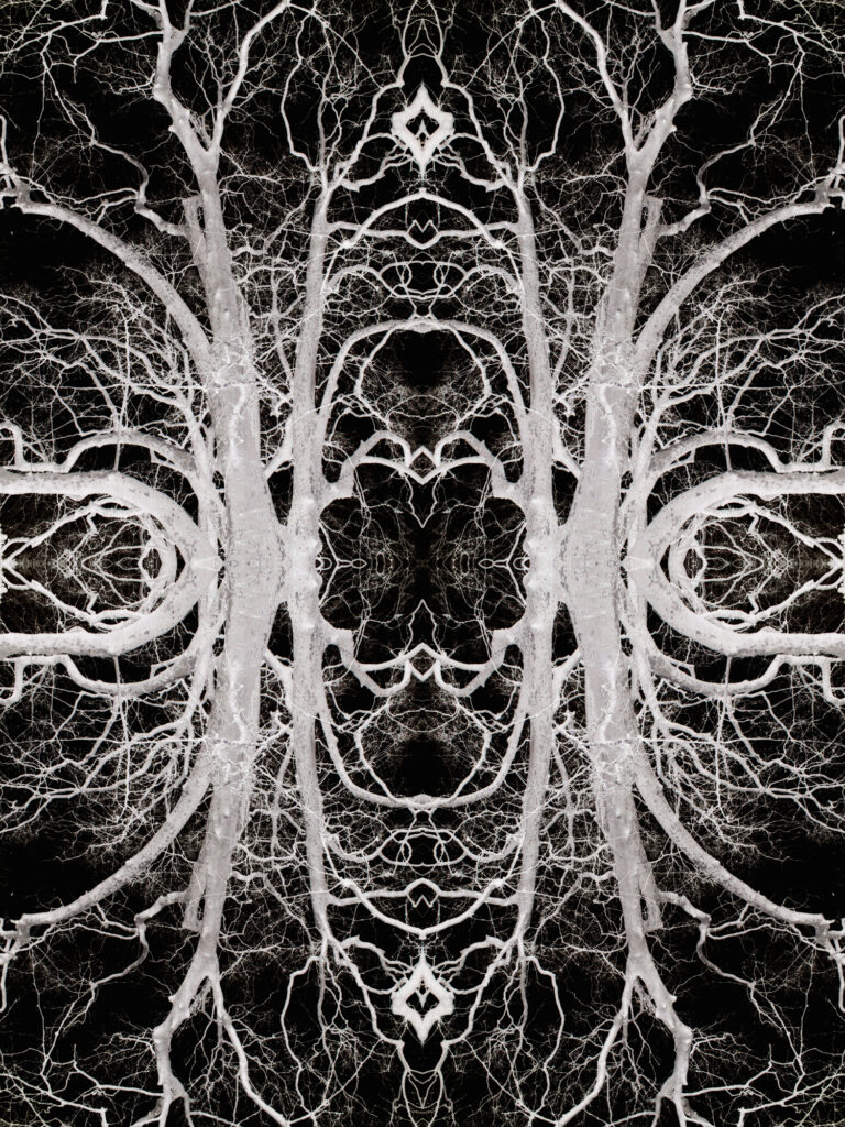
Samhain (2025)
digital art, inkjet print on photo paper
A stark inversion of light and shadow gives this composition its trance-like intensity. The mirrored tree forms appear skeletal and electric, glowing with negative energy against a pitch-dark background. The work explores contrast as psychological territory — tension between presence and absence, memory and void — evoking altered states of perception.
Lost in Transmission (2023)
digital art, inkjet print on photo paper
In this winter landscape, mirrored trees and glitch-like chromatic distortion displace the eye’s expectations. The scene is at once familiar and uncanny. Contrast appears as interference — visual noise layered over geometric harmony. A reflection on how memory, nature, and digital space overlap, blur, and reconfigure each other.
Curatorial Review
Lost in Transmission (2023) has successfully manipulated a winter landscape into a field which is psychologically charged and espousing a perception of friction. It has been fractured through repetition- its orientation flipped and through chromatic aberration. You simply cannot view this image passively and must become active to understand and explore the work.
Interview
You describe your process as psychodynamic photography, what inspired you to connect photography with psychology and the unconscious?
For me, all art at some level connects with what is in our mind. Little moments of looking at something and for a moment, you register it as something else.
Playing with that moment was the spark that got me to go down this road.
To what extent do you view your work as psychological portraiture- either of yourself or of more broader emotional states?
For the most part, my artwork is more a reflection of my curiosity of the moment. Something that just didn’t quite look right at first that caught my eye in the tapestry of our world. There have been some pieces I have made when in an emotional state where finding the light seemed impossible, and it is reflected as such in them. However, these are few and far between and I push myself to find flashes of stories in the world. Little moments of narrative from a novel that I feel I opened up halfway through and am trying to make sense of with the detail provided on the page.
Leanne Violet
Artist Statement
My practice centres around themes of connection to legacy, to memory, and to the often-invisible labour of women. Rooted in the documentation of everyday life, my work pays homage to the quiet resilience, care, and creativity that have historically gone unnoticed or undervalued. I take a multi-media approach that blends textiles, painting, and digital media. Through colour, texture, and shape, I create bold, tactile pieces that honour the silent activism of women’s domestic labour. Stitching, mending, making-do acts of both necessity and love. These gestures, passed down through generations, form a rich, interwoven archive of memory and survival. This work is personal. It connects me to generations of women before me, whose superstitions, stories, and post-war “make do and mend” values have shaped not only my worldview but my creative approach. Through my practice, I seek a sense of belonging — to family, to history, and to a lineage of women who made beauty out of what was available, who documented life in threads and routines.
Love in Idleness
Love in Idleness is a work born out of contrast, between softness and strength, presence and invisibility, enchantment and endurance. It is part of an ongoing practice rooted in connection to women’s labour, particularly within working-class traditions, and the quiet resilience woven through acts of domestic making.
At first glance, the imagery evokes nostalgia and tenderness: floral motifs, delicate lace, hand-stitched details. But at its centre sits a bold, commanding image – a pansy with an all-seeing eye. This central figure disrupts the romanticism, turning the flower into something watchful, protective, and even defiant. It’s this tension, between beauty and confrontation that lies at the heart of the work.
The title itself, Love in Idleness, is a deliberate contradiction. Drawn from the Shakespearean name for the wild pansy, the phrase carries connotations of desire and passivity, of love blooming without effort. Also know as the “heart-ease” flower it has been used in herbal medicine as treatment for a range of conditions from respiratory conditions to skin ailments.
The creation of this piece was anything but idle. It was a labour of love in its truest sense; slow and deliberate. This contrast — between the illusion of effortless beauty and the reality of painstaking labour speaks to a wider truth about the histories I explore in my work. My practice draws on the traditions of women’s textile labour, much of which has been historically overlooked or undervalued. These acts of mending, stitching, decorating have been framed as idle or ornamental, when in fact they are rich with meaning, memory, and narrative. In Love in Idleness, I use these techniques to challenge that misconception. The work is both tender and assertive, sentimental and subversive.
The materials themselves carry contrast too — rough hessian against delicate lace, soft cotton next to precise embroidery threads. There is a push and pull between permanence and fragility, between tradition and reinterpretation. These material tensions reflect the emotional landscape I explore: the contradictions of care, the beauty in endurance, and the strength found in softness.


Love in Idleness (2025)
Art Textiles
Love in Idleness is a richly layered textile piece that explores the tension between perceived softness and underlying strength. Centred around a hand-stitched pansy bearing an all-seeing eye, the work blends embroidery, lace, and reclaimed fabric to reflect on themes of domestic labour, memory, and feminine resilience. The title, a nod to the Shakespearean flower associated with desire and illusion, contrasts with the meticulous, intentional labour behind the piece. Drawing from the artist’s personal connection to her matriarchal line and the generational legacy of the “make do and mend,” mentality this work becomes both a tribute and a quiet protest – elevating overlooked craft into a site of visibility, care, and enduring power.
Curatorial Review
Love in Idleness (2025) reclaims textiles and is a reclamation of domestic textile work. Violet has challenged the romanticised notion of ‘women’s work’ by confronting it, the symbolism in the work and the defiance of it.
Interview
You described your work as an ‘archive of memory and survival’. How do you see your pieces serving as both personal testimony and collective history?
Although my practice spans a range of mediums, memory is the thread that ties it together. I see each piece as a layered narrative, holding both personal and collective histories. When I choose scrap fabrics or hand-embroidered linens, it’s not just for their visual appeal it’s their stories too – these materials have already lived. They bear marks, wear, and stories of their own. Stitching into them feels like a quiet act of remembrance – not only of my experiences but of those who cared for and preserved these textiles before me. It’s a way of honouring endurance and adding another chapter to their story.
In what ways do you see your practice as a form of activism or resistance?
Textile work, especially the kind traditionally undertaken by women, has long been undervalued and excluded from the realm of ‘high’ art. Yet so much of what we understand about our history is preserved in fabric, as a relatively accessible, widely practiced art form.
By working with domestic textiles and embracing slow, manual processes, I’m resisting capitalist values that prioritise speed, productivity, and disposability. It’s a way of reclaiming time and care as powerful, subversive tools.
Elena Gorn
Artist Statement
My practice explores the tension between presence and absence, softness and control. Using acrylics, natural textures, and industrial fragments, I work with silhouettes, shadows, and fractured forms — visual metaphors for memory, inner conflict, and emotional containment. In this series for Contrast! Issue 4, I investigate how opposites coexist within one body: warmth and detachment, silence and pressure, organic material and structural constraint. For me, contrast is not just a formal element — it is the language of being split and still whole.
My works explores contrast through material, form, and emotional presence. I use acrylic in combination with natural sand collected from the coast to create textured surfaces that hold both silence and resistance. For me, contrast is a quiet strength — something that reveals itself not only in what is seen, but in what is felt through texture.
My works explore the theme of contrast on multiple levels — material, emotional, and spatial. I use silhouettes, minimal forms, and open space to convey quiet presence and inner tension. Each shape is intentionally incomplete — suggesting something fragile, unresolved, or in transition. By combining acrylic with natural sand collected from the coast, I create textured surfaces where softness meets resistance.
For me, contrast is not always loud or dramatic. It reveals itself in subtle shifts — between stillness and movement, presence and absence, visibility and silence. It is a language of duality, held gently within the surface.

The Listener (2025)
Acrylic on canvas
The Listener is part of an ongoing series that explores identity and memory through minimal forms, silence, and emotional texture — but in this work, contrast becomes the core language. Here, the tension unfolds between a human presence and an architectural form, between warmth and coolness, texture and flatness, organic and constructed. The faceless silhouette is rendered in deep black, facing a dark geometric shape under a blue sky — a distant “home,” perhaps, or a memory out of reach. Burnt sienna dominates the middle ground, acting as a soft barrier — a line of emotional separation. The work is created with acrylic and natural sand, blending softness and weight, stillness and resistance. Rather than depicting contrast as conflict, this piece holds it quietly — as distance, as longing, as something unresolved between two forms. The Listener invites the viewer to stand inside this tension — to feel the pause between presence and absence, self and shadow, home and exile.

Hidden in One’s Own Shadow (2025)
Acrylic on canvas
Hidden in One’s Own Shadow explores contrast as an internal conflict — the quiet tension between who we are and who we appear to be. The composition is built on duality: two overlapping silhouettes, one in deep blue, the other in warm orange. The cooler, sharper form represents the emotional armor we present to the world; the softer, fading figure behind it suggests the more vulnerable, authentic self that often retreats. This contrast is not only visual — cool vs warm, defined vs diffused — but psychological: protection vs exposure, control vs fragility. The use of acrylics and dry brush layering preserves both forms in a delicate balance, allowing one to dominate without erasing the other. Through this piece, I explore how contrast becomes identity — not through extremes, but through the subtle conflict that exists within.
Curatorial Review
The Listener (2025) brings us directly towards a silhouette of a face which has been cleanly carved from the left side of the composition. The silhouette does not have any individuality as it has been stripped of any emotion, expression or appearance and does not speak. It listens which turns the silence of the silhouette into an active participant in the work- the edges of this silhouette are sharp and clear while its identity is anonymous.
Interview
Can you take us through your creative process — from the start to finished piece?
My creative process begins with an internal image. These images stay with me constantly — not as visuals, but as quiet thoughts directed inward. Sometimes I work from a sketch — it helps bring clarity to my inner picture. Other times I work purely on emotion, intuitively. I use acrylic mixed with natural sand collected from the Mediterranean coast. This combination allows me to build form and relief, evoking a sense of memory.
The process is slow and reflective. I am a deeply intuitive person, and at times I need to negotiate with myself before a painting reveals its direction.
Finishing a piece is not about completing an image — it’s about reaching the point where the work reflects my personal statement and inner truth.
Maryam Fardinfard
Artist Statement
I use pastel and colored pencils to draw what moves me most — the deep connection between people, animals, and nature.
My style is based on hyperrealism, but I’m not just trying to copy what I see. I try to show what’s underneath — the feeling in a lion’s eyes, the freedom of a bird in flight, the calm beauty of autumn, or a quiet moment between two people.
Nature and everyday life inspire me. I hope my work makes people feel something — whether it’s strength, love, or just a sense of wonder. I want my art to remind others to slow down and notice the small things we often miss.
Recently, I started sharing my work internationally. My art will be shown at The Holy Art Gallery in New York (Fall 2025) and will appear in Create! Magazine and the YICCA International Contest in Europe. I’ve also exhibited in Dubai, Georgia, and Turkey, and received awards in Iran — including First Place in the National Student Art Competition and in provincial colored pencil contests in 2016 and 2018.
These experiences keep me motivated to explore emotions through drawings of wildlife, nature, and human relationships. I’m always learning, improving, and finding new ways to tell stories through my art. To me, art is a way to connect — a quiet conversation between what we see and what we feel.
My artworks show different kinds of contrast. In the tiger painting, there is a strong contrast between the orange tiger and the green water. It shows power and beauty in nature. In the portrait of the child with the grandfather, I wanted to show the contrast between young and old, soft and strong, and feelings of care. The still life with the bottles shows contrast in textures—glass, wood, and metal—and also light and shadow. I always try to show feelings and stories through these contrasts in my work.

The King Beneath the Surface (2018)
Oil on Canvas
The tiger walks slowly through the water. Its strong body reflects clearly, like a mirror. Even though it is powerful, it looks calm and peaceful. This artwork shows the beauty and strength of wild animals, and how sometimes power can be quiet. It’s called “The King Beneath the Surface” because the tiger’s reflection feels just as strong as the tiger itself.

Echoes of Childhood (2017)
Coloured Pencil
This painting shows old bottles, wooden boxes, and dry plants. It reminds me of my grandmother and her simple, traditional life. Everything in the painting tells a quiet story about the past, about working with hands and living close to nature. It’s full of warm memories and feelings of peace.

Grandfather’s Embrace (2020)
Coloured Pencil
The child feels a little sad, but finds comfort in his grandfather’s arms. The gentle touch of the old hand helps him feel safe and calm. This moment shows the strong love between generations — where care and kindness bring peace to the heart.
Curatorial Review
The King Beneath the Surface (2018) presents a tiger moving through the water in a quite and solitary setting. The painting has mastered the scene extremely well and thus allows us to observe the tiger at ease and relaxed. Below the tiger is its own reflection in the water which, despite being distorted by the waves of the water, showcases equal power to the tiger suggesting what lies beneath isn’t loud or visible at the first appearance but holds its own weight.
Andrea London
Artist Statement
Photography is a visual articulation of a thought or perception and the resulting image is a personal declaration of visual significance. I share with you the places I have been and the things I have seen. The photographs are my story. If you had been where I was you might have seen things differently; I am pleased to show you my impressions and grateful for your interest.
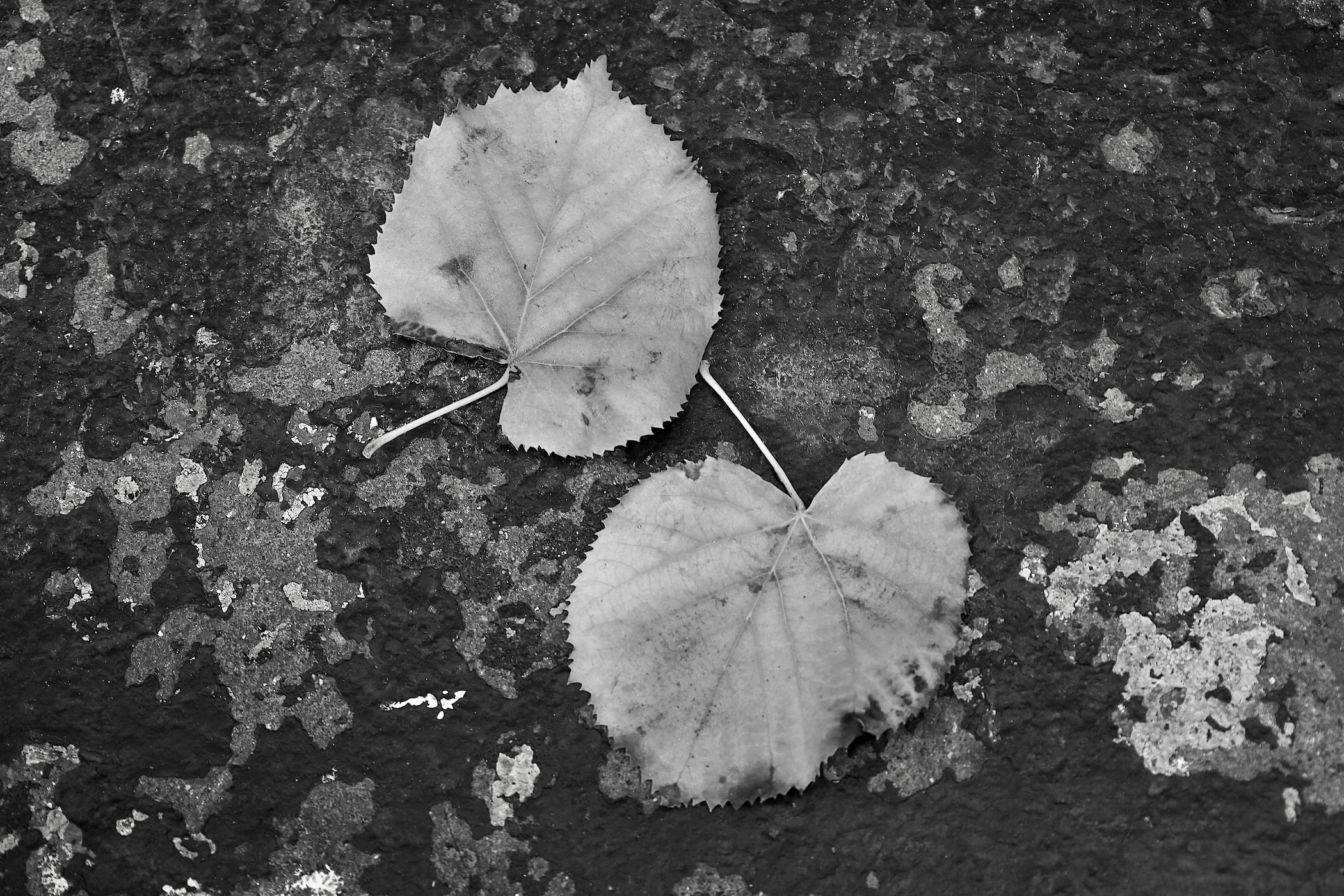
Leaves on Asphalt (2024)
digital photography
Two fallen leaves lie in the street. The organic and inorganic come together in mottled shades of gray, showing how our environment is composed of different elements, in this case with a hint of camouflage.
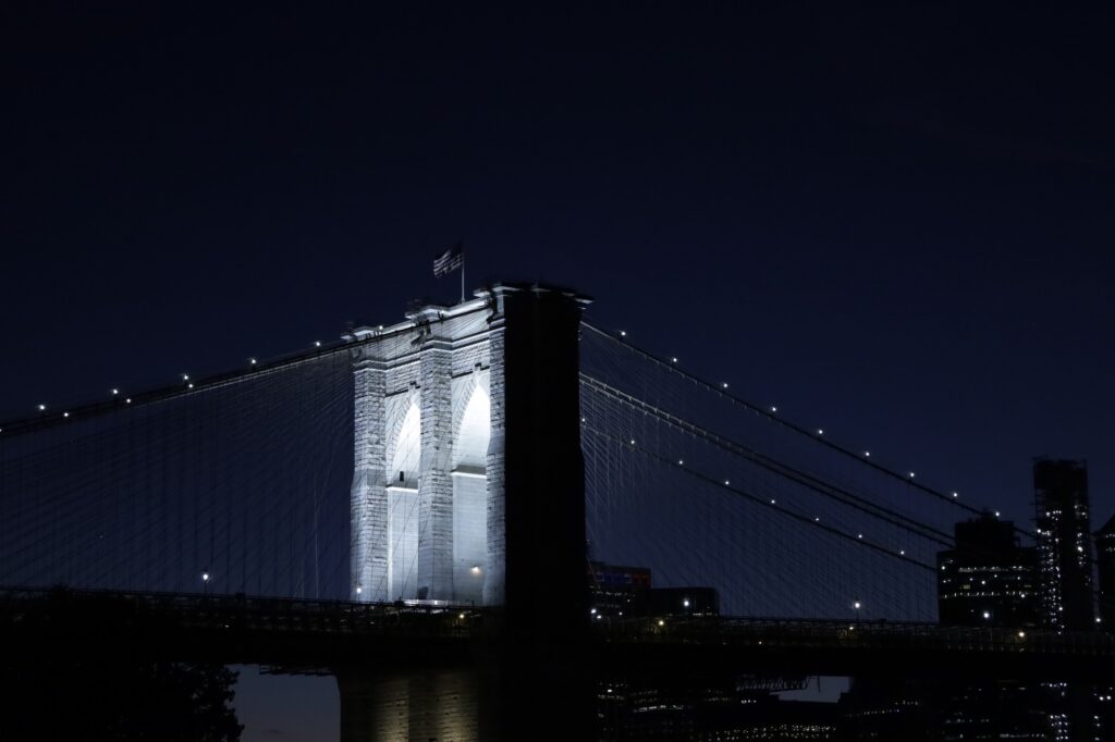
Light in the Blue Hour (2024)
digital photography
The blue hour of the evening, just after sunset, contrasts sharply with the white light emanating from the bridge.

A Horse of A Different Color (2005)
digital photography
Contrast finds itself in two forms here – one is the orientation of the subjects. Two are facing left and one faces right. The second way is in the depiction of color. The two white horses envelop the brown horse, who rests comfortably between them.

Tone, Shape, Texture (2025)
digital photography
The bright white curvaceous flower stands against dark, sharp and smooth spikey leaves and is moderated by a neutral textured backdrop.

Two Women (2024)
digital photography
This photograph depicts the similar profiles of two women, contrasted with their times and places in life. They represent modernity and antiquity, side by side.
Curatorial Review
Light in the Blue Hour (2024) is a spectacular photograph of the Brooklyn Bridge at night. The atmosphere within the photograph is strong while also showing restraint – the stone towers of the bridge are positioned within the photograph to look as though they are towering and standing and imposing over city and bridge. The American flag, above, is flying gently above it while the light highlights it quietly and pours out of the towers arches guiding the viewer towards the tower.
Simone Figus
Artist Statement
“My works are born by themselves… I never program a painting, I don’t sit on my chair thinking about what I could or could not paint… I simply have visions that I don’t know from which strange world or which dark side of my mind they come. They are visions, it is already all in my head, defined, clear. The rest is just manual work, transporting what I see on canvas or any other surface. There are very beautiful and bright things in this world, and there are other dark and sad things… I float in the middle… Maybe my works represent the unconscious attempt to escape from reality, perceived as unsafe, dangerous, fragile… An escape to another world, another dimension… Maybe that’s where my fears find peace, often turning into dark and disturbing visions or sometimes into beautiful dreams…”
In my works the contrast between dream and reality is often evident, but not intended as a conflict, rather as a contraposition between the real figure and the dreamlike component. What is truly real and what is only a dream or hallucination? It is a continuous contraposition that never reveals anything certain but that leaves us suspended, in contrast precisely, with what should appear normal and what belongs to a more oniric dimension.

REVELATIONS 2 (2022)
Acrylic on Canvas
The contrast between red and blue, the two predominant colors, immediately catches the eye. But what this work wants to communicate is a revelation… A face glimpses a strange luminous shape, and it is inside that the eyes clearly see something. A premonition perhaps. Or perhaps a past event, which now presents itself to provide an answer. It is a revelation, but we will never know what it is. We remain spectators inside this red dimension, without answers, balanced between dream and reality.
ZIPPED TRIP (FLAME) (2023)
Acrylic on Canvas
A face with an evil grin watches us… it presents itself to us threateningly. A flame that seems to belong to reality, illuminates us and guides us into this nightmare, this hallucinatory trip. Perhaps the flame is the salvation, the way out. Or perhaps it is just a deception, a trap that guides us into a dark well…

ZIPPED TRIP (DOG) (2024)
Acrylic on Canvas
In this work the contrast, intended as a contraposition between what is real and what is not, is stronger than ever. We can’t understand if we are in a dream, in the grip of a hallucination or if all this is real. We are on the brink, and it is not reassuring… This dog observes us and scrutinizes us menacingly… he is ready to devour us piece by piece…
Curatorial Review
Revelations 2 (2022) instantaneously contrasts our eyes—there is a strong red—aggressive and loud against the figure’s blue face. Thus, it seems as though it is an almost physical encounter between the two opposite primary colours: red and blue. They continuously clash and bleed into one another, giving a sharp jolt to the work.
The piece is immediate and in your face; the colour contrast and clashes bring upon the urgency of the thought that had been caught which led to the creation of the work. It is something that fades from consciousness and suddenly that gives the artwork strength. Furthermore, the figure in the work’s face looks curious while the figure looks as though it is recognising something – the viewer will never know. What is seen by the figure could be a sudden fleeting thought just like the vision that may have inspired the work. Something the viewer will not know.
Thomas Morgan
Artist Statement
I endeavour to see the story when I’m in the moment of capturing an image, try to transcend its history. And in that moment, I often reflect on whether anyone has stood at the same spot I did and if so, who were they? Did she or he see what I saw? The possibilities are endless. Photography is the quiet observance of the fast-moving world in which human connection has been untwined to the last strand but in that tethering we see and feel the world upon which we tread. We’re passing through this time; I’m simply a vessel whose strength is the observation. I want my world to be beautiful, but I can’t force it. I want those who see my work to slow down and reflect. That’s what photography is to me: Reflections on this passing moment, and somewhere within the casting of that light there is beauty.
I spend a lot of my free time–if there is such a thing–looking for Los Angeles. And I look for it through the eyes of a photographer who has spent half his life here. That’s a long time. And in a place like this, oftentimes you see something new everyday.
Every day another screenwriter arrives in town either by plane, train, or automobile, armed with their three screenplays and a plan.
Every day the actress goes to the well after her shift at Starbucks.
Every day another millionaire is made.
Every day someone’s heart’s broken.
This can happen in any town the world over, but I see it happen here. I’ve been those people. More than once.
And so I hide behind my lenses and capture the city. I look for the narrative, and I listen to it to create the pictures that I think best describe the place.
City of Angels.

City of Angels (2025)
Photography
After the storm, mid-winter, and the afternoon light stretches shadows across Hollywood, with downtown in the background.

It’s Been a Long Time Since I Rock and Rolled (2025)
Photography
Bitched-out El Camino parked up in Griffith park, overlooking the arroyo. Wicked.

Flowers from a Stranger (2025)
Photography
Lovely vase in the window sill as the morning light hits the building, just waiting to be discovered and appreciated from afar. The drama!
The Further You Go, the Closer It Gets (2025)
Photography
Descriptive view of Hill Street, Los Angeles in the milky morning light.
Curatorial Review
City of Angels (2025) showcases Los Angeles as sprawling with the freeway cutting through the composition like a stream. Every part of the city, each car, each building and area has its dreams and stories. The city has not been simplified into just buildings and vehicles- the angle brings us level with the city- making it a much more personal feeling.
Within the image, we see Hollywood’s historical buildings seemingly crouching beneath the glass skyscrapers and towers built for the current age. The trees cover the lower streets which shows the human lives that are hidden beneath the towering city. The photograph refuses to stick Los Angeles as a cliche and rather it is presented as an ordinary and powerful place at the same time. Every part of the city holds a different story and shows the human nature of the city giving pause to the relentless bustle.
Interview
You described photography as a ‘quiet observance’. How do you create that stillness in a fast-paced fast moving city like Los Angeles?
Photography is a solitary, often solemn pursuit. If you’re not photographing people, you’re alone. You have conversations with yourself as you seek out an image in the field. You reason and critique yourself in the moment. You quietly observe and try not to draw attention to yourself. I used to rush through my shooting thinking I needed more shots in order to get the one shot, but that philosophy goes in stark contrast to the art as a whole; photography–even digital–forces us to slow down, get into a natural rhythm, and in doing so arrive at a quiet observance of the moment. And each image coming out of these moments is how I felt at the time. Maybe it’s not so much stillness of a city street that’s important, rather the textures beneath it. And if you can arrive at that zen, you’re seeing the seemingly unobserved human world. 🙂
Uliana Novak
Artist Statement
I am Uliana Novak, a self-taught artist of Russian origin based in Finland. For many years I worked as a sociologist in academia, exploring the complexities of life, society, and the intricate dynamics of the social world. After joining an Art studio in Helsinki in 2020, painting became my primary focus, and I have come to see myself as first and foremost an artist. Through painting, I learnt a new language which allowed me to express my view of the world and, in doing so, unlocked a sense of freedom within me which for so long had been suppressed.
The process of finding myself through art coincided with significant global changes, which included COVID-19 and the Russian invasion of Ukraine. This was a significant driving factor for me to reconsider the nature of social issues, and from then on, I wanted to express these reflections through the nonverbal language of art.
My art is figurative, cheerful and colourful. Oil and/or acrylic painting on canvas is the mediums of both my self-expression and continuous research of social reality. My sociological perspective informs my art, as I narrate stories about people and society through whimsical sketches that blend humour and depth. Influenced by social satire, caricature traditions, and naïve art, my work serves as a playful yet thought-provoking lens on human nature.
The idea of the contrast as a difference between the object and its background is one of the central in my artworks. In many paintings, I use the image of the window as a mean of contrasting two realms: inner and outer. Being an everyday object – a frame through which we view the outside world – in my artworks, window serves as a complex lens and embodies multiple symbolic meanings.
The window is crucial in shaping our perception. If the glass is clean, the view is straightforward, simple and safe, but if it is smudged or dirty then the view becomes layered and ambiguous, transforming the world into something complex, dangerous and risky. An open window invites the viewer to interact with the world, allowing them to engage with life beyond. Conversely, when the outside feels dark, unfamiliar, or even hostile, one can retreat from this reality by closing the window or drawing the curtains, thus hiding themselves from that reality.
Also, the window offers an entry point for an outsiders gaze. As people pass by and peer into windows, they gain a glimpse into another persons world, sparking their curiosity and imagination about the lives of those within. Thus, the window becomes a shifting threshold between the inner and outer, both on a simple physical level (indoors vs. outdoors, private vs. public) and a complex philosophical one (selfhood vs. otherness). Thus, I use the concept of the contrast as a rhetorical style while reflecting differences and similarities of two worlds divided by the window.
Also, in some paintings I incorporate elements from Russian, Finnish and European classical art and put them as a backdrop for contemporary content, using the window as a gateway to the world of the past, and thus explore the duality of past and present. By doing this, I merge two worlds and mix different historical and social contexts to uncover new layers of meanings.

Window #2 (2023)
Oil on Canvas

Carpet #3 (2023)
Oil on Canvas
Curatorial Review
Window #2 (2023) brings us to what looks like a modern setting – a laptop, a bottle of wine and a half-full glass on the windowsill. These are items of possibly indicating or symbolistic of remote work or solitude. Possibly referencing the long hours of being indoors during the lockdowns during the COVID-19 pandemic. However, the outside of the window showcases a very different world of figures in historical clothing going through a sandy yet modernist landscape.
The reference to historical painting styles in the work is critical as it transfers these figures into a present-day gaze for the viewer. The window brings this past to the present and merges them compressing time into one single moment. The figures on the outside are of motion and moving- while on the inside we are absent- it’s just a laptop. The absence here could be a critique of how crises, wars, disasters and other societal worries are seen through the screen rather than experienced in reality. Thus creating a detachment from real-world events.
Interview
You described yourself as a self-taught artist with a background in sociology. How did you experience your transition from academia to the art world?
Leaving academia was not a sudden decision—it happened gradually over a number of years. In general, life as a researcher in academia was intellectually stimulating, but I always felt as though something was missing: freedom and creativity. When I joined an art studio in Helsinki in 2020, I realised that painting allowed me to express myself in a new way which unlocked a sense of freedom within me that I had long been searching for. The full-scale war in Ukraine in 2022 was a pivotal moment in my transition. That profoundly personal and shocking experience greatly affected my life, and I was left no longer able to interpret or describe the world around me through the familiar language of sociology and research which I had become accustomed to. I needed a new language to communicate with the world—and art became that language. So, while the transition from academia to the art world wasn’t easy, it was necessary and even vital for me at that moment. I am particularly grateful to the renowned Russian artist Andrey Bilzho, to whom I sent few my early works. His positive feedback and encouragement gave me the confidence to pursue art more seriously.
Xingyu Dai
Artist Statement
As an artist, I am drawn to the overlooked, the unspoken, and the quiet moments that often slip through the cracks of daily life. My work is about revealing these hidden spaces, where silence speaks louder than words. Art, for me, is a tool to make the unseen seen, the unheard heard, and the ignored discovered.
Photography allows me to capture what is often invisible: the pressures we face, the silent judgements that shape our identities, and the personal stories that go unnoticed in a world constantly evaluating us. My practice is a reflection of these quiet struggles, the ones that exist in the spaces between what we are told and what we truly feel.
The work employs contrast as its core language:
Visual: Monochrome figures vs. visceral red blooms
Textural: Supple measuring tape vs. its rigid standards
Conceptual: Society’s “neutral” metrics vs. their violent impact.
Each layer exposes the hypocrisy of bodily judgement.

Blade (2025)
Digital photography
Silk restraints, petal wounds

Blade (2025)
Digital photography
What adorns her also holds her.
Curatorial Review
Blade (2025) uses contrast as a form of confrontation. The measuring tape which is usually an object of supposed neutrality has been turned into a tight choking collar. (in the first photograph seen in the publication and the web exhibition) The measuring tape sits around the neck and constricts, binds and judges. By wrapping the tape around the neck- it has been transformed into an implement of violence, furthermore, the flower is something that has been masked but inside it is blood erupting from the cuts.
The figure is monochromatic and desaturated coming out of the darkness showing the depletion of identity from imposed ideals. The flower representing blood and the constrictive measuring tape choking and rupturing out are the only elements with colour. The photograph does not show a face or eyes- the figure is anonymous thus insisting that this body could be any woman’s body- every woman’s body caught in the same quiet grip.
Interview
Why did you choose photography as the medium for exploring these themes of invisibility and judgement?
Photography isn’t just about documenting appearances; it’s an exploration of the gaze itself. It unveils the power dynamics between the observer and the observed. Historically, women have been the subject of this gaze, and photography amplifies that tension. The medium, imbued with the authority of ‘looking,’ becomes a vehicle to discuss the scrutiny and judgement of the body, offering a subtly ironic commentary.