META SPACE
SPRING SHOW!
@
META SPACE GALLERY
ARTISTS:
SEAN BW PARKER
LEE SMITH
DELIA ZORZOLIU
EMILY CARNEY
NIITA E.
JAMES MARK BROWN
RW TAYLOR
EMMA LEWIS
JOAS NEBE
JOHN MOLLOY
PRECIOUS OZEMOYA
KANISHKA GANDHI
MICHALIS KARAISKOS
ADA QI YING
TANYA PREMINGER
WEIYI CHEN
ABOUT THE EXHIBITION
The Meta Space Spring Show is a general exhibition that celebrates works from the numerous artists who are sharing their talented works within this exhibition and the publication that is subsequent with this show.
If you would like to easily navigate this exhibition please press on the artists names in the above section to go to their part of the exhibition.
28TH OF MARCH TO THE 11TH OF APRIL
SEAN BW PARKER
My visual art mode is largely painting, with occasional deviations into graphic design, photography, short films and book and album covers. The ten years I spent living and working in Istanbul 2004-14 influence my work, as does the work I have done in justice reform since 2018. My paintings are generally in acrylic, ink and watercolour, and are sometimes associated with surrealism and neo-impressionism. Faces, bodies and shapes form new relationships via colour juxtapositions and freehand lines. The moment is more important than literal representation, and verisimilitude is sensed by the viewer, not imposed by the artist. My work in painting and poetry tends to be ‘make, then see what I’ve made’ – concept follows production, via the subconscious. My new motto is if ‘it doesn’t look like it could have been made by AI, then it’s successful’.
Artworks

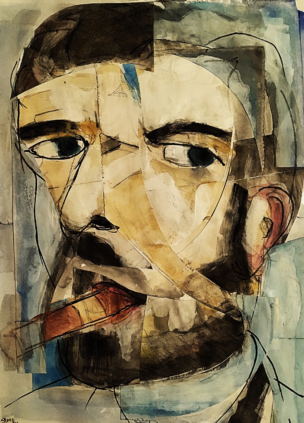
Ricky Gervais (2024)
Painting
Portrait impression of the British comedian, which he shared with his 14 million X followers, and will be part of an exhibition at the Gerald Moore Gallery, London, from March 2025.

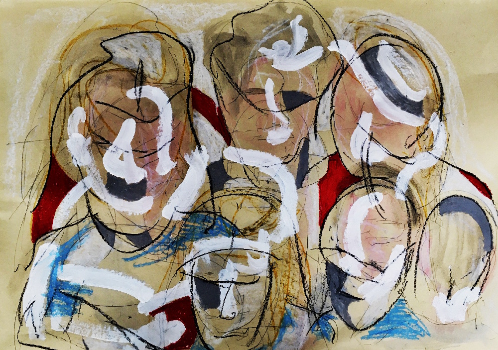
Artists At Work (2024)
Painting
Impression of attendees of a Brighton art club.
Curatorial Review
Artists At Work (2024) instantly showcases itself with numerous figures who have their faces with only simple indications of a human face (basic outlines of noses and where the eye would be and the shadows). This method seems to contrast the individual against the shared space of an art club- the figures seem to merge into each other while there is no central figure, bringing the viewer’s eye all over the composition. The beige background is quite warm and does not distract us from the figures, allowing them to have full prominence despite being unidentifiable. Therefore, the identity in the work is explored as rather a collective and they all contribute to one another through this perception becoming one.

LEE SMITH
I’m Lee a west Midlands based artist. I love to honour and pay tribute to the arts by painting famous movies , and give homage to the actors who portrayed them, I am a new emerging artist whom has found the therapeutic remedies of art to deal with PTSD after leaving the army and would like to continue doing for many years.
Artworks

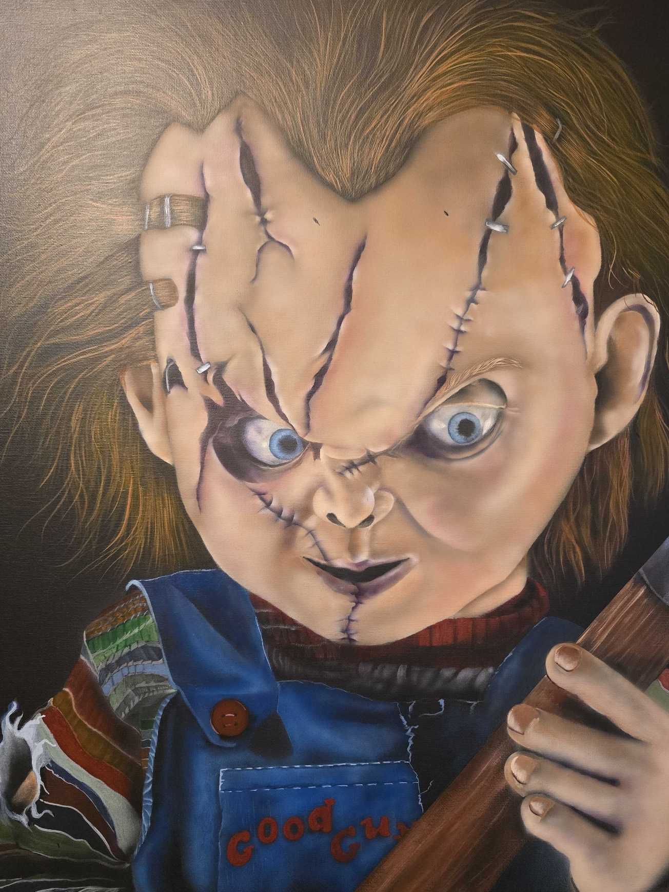
Portrait of chucky (2024)
Acrylic Painting
A portrait of Charles Lee ray
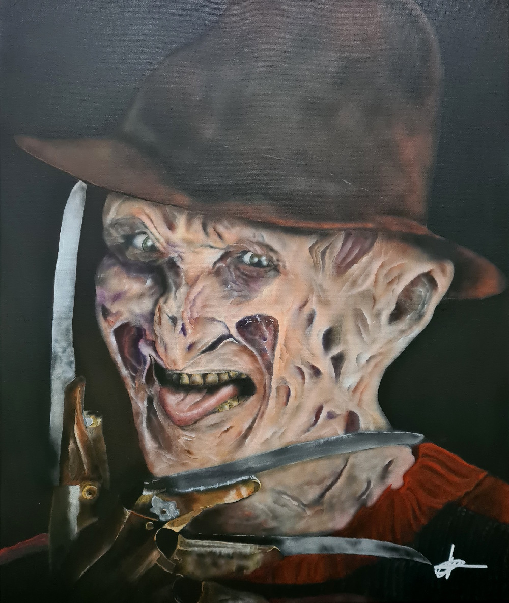
Portrait of Freddy (2025)
Acrylic Painting
A portrait of Freddy Kruger
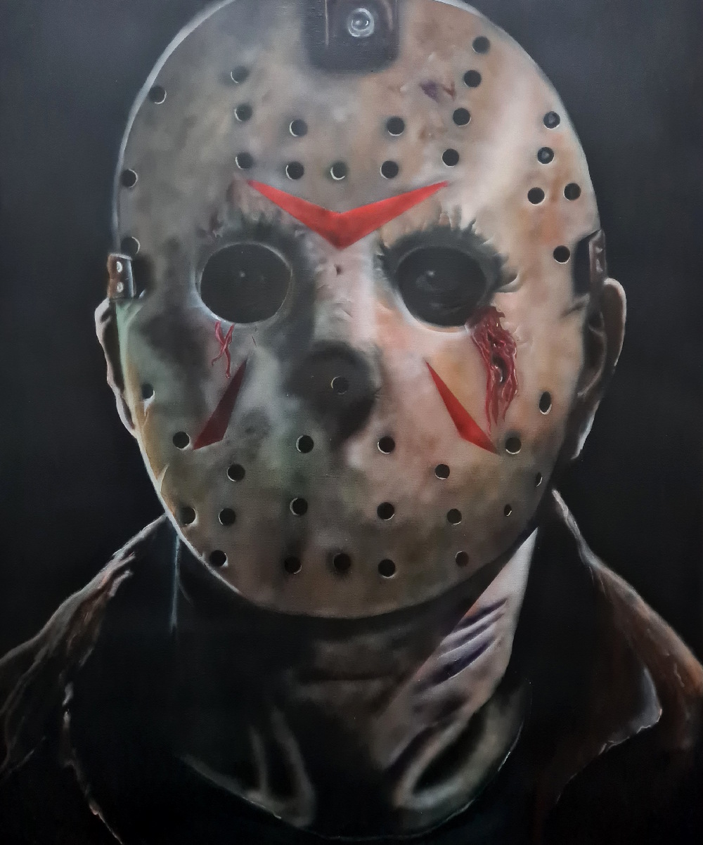
Portrait of Jason (2025)
Acrylic Painting
A portrait of Jason Vorhees
Curatorial Review
Portrait of Chucky (2024) is a realistic painting of Chucky that successfully captures the menacing presence of Chucky and the eeriness of the character. The painting technique pays great attention to the details within Chucky’s face, especially with the scars and staples within the face adding to the menacing atmosphere of the painting. Furthermore, the lighting and shadows of the work are successful in giving dimension to the work.

JAMES MARK BROWN
James Mark Brown is a mixed-media artist based in East London. His work combines diverse materials—including clay, wood, resin, paint, and recycled or found objects—transforming them into new dynamic forms. Inspired by seasonal and biological rhythms, prehistoric art, mythology, alchemy, and the natural world, his creations explore the interplay between time, transformation, and the enduring connection between humanity and nature
Artworks

Fired Conversations (2025)
Ceramic, carved/scorched wood, gold leaf, resin
My work centres on the alchemical transformation of elements and how they interact. Clay (earth) imprinted with the wood that is then used in the firing process to turn it into ceramic with the serendipity of ‘painting’ with fire using foraged organic materials.

Elemental alchemy (2024)
Ceramic, carved/scorched wood, gold leaf, resin
Drawing inspiration from the cycles of nature, this works explore the elemental themes of earth, fire, water, and their alchemical interactions. The ceramic tiles are ‘painted’ through an overnight pit-firing process, capturing the raw drama and serendipity of fire’s unpredictability. This organic spontaneity is juxtaposed with the deliberate order of the composition, reflecting the delicate balance between chaos and structure. The artwork underscores the essential harmony the natural world seeks—a dynamic equilibrium that enables it to thrive
Curatorial Review
Within the centre of Elemental Alchemy (2024) is a grid of ceramic tiles whose texture and surface are the traces of pit-firing. The spontaneous and sudden nature seems to mark the clay with the smoke of the fire and the heat creating an intricate natural-looking texture. Though the texture looks very natural; the process- by being pit-fired the fire is controlled by the artist to create these textures contrasting control and the natural process together creating a balance between the two.
RW TAYLOR
Alumni of Leeds Arts University and member of the Leeds Print Workshop, the artist works in a variety of media. The artist exhibits and illustrates children’s story books, including their own. Their latest book ‘Never Stop Asking Questions!’ has just been released. The artist activity aims to encourage children’s creativity, imagination and a little daydreaming (and hopes to encourage you too). The artist’s new book for children titled ‘Never Stop Asking Questions!’ is available now. A book of random stories, rhymes and pictures answering questions that you never thought you needed the answer to (with answers that may not necessarily be true…) Illustrated throughout by linocut, screen printing, drawing, painting, collage and etching.
Artworks
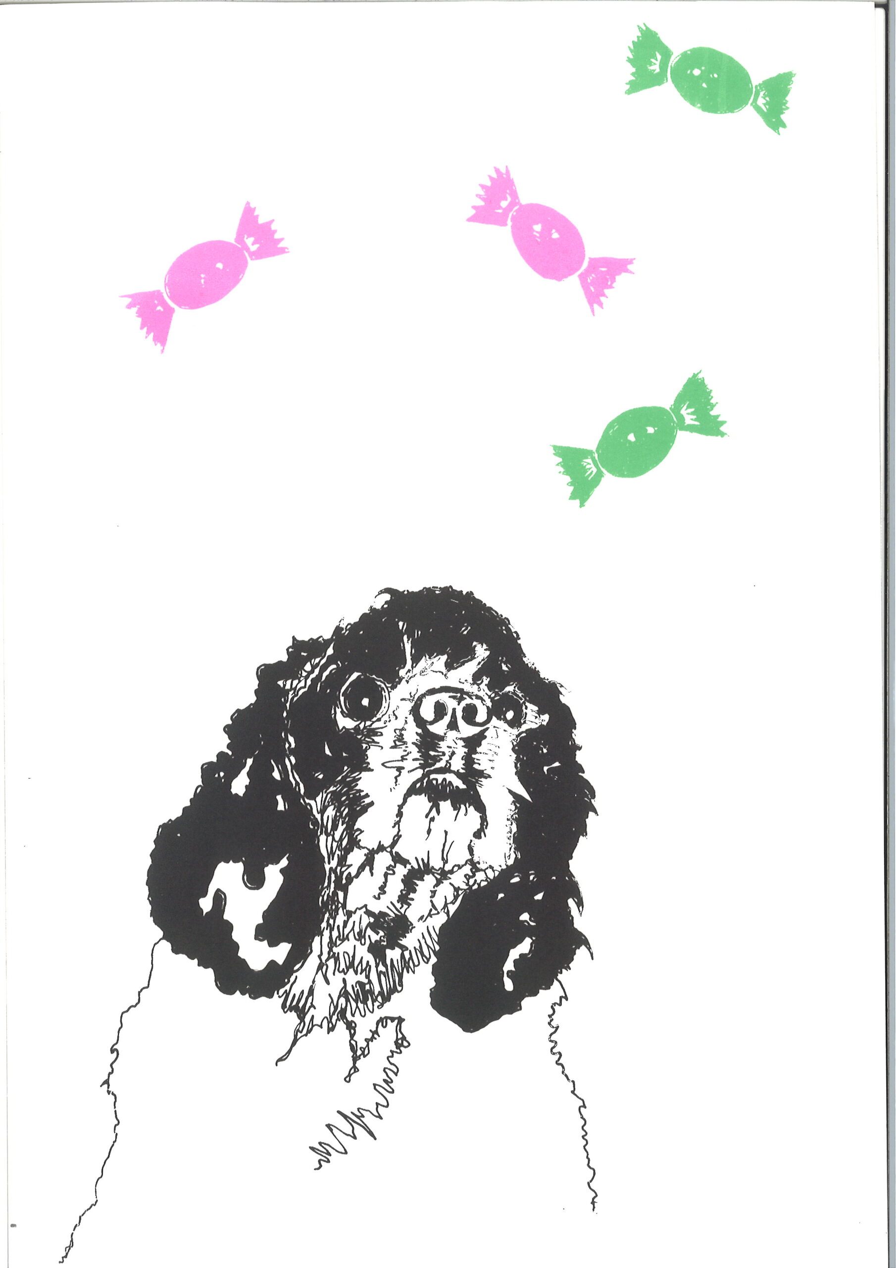
My Dog is a Sweetie (2024)
Screen print
Screen print from a drawing by the artist. The artwork aims to capture the wonderful and unique personality of the artist’s American Cocker spaniel, Winnie.

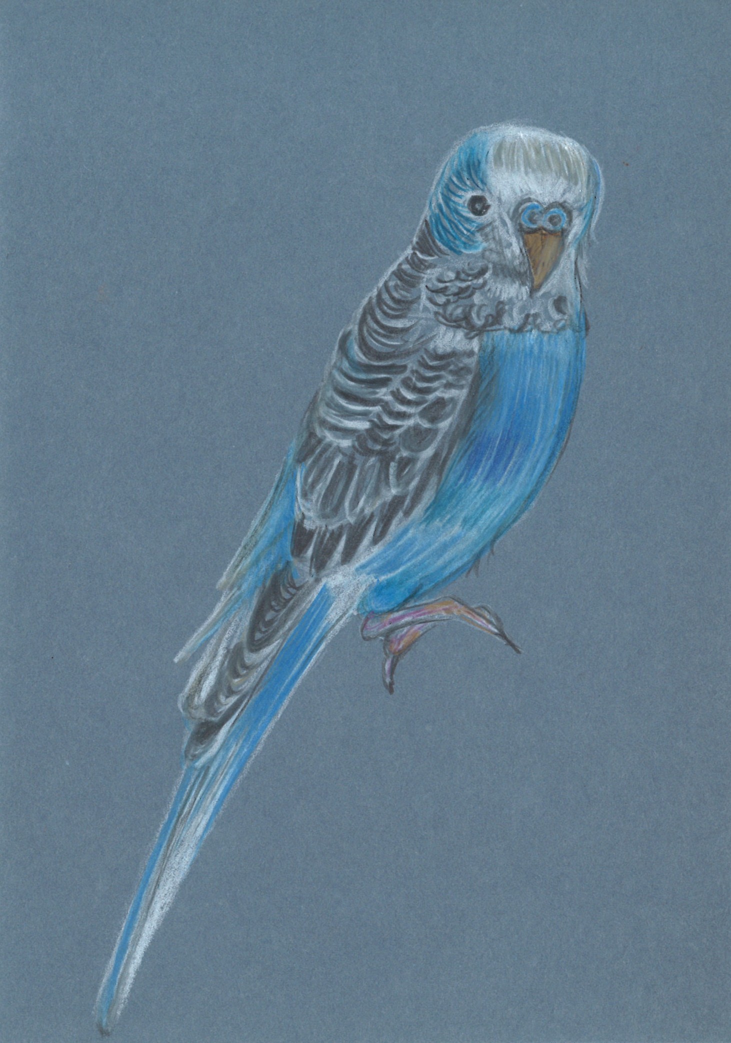
BBC (Bertie Blue Colour)
Pencil drawing on denim blue paper
Pencil drawing on 250 g blue denim paper depicting Bertie, the artist’s mother’s charismatic budgerigar.
Curatorial Review
In My Dog is a Sweetie (2024); the dog’s expression is what instantly draws the viewer to the work- the dog is wide-eyed and looks slightly anxious but also earnest. The dog is caught looking at the sweets or perhaps is confused about them being in the sky; this helps to give the work a comedic feel and presents a very light-hearted scene.
EMMA LEWIS
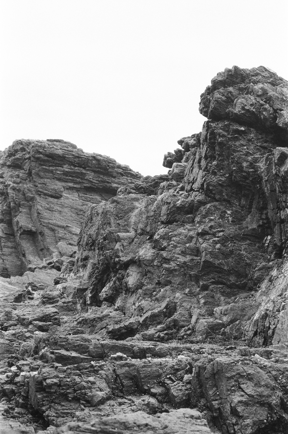
Home away from Home is a project exploring the relationship between place and identity. Using images from places the artist calls home: Poole. Coventry and Australia; the work takes on multiple forms to create new, fabricated landscapes.
Materials such as metal, acrylic and acetate are used to link to the artist’s experience of a fragmenting identity, which is often thought of as something fixed but is in fact malleable and constantly changing. Entering somewhere new leads us to seek the familiar in unfamiliar places, the pieces emblematising the constant search for where we truly feel we belong.
Artworks

Home away from Home
Home away from Home explores the shifted identity from moving between places constantly, wherein each location blends together and creates a new, fabricated landscape that cannot be deciphered from any of the others.
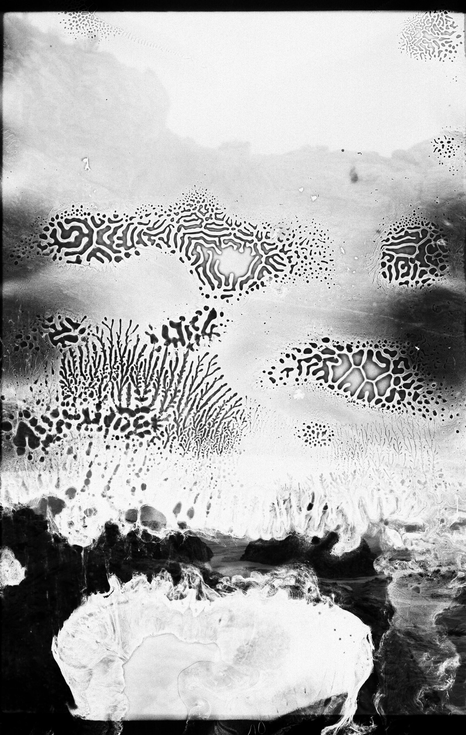
Dislocation
This work is made using damaged negatives layered over normal negatives to link to this idea of a fragmented identity and sense of self / belonging.
Curatorial Review
Home Away From Home is not only a photograph but also a memory that seems to be layered and thus creates a fractured composition which is not certain within its orientation. The rocky geography within the work at first viewing looks as though it’s natural- however becomes more and more increasingly unfamiliar the more you look at it. The surface textures are sharp and as though they confront you and as the composition is monochrome- it only leaves the shadows and highlights. The geography looks as though it belongs everywhere and nowhere at the same time.
DELIA ZORZOLIU
Delia Zorzoliu is a painter, writer, graphic designer and illustrator born on March 28, 1987, in Bucharest, Romania and based in Southampton, Great Britain.
Her passion for art in general is a family legacy, especially from her grandfather Traian Zorzoliu, a man of art and culture, who throughout his life encouraged her, and guided her in this direction.
Delia made her debut in painting in 2021, with the exhibition entitled “Inspiration and The Road”, which took place at the “Eugen Ionescu Cultural Centre”, from Slatina, Olt county, Romania, an exhibition that included both acrylic works on canvas and works in oil.
On occasion of this exhibition, the artist received a Diploma of Merit from the Romanian International Art Centre for her exhibition debut.
The artist received also a Diploma of Excellence from the Olt County Council, for the first exhibition of graphic art organized in the county, and the first exhibition of book illustrations for children.
In addition to painting, Delia is also the author of books for both children and adults, publishing: “The Brave Squirrel and the Enchanted Hazelnut Tree”, “Crystal Frog and Waterlily Fairy”, “Emerald Earrings. One only love. Two lives”.
Delia, illustrated some of her own books (The novel “Emerald Earrings. One only love. Two Lives” and the children’s book “The Crumb Monster” published in 2023, in the UK).
Artworks

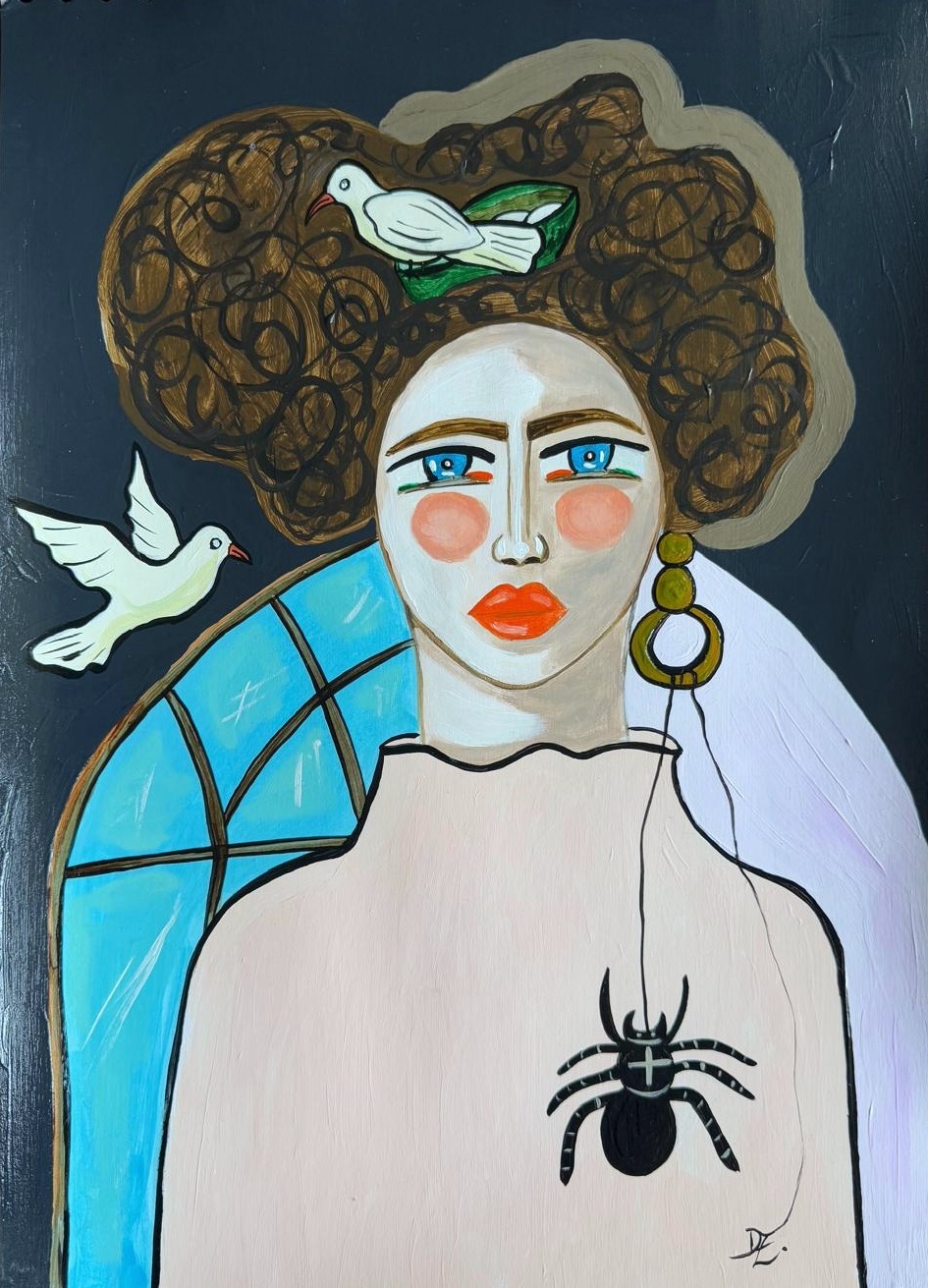
Sanctuary (2025)
Acrylics on heavyweight paper 280gsm
This artwork represents the idea of sanctuary, a refuge for humans and creatures, the stained glass in the background amplifying this idea. The human being can be a safe haven for creatures, a sign that birds have made a nest in the woman’s hair, and the spider clings to the woman’s earring. The artwork brings the idea of safety to the viewer’s attention.
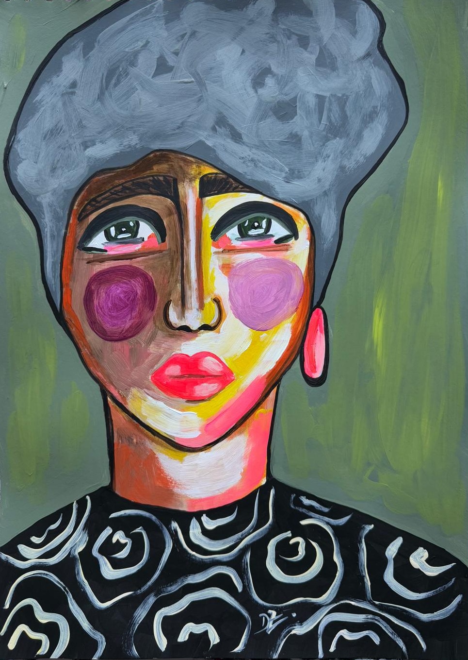
Portrait No. 58 (2025)
Acrylics on heavyweight paper 280gsm
This artwork represents feminine beauty in the artist’s vision. The vivid colours used give life to the work and attract the viewer’s eye. The woman looks nostalgically into the distance, a sign that she is a sensitive and gentle being.
Curatorial Review
Sanctuary (2025) is a portrait-style work that features a woman who is facing the viewer directly. Inside of the woman’s hair is a bird, its nest and the eggs within the nest. A spider dangles down with its web from the hooped earring while another bird flies towards her. The two birds seem to be doves which could be symbolising peace and purity. The stained glass behind the figure amplifies the religious symbolism, as one would expect this form of glass to be used in a church. Especially as the work utilises doves, which were the animals portrayed in the biblical story of Noah’s Ark to promise both peace and a new beginning.
Interview
What was the initial inspiration behind the work Sanctuary (2025), was there any specific experiences or thoughts that sparked the idea behind the work?
The idea of protection was at the heart of Sanctuary (2025), a chained protection that encompasses both the human spirit and that of living beings, so that the church would be a refuge for people, and man would be the protector of living beings.
How do you personally define the concept sanctuary as it can be interpreted in many ways. How does this definition implicate itself within your painting?
The concept of sanctuary, in my opinion, represents peace, balance, refuge, protection, and a place where you can retreat for inner discovery. This definition is fully reflected in the work Sanctuary (2025), which encompasses all the things mentioned above.
You mention that your work often explores theme of humanity’s connection with nature; what drew you to this theme originally and how does Sanctuary, in more depth and concept, expand on it?
The theme of humanity’s connection with nature initially attracted me to Neolithic symbolism, especially the Tree of Life, which has a profound meaning in this regard. Sanctuary is essentially a connection between man and nature and spirituality. The bird’s nest in the woman’s hair suggests nature’s sanctuary; the church stained glass symbolises spiritual sanctuary. The combination of these elements suggests that sanctuary is not just a place but a state of being—a fusion of spiritual, natural, and personal worlds
The stained-glass window in the background adds a slight sense of divine refuge to the work and structure- can you elaborate on the significance of the stained glass window in the artwork?
The stained glass in my painting is a powerful symbol of divine refuge and transformation. It is a sacred element through which light penetrates, banishing darkness. It is not just a decorative element, it amplifies the concept of sanctuary both through its physical presence and its spiritual significance.
Can you take us through the process of creating Sanctuary; what was the original idea and concept and did it change as you painted and worked on the painting? How did the work evolve as you painted it?
The creation of Sanctuary initially began with a pencil sketch on paper, establishing the composition and symbolism before being brought to life with acrylic paints. As the painting evolved, elements such as the stained glass, bird’s nest and spider took on a deeper meaning, balancing structure and nature to explore the idea of refuge from both a spiritual and earthly perspective.
Is there any personal experience or story behind the work Portrait No.58 (2025)?
Portrait No. 58 (2025) captures emotion and energy through vivid colours, symbolising transformation and identity. The interplay between light and colour reflects a vibrant state of mind, such as enthusiasm.
The artwork represents feminine beauty in your vision- how would you define what beauty is and how does the portrait portray this idea of feminine beauty?
Beauty, in my view, is a combination of expression, energy and individuality, going beyond physical characteristics to capture the essence of a person. Portrait No. 58 (2025) depicts feminine beauty through its vivid colours emphasising emotion, power and transformation rather than conventional ideals. The interplay of colours suggests an inner radiance.
Are there any emotions that you want viewers to experience when they look at the portrait? Are there any thoughts and reactions you are looking for from the viewer?
I hope that Portrait No. 58 (2025) will create in the viewer’s eyes emotions of curiosity and that they will feel the energy and complexity of feminine beauty. The vivid colours and light invite personal interpretation, provoking thoughts about transformation and the emotions that shape self-expression.
EMILY CARNEY
Based in Barnsley, South Yorkshire, I work with a variety of different mediums and particularly enjoy incorporating recycled materials into my artwork, as this both promotes renew-ability and I enjoy the challenge of taking an object that may have been otherwise discarded and essentially turning it into something else. Much of my artwork is inspired by films, books and general things that I have found interesting and documented in my day-to-day life. I enjoy experimenting with a variety of colours and textures, as I find it fascinating how the entire mood of a piece can change just by altering a few tones here and there!
Artworks

In My Happy Place (2025)
Acrylic, recycled comic book pages and buttons on canvas
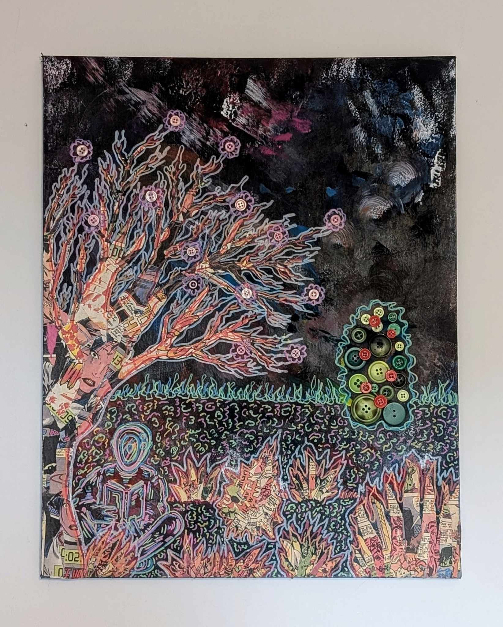
In My Happy Place is a mixed-media piece that I recently completed as a bit of an experiment. Upon having a clear out my loft I came across some of my old canvases bearing semi-completed paintings, which I decided to re-use and fully repainted using a variety of colours and sponges. I had a number damaged comic books in my possession at the same time and decided to use the pages from some of these books to create a collage of a tree and bushes on top of the painted canvas, adding the reading figure under the tree as I thought it would be fun to try and create a visualisation of the escapism an avid reader may feel when enjoying a good story. Adding the flowers and tree made out of buttons was another aspect of the piece that I chose to add in to exemplify this feeling of escapism, as I really enjoyed experimenting with adding a variety of different textures and colours to this piece.
Blue Hotel (2025)
Acrylic on Canvas
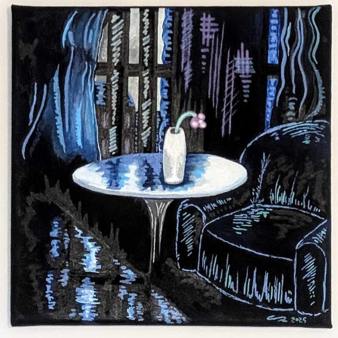
This painting was inspired by a photo I snapped early one morning during a stay at a hotel in Tynemouth a few years ago. I re-discovered the photo earlier this year when clearing up some space on my drive, finding it to be quite striking I decided to use it as inspiration for this piece. I wanted to centre the painting around the varying blue tones to give it a melancholy feel, along with combining aspects of both the comic book style art of which much of my work draws inspiration from and touches of impressionism. The wilted flower on the table was included to further emphasise the desolate tone of the piece, helping to fully encompass the title “Blue Hotel”.
Curatorial Review
In My Happy Place (2025) has salvaged buttons and comic book pages which are connected through the usage of acrylic paint. The black background allows these elements to pop out impressively – especially with the acrylics as the lines and marks are extremely vibrant. The foliage and the tree within the work are composed of both the pages and, in the tree: buttons, give these elements a more organic feel as the pages flow and move.
Interview
In My Happy Place (2025) combines painting, collage and found objects- what brought you to combine all these elements together and what initially inspired you to create the piece?
This piece sort of came together by accident, I’d found an old, partially finished painting I’d started over 15 years ago that was of pretty shoddy quality, so I painted over most of it with a mixture of colours and some sponges, then decided to have a bit of fun making a collage of sorts from some old damaged comic books I had lying around. I’m an avid reader myself and I often think of books, comics and graphic novels as being a bit of a “happy place” so I really wanted to try and convey this in the piece.
During the creative process of the work; how did the concept and idea evolve throughout its process?
The whole process was just one big experiment really, when I began the piece I knew I wanted to involve a comic book-collage of sorts but it was only when I started putting the pieces down that I formed them into a tree shape and decided to add the figure underneath. I purposely wanted to make the figure under the tree look unidentifiable, androgynous and not realistic as then it could basically represent anyone who finds comfort in reading! The buttons were a completely random addition I made towards finishing the piece, I felt like it needed something a bit more and with the buttons all being such vibrant colours I thought they could be fun to experiment with!
How did the clearing of your loft evolve the idea of the work? Was there any other directions you were planning with this work or did you have an initial concept that you stayed to.
Well my loft was packed to the brim with all sorts of old bits and bobs so I suppose in a way that may have influenced a sense of nostalgia I wanted to capture in the piece. I did consider covering the whole of the canvas in old comic book clippings and painting on top of that, but in the end I decided to save this idea for a future piece on a smaller canvas.
Looking back at In My Happy Place; what aspects of the work are you most proud of and why?
I really like the vibe of the piece that portrays (to me at least) that engaging in activity such as reading can give you a sense of escapism and a break from the malaise of reality, which in this day and age is something I think we all certainly need. I recently watched Jane Schoenbrun’s film I Saw The TV Glow, which I thought did a wonderful job of portraying entertainment as escapism in many different contexts as well as showing how our relationship with nostalgia in regards to certain media can change over the course of our lives. It’s an aesthetically beautiful film as well and it certainly influenced the stylistic choices I made creating “In My Happy Place” (I was even listening to the film’s soundtrack during much of the piece’s creation!)
Blue Hotel (2025) was inspired by a photograph that you took during a stay in Tynemouth, what was it about the photograph that stood out to you and made you want to transform it into a painting?
The most notable aspect of the photo was certainly the blue colour tones captured within it and the sense of stillness that it evoked. Truth be told it was just a random photo I happened to snap early one morning when I was messing about with a new camera I’d recently acquired, but when looking back over the photo I really liked the contrast between it’s dark elements and the small amounts of light seeping in through the windows, which I thought gave the scene a atmospheric quality that might be fun to try and turn into a painting.
The scene within the painting creates an intense atmosphere of mood due to the blue tones and dramatic way the lighting is portrayed. What emotions or ideas where you hoping that this piece conveys through the colour palette?
I think the painting could be interpreted in a few different ways, obviously the use of a variety of blue tones and even the piece’s title could relate back to “having the blues” and be considered quite solemn and sad, especially with the wilted flower at it’s centre. Despite this however I do think there is some tranquillity in there, which as someone who is a habitual early riser I do believe that there is a sense of calm in the early hours of the morning, before the rest of the world wakes up, that you don’t get at any other time of day, which is another element I was keen to try and work into the piece.
The absence of any human figure turns to space into a much more intimate and lonely scene. Was this intentional and do you think the scene would have a different feeling or meaning if there were someone present?
I think having someone present in the scene would be quite interesting, although whether this would change the feeling of loneliness in the piece itself would really depend on how the figure was portrayed. I think the piece is quite open-ended in this sense, as the wilted flower suggests that the hotel room furnishings haven’t been changed in a while, but is this because someone is staying there long-term? Has someone locked themselves in there room and is refusing to let anyone in? Is the hotel abandoned? I think paintings like this that allow the viewer to make their own conclusions on can be quite good fun not only to paint, but also for people to analyse and think about.
Given that this piece came from rediscovering an old photograph; do you oftentimes work from personal archives or was this a new process for you?
I often trawl through old photographs that I’ve saved, particularly on my Google drive, though a high percentage of these photos are just of my cats doing various cat-related activities, sleeping, eating, occasionally wearing hats or bow ties. In recent years however I have been making a point to snap quick photos of anything that could be remotely inspiring for art pieces down the line, particularly in terms of still life or landscapes. Sometimes I might not even look at these photos for months after, but I think it can be incredibly handy to have a cache of reference images to fall back on just in case a creative block strikes and you find yourself struggling to find immediate inspiration.
NIITA E.
My creative journey is influenced by my nomadic upbringing —a fusion of various cultures, traditions, and socio-political landscapes. These experiences have become the foundation of my creative practice, influencing how I see and engage with the world. I work across multiple disciplines, including music, photography, fashion, digital collage, and writing. In my visual and written work, I delve into themes of narrative, decolonisation, and unconventional forms of expression. I continue to evolve, explore and experiment, using my art to challenge norms and weave stories together that create new frames of reference, express beauty, and celebrate the complexity of identity and belonging.
Artworks
The Object (2024)
Collage
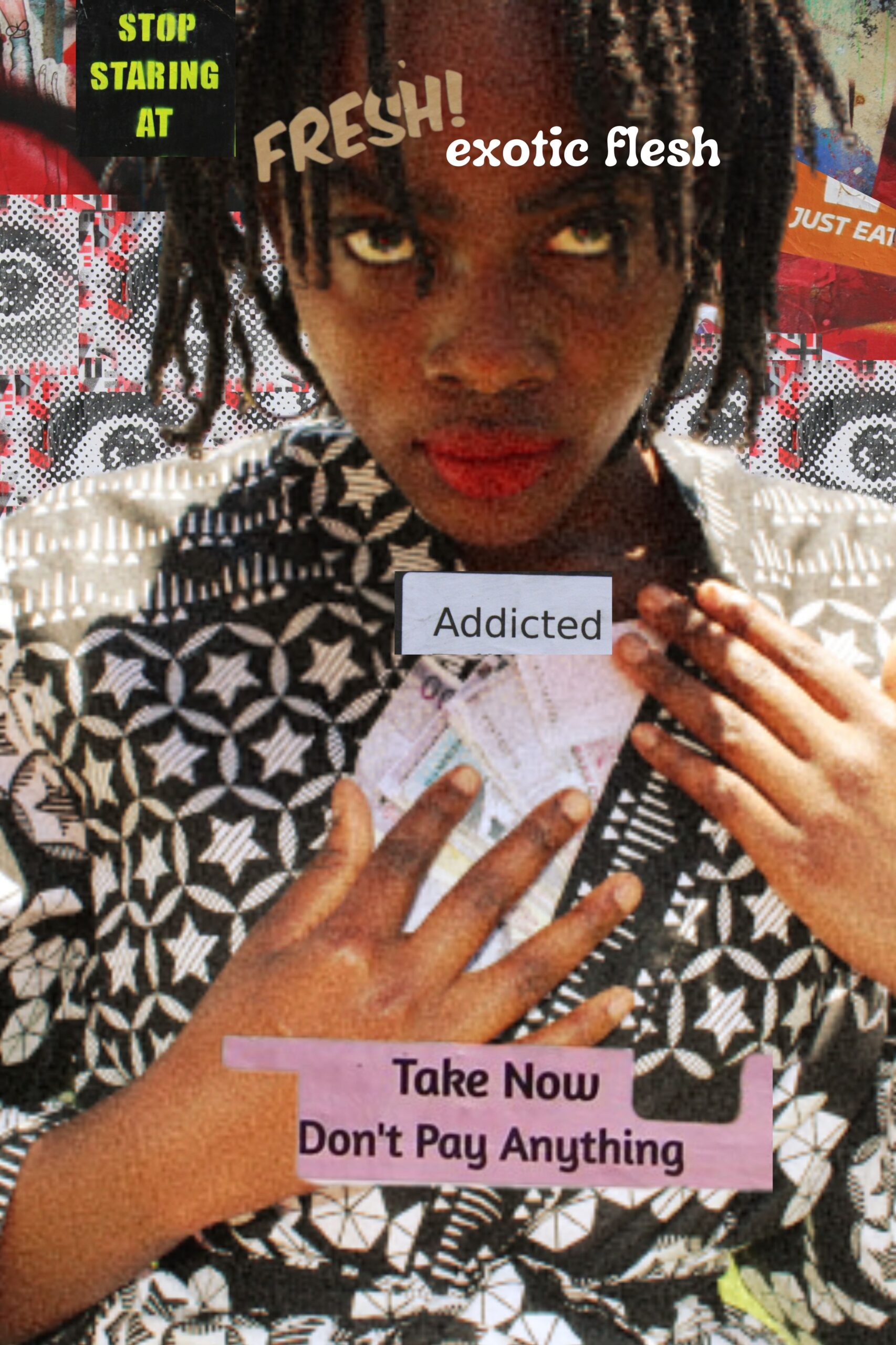
A fascination with the “exotic” fuels a cycle of objectification and consumption. Desire is gratified through financial exchange, reducing the unfamiliar to a commodity. The boundaries between victim and predator blur, shifting roles in an unsettling power dynamic. Perception dictates control, as the hunted becomes the hunter. This collage explores the tension between desire, exploitation, and identity.
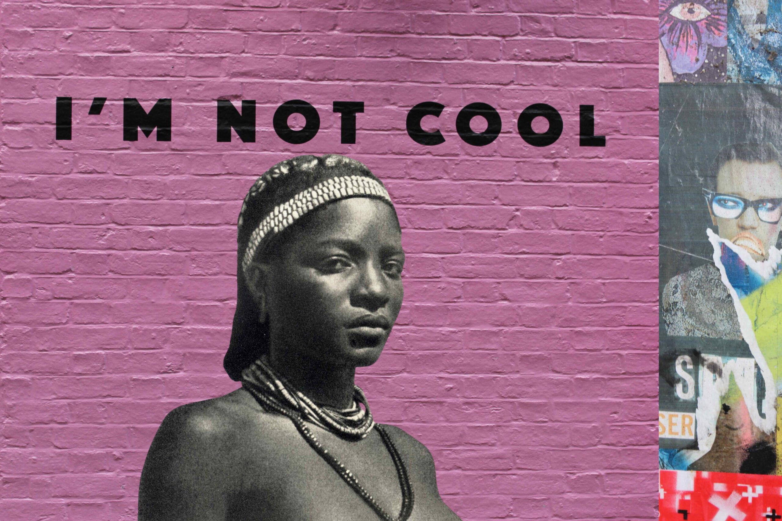
I’m not cool (2023)
Collage
This work delves into concepts of “exoticism,” “perceived coolness,” and “cultural misconceptions,” examining the silent burdens they carry.

Without the love (2023)
Collage
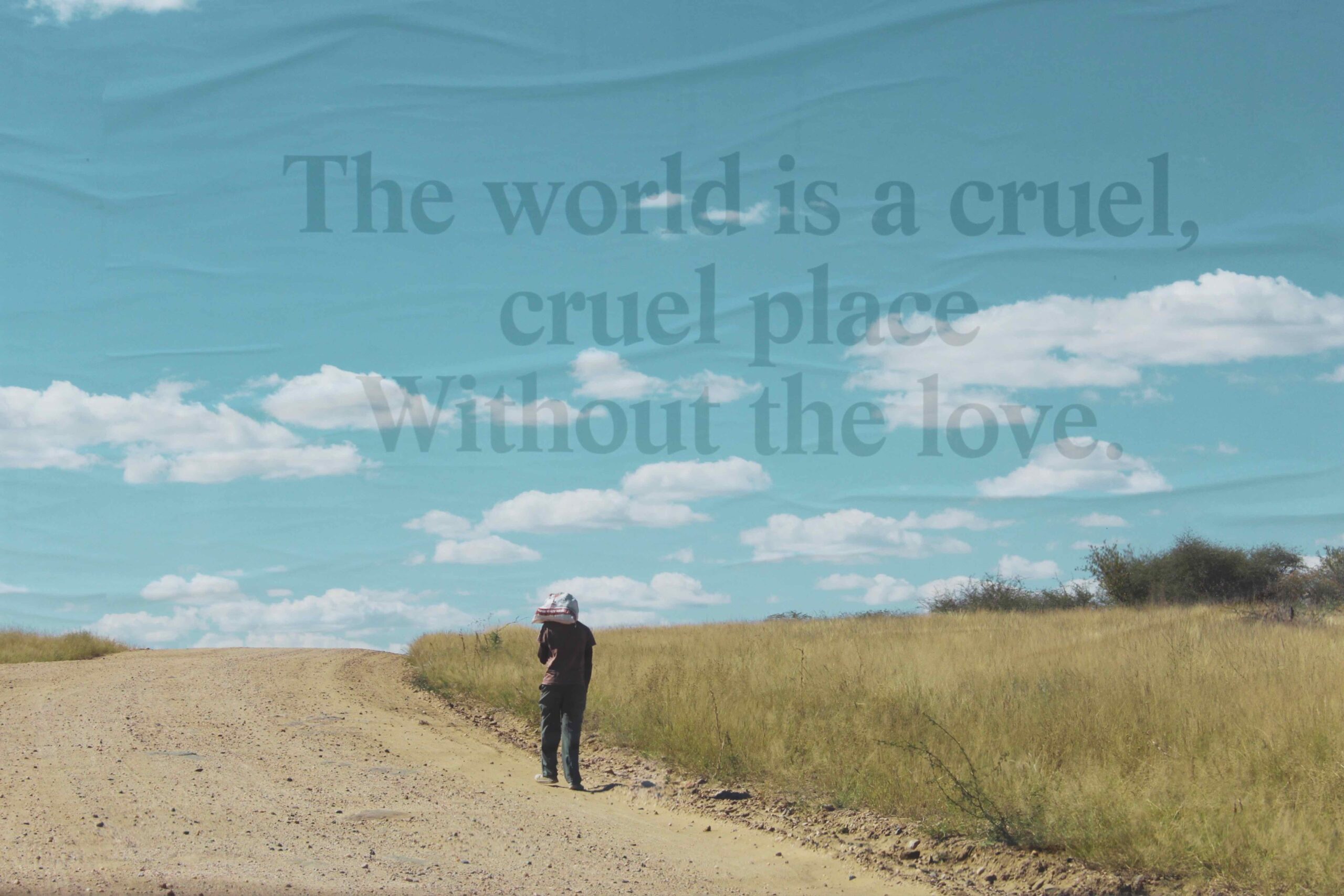
This work contrasts and romanticises the serene emptiness (and loneliness) of the Namibian landscape with the pervasive loneliness that emerges amidst the bustling overpopulation of a metropolis like London.
Curatorial Review
Without the Love (2023) utilises a digitised collage which showcases the endlessness (emptiness, loneliness and silence) of the Namibian landscape while contrasting and comparing it to the more metropolitan setting of London. Within the lower centre of the work is a figure that seems to be navigating the solitary environment of the landscape which is barren, dusty and yet still full of life (though mostly flora). Beyond the figure is a road which seems to go into the horizon, thus, suggesting the endless journey through the landscape that continues and continues both physically and psychologically.
Interview
Your work includes multiple forms of media: music, photography, fashion, digital collage and writing. How do each of these mediums inform one another within your artistic and creative process?
Each medium I work with acts as a different filter through which I process and express ideas, but they’re all interconnected within my creative practice and circle each other. Music often expresses that which cannot be spoken but can be felt with tone and atmosphere. Photography and digital collage allow me to explore memory, layering, and place, both literally and metaphorically, while fashion adds another dimension of storytelling through texture, silhouette, and cultural reference. Writing allows me to play with words, make sense of the abstract, distil intention, and articulate what’s often felt before it’s fully understood. Each form speaks to the other, sometimes subtly, sometimes glaringly, and together they create a fuller picture, allowing me to move fluidly between the seen, the felt, and the imagined.
You describe in your statement that your upbringing was nomadic- shaped by different cultures and socio-political landscapes; how has this constant movement influenced your practice?
The constant movement throughout my upbringing has given me a unique frame of reference. I am able to see patterns/correlations between seemingly unconnected things as well as a heightened sensitivity as to how things are communicated and observed by different cultures. It’s made me more attuned to nuance and deeply aware of how everything is connected. That sense of interrelation sits at the core of my practice—whether I’m working with sound, image, text, or anything else.
In your opinion- what are some of the biggest misconceptions about cultural identity that you seek to challenge throughout your work?
“Challenge” might not be the word I’d use to describe what I do. I’m not trying to provoke a specific reaction, correction or “repentance”. I’m simply expressing my point of reference, pointing toward a different frame that doesn’t require validation.
The concept of “cultural identity” is something we lean into in today’s world, often because there’s been such fragmentation and projection placed onto identity itself. In many ways, my creative practice is about joyfully freeing myself from what has been imposed through socialisation. It’s a process of returning to a space that isn’t dictated by external expectations or predefined labels.
I’m not here to correct anything, nor am I invested in how I’m perceived within the context of my “cultural identity.” If there’s a question some of my work holds, it’s whether we can resist being distracted by the identities others place upon us. Can we move without the need for approval or validation? That’s the quiet “rebellion” my work leans into.
How do you hope the viewer interacts with your work? Are there any particular reactions, emotions or thoughts you aim to provoke with your work?
I hope the viewer engages with my work with a sense of openness—without rushing to label, define, or immediately understand. So much of how we interact with the world is about referencing, identifying, and categorising each other. I’m more interested in creating a pause, a moment of space before that reflex kicks in.
To me, we’re all filters, mirrors of one another. In that sense, I see myself as just a frame pointing to another frame – the viewer. The work becomes a shared moment of reflection rather than a fixed message.
If anything, I want to leave space… I’m not interested in prescribing meaning or defending a singular interpretation. I’d rather the viewer take from the work what they need—whether that’s clarity, discomfort, beauty, or simply a moment of stillness.
You described your practice as of one with continuous evolution; how has your approach to art changed over time?
I’m relatively new to this broader form of expression. For a long time, music was my main public outlet, and I didn’t fully explore anything beyond that. But over time, I began to acknowledge and engage with my other creative instincts, and that shift has opened something up in me. There’s a sense of playful freedom that’s emerged, almost like giving myself permission to explore without needing to define or control the outcome.
Interestingly, I now feel more detached from the idea of “finished work” or fixed identity in my work, which has created space for curiosity to lead. This openness has become a vital part of my process and my approach has become more intuitive, layered, and conceptually grounded over time. I no longer see music, visual work, or writing as separate practices, but as parts of a larger ecosystem that evolve together. There’s more trust in the unknown, openness to process, and the uncomfortable.
For Without the Love (2023); what was it that drew you to contrast the two geographies – Namibia and London?
I was drawn to the contrast between Namibia and London because of the differences in scale, pace, and human connection. Being of Namibian heritage, I’ve always been able to observe and compare the two in a personal way. Namibia is geographically expansive with a small population that can easily fit into a few London boroughs. You can drive for miles on the highway, without encountering another car, and there’s a spaciousness to everything.
London, on the other hand, is dense, layered, and constantly in motion with hardly an inch that isn’t covered with human activity. Yet despite this, you could remain anonymous if you choose to or struggle to make meaningful human connections if you don’t make the effort. That kind of anonymity is much harder to come by in Namibia, as even though it has such a small population and is sparsely populated, the level of curiosity for another human being is culturally more intimate. I was compelled by that contrast: the tension between visibility and invisibility, connection and distance, presence and absence.
To the work it seems that loneliness is central to it- do you see loneliness as inherent to humanity or is it something that is shaped by either place or society?
It depends on how one defines loneliness. If we’re talking about social isolation, then yes, place and society can absolutely shape that experience. One can be physically isolated due to geography, or feel emotionally and socially disconnected even in densely populated environments.
But loneliness, to me, also exists on a more internal level, a feeling of being cut off from something or someone, or even from a deeper part of oneself. In that sense, it becomes a more existential experience, one that feels inherent to being human. We all carry moments of disconnection, longing, or the sense of being unseen or unheard, regardless of where we are.
In the collage, I wasn’t trying to define loneliness, but to sit with it, explore its layers, its contradictions, and how it shifts depending on space, context, or emotional landscape. Whether shaped by place, culture, or something more personal, it’s a state I believe many of us move in and out of throughout life.
In The Object (2024) – it questions who is allowed to want and who is reduced to being wanted. How do you think society enforces or teaches us those roles and how do we challenge this?
Society subtly conditions us to adopt these roles through media, advertising, history, and everyday language. From an early age, we’re conditioned to associate power with the one who desires, and objecthood with the one who is desired. These dynamics often intersect with race, gender, class, and culture, reinforcing ideas about who is seen as active or passive, subject or object, consumer or consumed.
Desire becomes political when it’s filtered through systems that commodify difference where “the exotic” is something to be acquired, possessed, or tamed. In that process, people and cultures are flattened into symbols, stripped of agency and complexity. In turn people begin to perform these roles, sometimes unconsciously, often as a means of survival or belonging within dominant structures.
I’m not interested in “challenging” these constructs in the sense of seeking correction or validation from those who uphold them. That would imply a desire for recognition within a system I’m not trying to be legitimised by. I present an observation and in reframing, creating space where roles shift, dissolve, or become unclear.
Basically, it’s about presenting a different gaze altogether that doesn’t depend on the approval of the dominant narrative, but instead reflects back a multiplicity of truths, perspectives, and ways of being that exist beyond it.
JOAS NEBE
Joas Nebe is an artist, curator, and academic with a background in psychology, media studies, literature, and theatre from the University of Hamburg. He also trained in traditional art techniques at a private art school. After graduating, Nebe lectured on film analysis at Hamburg University and analyzed advertising campaigns for Reemtsma.
Since 2000, he has worked as an artist and freelance curator, with projects shown in Berlin, Milan, and Tehran. Notable exhibitions include “Climate Change Cartoons” at the 2011 UN Climate Change Conference in Durban and “Machine Fair” at Moscow’s Museum of Modern Art in 2012. His films have been featured in international festivals such as Les Instants Video in Cairo, Videoformes Festival, Sustain Our Africa, Madatac in Madrid, and Papy Gyros Nights in Hong Kong. Nebe’s work has been shown at the Biblioteca Alexandrina, ART_TECTURE, and SHIFT:ibpcpa’s “In 24hours: Future Visions.” He has received numerous awards, stipends, and residencies from various countries, contributing to his diverse artistic perspective and body of work.
Artworks
Black Widow, still 4 (2023)
video, drawing, digital post production
Joas Nebe Black Widow (4k, colour, 4 channel video, 1m38s, 2024) Black is the beginning of all life. Black is the universe, at least to our naked eye. From black, all life emerges, unless it later emerges from water. Black and white are the colours from which all other colours arise (in chromatic colour theory), especially from white when considering the mixing of light. The Black Widow is therefore something like the opposite, the absolute darkness, for which Anish Kapoor has filed a patent.
Curatorial Review
Black Widow (2023) reflects on form and perception through the meditative engagement with light and dark. If black, devoid of light, is the beginning of all life and the foundation of the universe then the work invokes this state. The movements and textures of the work (which seem to form mandala-like shapes) along with the sounds create a transitory effect that takes us through the imagery as though something materialises and then suddenly vanishes. Yet- they all align to the sound of a heartbeat which could be conceptualising the universe as a living thing.
Interview
What prompted you to transition from academia to full-time art and curatorial work?
Art has been of immense importance to me since my first visit to museums with my parents at the age of four. Back then, after visiting the Rijksmuseum in Amsterdam, my art reception first transitioned into an active interpretation of what I had seen when I participated in the museum’s children’s program, ‘Schilderen voor Kinderen.’ This connection, or the need to interpret what has been seen and experienced through a creative process, has stayed with me until today.
As for working as an artist-curator, just like writing about art, it is an integral part of my daily artistic practice. Moreover, the work as a curator also involves a similar task: finding answers to specific aesthetic, societal, and individual questions.
You often work as both an artist and curator- how does curating others’ works impact your own creative practice?
As a curator, I enjoy working with artists who are willing to engage in an approach that I have set out beforehand and create new works on the theme of the exhibition. It’s a give-and-take, a mutual inspiration. When an artist participating in one of my exhibition projects agrees to my approach, which essentially consists of establishing a theme and setting broad rules for the work, which apply equally to all participating artists, they open themselves to my suggestions. On the other hand, I learn a great deal about what the theme and approach of each individual artist tell me about my starting point.
What is your process in blending both traditional drawing techniques with digital post-production for the work Black Widow (2023)?
The title of this video work consists of two parts that point to different things. On the one hand, “Black” stands for the beginning or end of a creative process. On the other hand, “Widow” refers to the solitude that comes with the experience of creativity.
In the “Black Widow” video project, I use the old-fashioned method of hand drawing. Graphite drawings on paper form the starting point of the video work. While drawing, I photograph the changes on the paper at very short intervals. I then edit the time-lapse sequence on the computer using various digital filters, such as the kaleidoscope filter. This results in a variety of different digital interpretations of the original material. So, I essentially explore all the possibilities that lie in the original material, the graphite drawing, and play them out.
You made a reference to Anish Kapoor’s patent of the Vantablack colour. What are your thoughts on the concept of ‘owning’ a colour- especially one that could be considered universal?
Applying for a patent on a colour—Kapoor is not the first and will not be the last to do so. Think of Yves Klein Blue—it is problematic. It resembles the approach of some large corporations that use entire research departments to sequence the genetic material of various plant or animal species and apply for patents in the hope that someday a profitable remedy, a new adhesive, etc., can be developed from that genetic material. The possibility of securing common goods or at least parts of them legally is problematic for society. The same applies to patents on individual shades of colour.
Why did you choose a four-channel video format for the work, how should the viewer engage with this multiplicity of the frames?
The four-channel video format allows for emphasising what I would call the “cabinet of wonders,” which is central to my work. In the 16th and 17th centuries, wealthy merchants or aristocrats tried to bring together particularly amazing and unknown examples of a species, a type of rock, but also rare handcrafted art pieces, etc., as representations of the world. The “cabinet of wonders” is thus a place where the various expressions of nature or evolution come together. Since my work “Black Widow” revolves around the diversity of possibilities in the creative process, the four-channel format seemed to be the most appropriate form of expression.
What kind of experience, reflections or reactions do you hope that viewers of your work will come away with?
I hope to encourage the viewer to become aware of the ultimately endless diversity of human creativity and to learn to appreciate this ability, which is so central to human existence.
Are there any upcoming projects or concepts you’re exploring? Where do you see your artistic practice in the next ten years?
At the moment, I am working with colour and scissors. I am working with pages from an encyclopedia, so to speak, an equivalent of the “cabinet of wonders” in the cognitive realm. I cut out shapes and figures from the encyclopedia pages and use ink colours to evoke a particular emotion in the viewer. By doing this and emphasising the narrative element—since all knowledge transfer works as a narrative—I reference the transience, the finiteness of human knowledge.
Since my central theme is language and thus the transmission of knowledge, in ten years, I will probably still be dealing with cabinets of wonders and encyclopedias. However, by then, perhaps with a technology that I create myself, which will far surpass AI.
JOHN MOLLOY
As a multi-media artist I use mostly oil paints. Although, I also use drawing as a strong influence on my artwork, combining the physical gestures of both mediums: observation of people, places and my dogs, bringing together an expressive, bold line and form in my paintings.
When using any media, I can feel the gesture and intuition that begins when observing and connecting with my subject, along with the internal process of creating the art work.
I love seeing the movement of form, the combination of natural form and gesture in the landscape, including the domestic and urban scenery around us. My experiences and presence within an environment of time past and present all create an out come of creative application.
Artworks

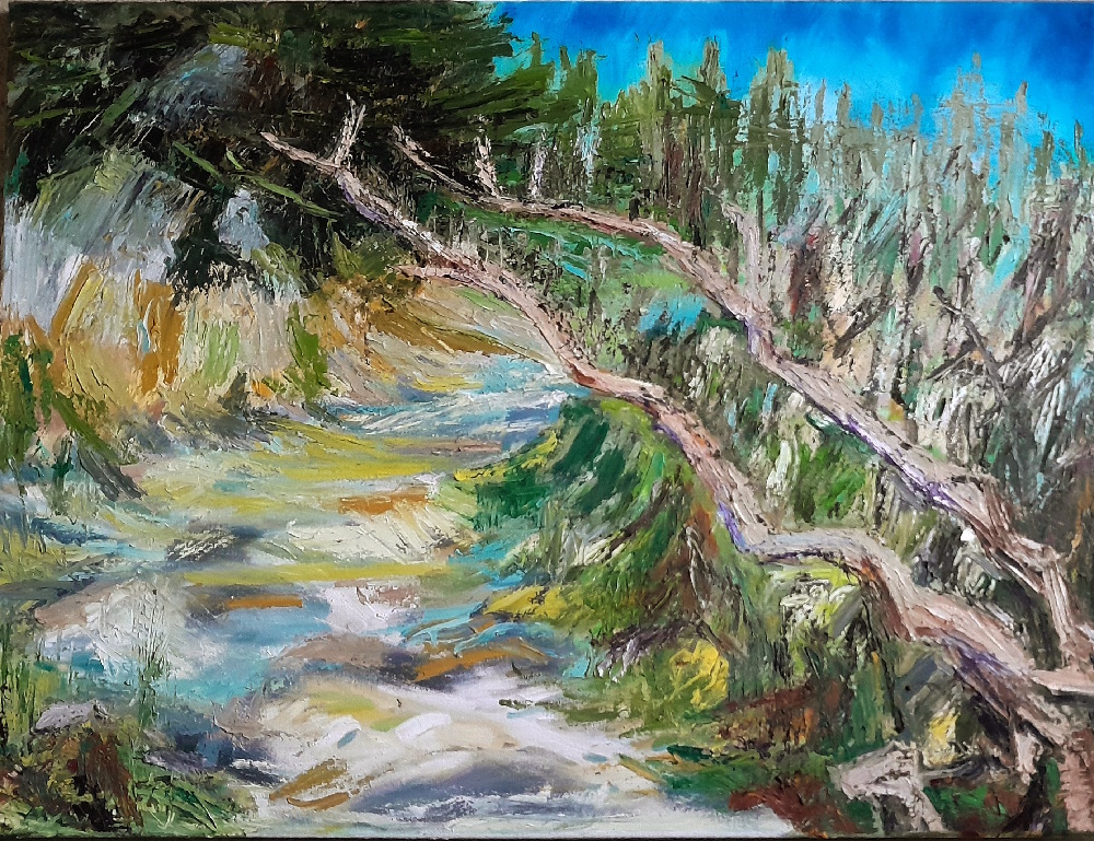
Forest path. (2024)
Oil on canvas
The composition is the imbalance of forward motion; in this forest environment everything is physically on the move. Seasonal progression and human presence combine continuously.
Curatorial Review
Forest Path (2024) is an oil painting that has successfully prevented and resisted being contained and is an explosion of movement and unsteadiness. The textures and details from all the brushstrokes create guides for the viewer to move from; however, these impasto strokes flow up and down and take us to one spot and then to another- without any grounding. We are brought throughout the entire canvas- yet there is a slight rest in the path until we go upwards towards the rest of the forest where it brings us back to the right side of the composition.
Interview
What does ‘movement of form’ mean to you and how do you capture this in your work? What is the process behind capturing this?
In my artwork, I aim to capture the transience of a landscape, the relationship and boundaries between human-made landscapes and that which is wild and self-autonomous. When I look at any environment, I see things are constantly in motion: the disruption of the ground around a plant as it grows, or tree roots exerting their force on a wall, re-forming the original and intended state. There is a presence and energy behind the surface of the world, and in any landscape a story is being told. My work communicates this through playing with the tension between boundaries, edges and horizons, using form, line and negative space to reveal the energy that is present in that landscape, and therefore the painting.
You mentioned an ‘internal process’ which creating; can share more about what is happening mentally or emotionally as you work?
I see the external landscape as a reflection of the internal landscape; when I am out walking I am observing both the inner and outer worlds and the tensions and relationships between the two. There is a surface layer of the world that we are all supposed to walk upon, consumers in a wasteful society. But ‘getting and spending we lay waste our powers,’ and the land reminds us that there are other cycles of energy and motion in the world, and other ways of being.
On ‘Forest Path (2024)’ you mention there is ‘seasonal progression and human presence’ in the forest. Are there any specific signs of this presence you intended to include- or is it perhaps more abstract and emotional?
The painting is of a place I walk most days, so I have witnessed the seasons cycle round and the subtleties of change within this, among the grander arc of the turning year. It is a place woven with both human and non-human presence, from logging and planting, which have both a linear presence on the landscape, to the wilder, meandering networks of scent trails and fox runs. It is the gesture of this movement and motion that I have tried to capture in my painting; the large willow branch breaking through the centre of the composition represents the momentum of both plant, human and animal life all traversing across each other’s path. The painting is a statement about this back-and-forth re-wilding cycle.
Can you take us through the creative process behind the artwork? How do you build the layers and textures on your paintings?
I often see a painting already completed in my mind’s eye when I am out walking in the landscape. A painting can come together over many sessions, and as I am building up the layers of paint, I am moving deeper into the layers of the story I am telling. I work quite heavily with the paint application, relying on strong line and gestural brush stokes until the painting reaches a point of completion. When I remove and re-apply areas of paint, the next layer or brushstroke gives rise to the next texture, and the narrative of the painting flows on.
What does the piece mean to you now that it has been finished? Has your relationship to it changed since completing it?
In a sense, nothing is ever finished because my paintings go on to inform the next piece. It is a continuing and evolving narrative.
Furthermore, what do you hope viewers will take away from your work? Is there any emotions, feelings or reactions that you are aiming viewers to have?
My hope would be that my painting continues to work on viewers long after they have moved out of the exhibition space; that they leave with a feeling to explore the layers of being and meaning that I explore within the painting, within their own worlds.
Are there any upcoming projects or concepts you’re exploring? Where do you see your artistic practice in the next ten years?
The themes I have explored within this painting, the presence of being within natural, urban and domestic landscapes, are continuing to work on me at a deeper level, and so I foresee myself continuing with this work for some time, continuing with painting but also moving out into drawing and sculptural work also. Experiencing the unknown of what comes next pushes me onward.
PRECIOUS OZEMOYA
My work explores the seen and the felt, where form dissolves, and concept takes shape. I am drawn to the idea that abstraction can transcend the limitations of representational art, allowing viewers to engage with the work in a deeply personal and intuitive way, one where meaning is not dictated but discovered. Each of the art pieces that I create is a journey, an expression of thought and feeling that is not confined by conventional form, but rather guided by colour, form, texture, and movement. I think abstraction speaks in a language beyond words, evoking memories, emotions, and sensations that may shift with time and perspective. My artistic practice spans multiple mediums, such as photography and digital art. By embracing creativity, I seek to capture concepts through my practice.
Artworks
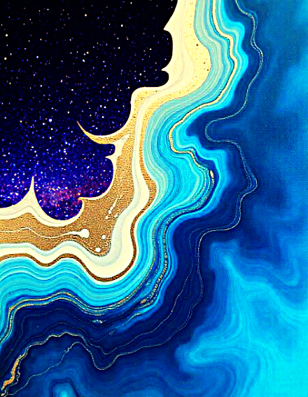
Cosmos (2025)
Digital Art
This abstract piece portrays a cross-section of the earth’s layers blending into the cosmos. The composition features fluid, wavy layers of deep blues, turquoise, and gold, mimicking the look of geological formations. The organic flow of colours transitions from vibrant oceanic tones to a rich, cosmic expanse of dark purples and starry speckles, evokes a sense of depth and infinity. The gold accents add a luxurious touch, enhancing the contrast between the terrestrial and celestial elements. The piece beautifully fuses natural and cosmic aesthetics, symbolising the connection between the earth and the universe. It is a visual metaphor for the depth of our planet’s beauty and its place in the vastness of space.

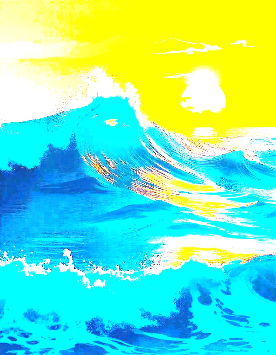
Luminous wave (2025)
Digital Art
This artwork presents a striking and surreal depiction of an ocean wave under a radiant sky. The vivid colour palette is highly stylised, with electric blues dominating the water, contrasted sharply against a yellow sky. The sun, glowing intensely, casts golden reflections on the cresting waves, enhancing the dynamic movement of the scene. The piece evokes a sense of energy and fluidity, capturing the power of the ocean while playing with extreme colour contrasts to create a dreamlike or abstract atmosphere. The high saturation and altered hues give it a pop-art aesthetic, making the viewer feel immersed in a world that is both natural and surreal.
Curatorial Review
Cosmos (2025) is a composition of rich colours that divide into space and within this Earth. At first glance, it seems to be a beach set against the sea with an extremely clear night sky on the top left. However, the scene – on closer observation – takes a turn towards memory instead. Every layer is textured and pulses against the previous layer; they ripple as though they are continuously flowing with structure yet also spontaneity – the gold connects the Earth to the cosmos merging them into a dream or a memory. As this represents the planet and the cosmos together; the flowing could be the constant transformation that both space and the Earth undergo as part of their lives.
KANISHKA GANDHI
I am a contemporary artist exploring the delicate balance between nature’s beauty and its fragility. Inspired by organic patterns, vibrant palettes, and environmental themes, my work blends abstraction and naturalism to capture the essence of life, growth, and renewal. Through collage, painting, and layered textures, I aim to create thought-provoking pieces that evoke both wonder and urgency.
My work is a celebration of nature’s resilience but also a reminder of its vulnerability. The colours, forms, and textures I use reflect the intricate relationship between time and the environment—tree rings symbolising history, fragmented landscapes mirroring ecological loss, and blooming flowers representing fleeting beauty. I want my art to inspire viewers to pause, reflect, and reconnect with the natural world. By highlighting both its strength and fragility, I hope to spark a deeper awareness of our role in preserving the world around us before it’s too late.
Artworks
WHISPERING GROWTH (2024)
Collage
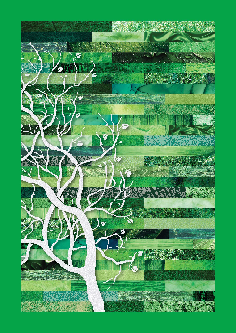
A stark white tree stands against fragmented layers of green, evoking a sense of loss and fragility. The fractured hues, once symbols of lush life, now resemble fading memories of a world in decline. The skeletal branches contrast sharply with the disjointed background, mirroring the tension between resilience and decay. Inspired by the ongoing climate crisis, this piece reflects the struggle of nature against environmental degradation. The collage medium and abstract layering create a sense of imbalance, emphasising the delicate and uncertain state of the natural world. Through contrasting textures and disrupted forms, the artwork serves as both a visual warning and a call to reflection—urging viewers to confront the fading beauty of nature before it disappears.

BOTANICAL EMBRACE (2024)
Printmaking (Lithography)
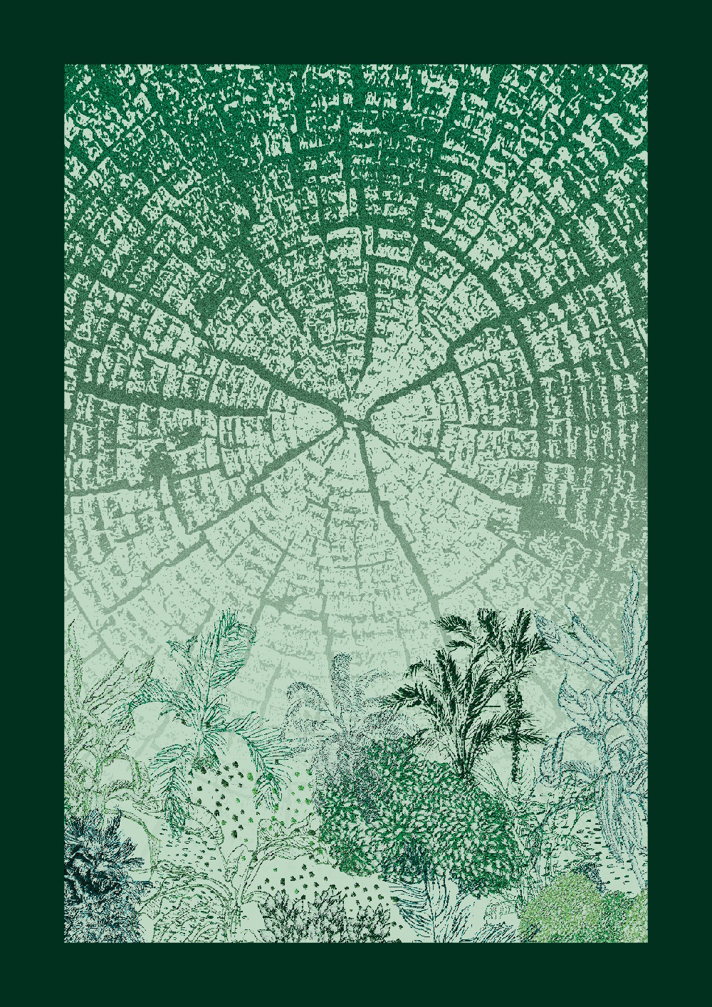
A serene composition that captures the quiet wisdom of nature, centred around a detailed tree ring—an enduring symbol of time, growth, and memory. Layers of green, from soft mint to vibrant chartreuse, blend harmoniously, evoking a sense of renewal and balance. The plants and leaves at the base reach upward, embodying resilience and the ever-present cycle of life. Inspired by the intricate relationship between time and nature, this piece reflects the stories held within each ring and the quiet strength of growth. The lithographic technique enhances fine textures, while the minimalist composition keeps the focus on the organic forms. A tribute to nature’s timeless ability to heal, inspire, and endure.
Curatorial Review
Botanical Embrace (2024) is a meditative composition yet also has a sense of tension that is rising. The lower section includes numerous finely detailed line illustrations of flora which are delicate and seem to suggest that this garden grows from the memory of the tree itself. Furthermore, the tree ring itself not only registers history but also creates the future as the garden suggests. The rings within the tree record the climate shifts, droughts, growth spurts and the more silent seasons.
Interview
What is it that first inspired you towards the collage medium? And how does it compare for you to other mediums?
For CanVerse, a collection of poems and artworks, I wanted each colour to have its own distinct visual language. I experimented with various printing methods and paper-based techniques for each colour which allowed me to create something tangible. The process involved practices like risography, stitching on paper, screen printing, origami, lithography and collage.
Collage, in particular, felt like the perfect fit for green. The inspiration came from the wooden planks in my London studio—their natural textures sparked the idea of layering hues, tones, and materials to create a rich composition
What drew me to collage is its ability to mirror nature’s complexity—layered, fragmented, and constantly shifting. In the artwork, you can see the juxtaposition of smooth and rough textures reflects the tension between growth and decay, stability and fragility. It allows me to create depth not just visually, but emotionally—pulling the viewer in while also unsettling them, much like the environmental realities we face today.
On the subject of collage; what was the creative process behind your work Whispering Growth (2024)? Can you tell us about it from the start to finish and did your concept stay the same or change slightly during the creation of the work?
For Whispering Growth, my initial idea was to create a bouquet of real pressed flowers and leaves.But as I considered the practical aspects, it became clear that I needed a different approach. That’s when I turned to collage
The best part of creating this artwork was all the time I spent walking around London, observing and collecting references from different greenscapes—parks, pollarded trees and even the cracks in pavements where nature finds its way through. I also gathered clippings from magazines, selecting textures and shades that captured the essence of organic, layered elements. The process began with creating these small patches.
Structuring the composition felt like assembling a puzzle, and probably why the process became almost meditative. Layering each piece brought back memories of childhood craft sessions where cutting and pasting felt like pure creative joy. While the core concept stayed the same, the textures and details began to evolve naturally as I built the piece. It became less about replicating nature and more about capturing its quiet persistence—how it grows, adapts, and reshapes itself over time.
Furthermore, how do you hope that viewers will feel when they interact with your work? What kind of emotional, or intellectual, response are you looking for?
I want viewers to feel a mix of wonder, but at the same time, a sense of concern. I hope that they are drawn in by the beauty of the work, yet are aware of the deeper message beneath it. Nature tells its story in quiet, powerful ways, and I hope my work encourages people to stop and listen to what it has to say.
Personally, if my artwork sparks even a moment of reflection—if someone pauses to observe, to reconsider their relationship with the natural world—that would be incredibly rewarding. The fading textures and layered fragments you see in the artwork are meant to feel slightly unsettling, a reminder of nature’s fragile balance. But at the same time, there’s resilience in them too. I hope people walk away with a renewed appreciation for the tiny, beautiful and powerful but often overlooked details of nature, along with an awareness of the need to protect them.
What was the first thing that sparked your connection to nature and its themes within your artistic practice?
I grew up in Mumbai, which means moments of stillness were quite rare for me. Which is why nature always felt distant—something I glimpsed in fragments between concrete and traffic. The few times I did find small patches of greenery or a sky free from city lights, it felt like breathing in something I hadn’t even realised I was missing all along. Those moments stayed with me.
But nowadays, we live in a digitally dominant space—a space where, in my opinion, we’re all trapped. Everywhere I look, people are constantly scrolling, endlessly consuming in one way or another. We rarely take a moment to simply exist in the world around us. As an emerging artist in this generation, I want my work to offer both a sense of calmness to the viewer and a wake-up call to remind us of what’s slipping away. It’s not just about admiring nature; it’s about recognising our fading connection to it.
In what way does Whispering Growth reflect your personal relationship to nature and its changing state?
I think my relationship with nature has evolved from admiration to concern, and Whispering Growth reflects that. I wanted my work to serve as a nudge for me to slow down, look closer, and truly understand my responsibility toward what remains.
The stark white branches against fragmented greens symbolise a landscape that is disappearing—once thriving and everywhere, now barely visible in it’s true form. The fractured textures feel like distant memories, and the bare tree stands as a quiet witness to loss. For me, this piece is a warning. It holds the weight of its vulnerability, urging viewers to recognise and appreciate what remains now, and hopefully rebuild it together before it truly disappears.
In Botanical Embrace (2024); why did you choose lithography for the work? How does this medium help to express the details and textures that you were aiming for?
For Botanical Embrace, lithography felt like the perfect balance between precise strokes and organic texture. Its ability to capture raw, delicate details—tree rings, leaf veins—was essential to the piece. Each intentional mark feels quite natural, allowing the textures to be not just seen but felt.
The rich tonal range allowed me to explore the duality of strength and fragility, mirroring nature’s ability to preserve memories within its patterns of growth and decay over the years. The range of greens chosen evoke renewal, while the minimal composition keeps the focus on harmony. Lithography’s layered process allowed me to explore these ideas in a way that felt both personal and universal.
There’s a feeling of hope within the rings along with the history that they contain- how do you explore memory and rebirth in your broader practice?
As time moves forward, our memories linger, shaping who we become, much like the grooves of a tree trunk tracing the rings that came before. These rings represent both history and endurance—some strokes bold and defined, others faint and nearly forgotten. Interestingly, they reflect our own personal and collective memories.
The small plants in Botanical Embrace reaching upward symbolise growth and nature’s silent resolve. My broader practice reflects this cycle of decay and rebirth, reminding us that even as things fade, something new always emerges. The choices we make today will determine whether we create another concrete jungle or nurture a future that is greener and more vibrant. I hope it encourages viewers to reflect on what they hold onto and what is truly growing around them.
Where do you see your practice in the next ten years? Any upcoming projects you’d like to share with us?
As we move further into the digital age, I hope traditional, tactile art forms continue to hold value. I want to keep expanding my horizons—experimenting with new materials, engaging with emerging ideas, and exploring varying degrees of human perception through different senses. My growing interest in creative writing is also something I continue returning to, allowing me to weave narratives that deepen the viewer’s connection to my work.
Right now, I’m working on a series of paintings using Alcohol Ink, pushing its abstract qualities to highlight some contemporary challenges. It’s an exciting medium that allows for fluid, organic movement—perfect for exploring themes of change and adaptation.
MICHALIS KARAISKOS
My work often explores themes of mortality and the living body, blending eroticism with the sacred and the mystical alongside the sacrilegious and the abject. I am fascinated by the tension between the ecstatic nature of the body and its ultimate fate – the corpse – prompting inquiries into what animates a body and the fragility of existence. I capture scenes from my intimate daily life, such as my partner resting against a radiator on a chilly morning or sitting alone, shuffling a deck of cards.
Recently, I have ventured into a more fictional realm, staging scenes with performers who embody mysterious characters or hybrid entities that represent absolute Otherness. These fantasies evoke a soft yet unsettling horror, disrupting viewers’ perceptions of self and challenging the dichotomy between Self and Other. I photograph these scenes to serve as reference material for paintings, starting with small-scale works that resemble the photographic sources. In working small, I determine the ideal size for each painting to ensure that the themes resonate fully.
My fascination lies in uncovering the uncanny within the ordinary, although I sometimes retreat to still-life compositions in my studio, utilising a mixture of found and constructed objects. This act of “repatriation” to observational painting allows me to reassess my relationship with the medium itself. Often, I feel as if I am getting too close to my subject when I paint, yet this proximity is essential to complete the work in a sensible way. Through prolonged observation, a deeper understanding of what I am looking at emerges. Under normal conditions, I never quite arrive at seeing anything; it is only when I start to observe and paint that the subject gradually reveals itself. In this way, the painting becomes the tangible manifestation of this perceptual experience.
Artworks

Midnight Reflection at Ommaney Road (2024)
Oil on Linen
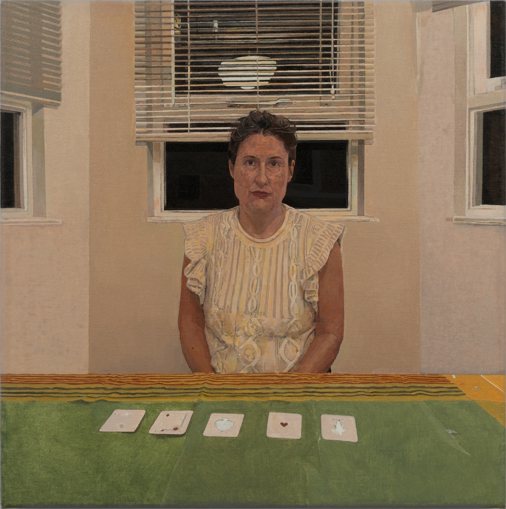
At night hours, a woman sits behind a table in a typical London Victorian bay room, gazing at the viewer as she shuffles the deck. The glow of the night lights cast gentle reflections on the window, but the woman’s inner reflections remain opaque.
The Archbishop (2024)
Oil on Linen
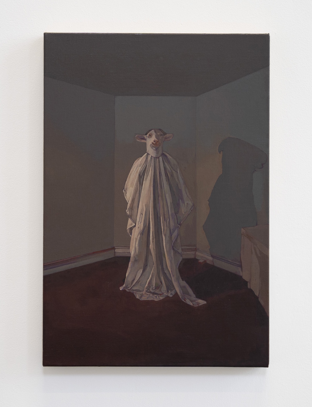
A hybrid figure with an animal head and priestly tunic stands in a dimly lit space, gazing at the viewer. This ominous, mysterious presence raises questions about its origins and what lies beyond the picture frame.
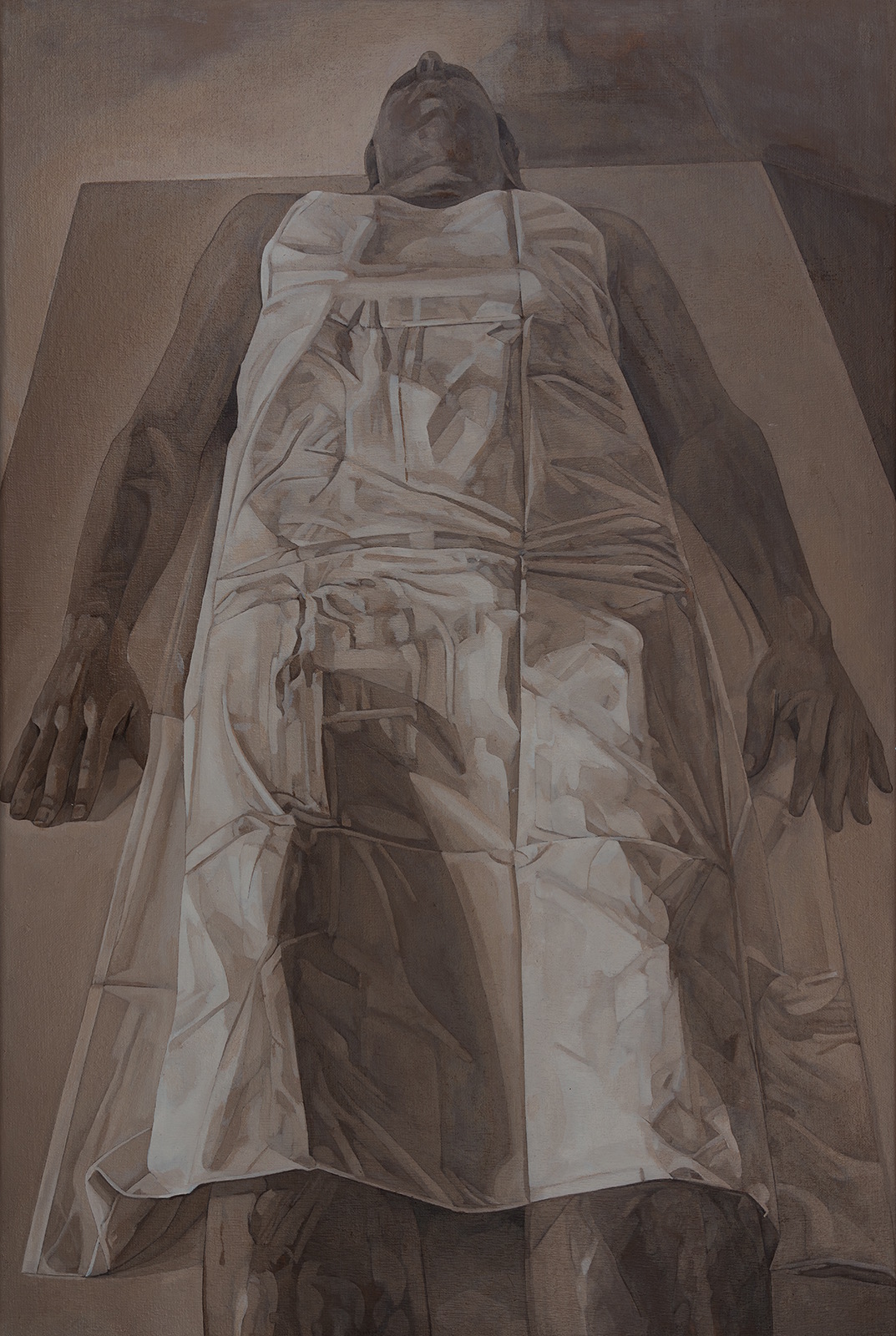
The End of Masculinity (2023)
Oil on Linen
This painting aims to critically challenge and deconstruct traditional patriarchal masculinity. Additionally, the work draws parallels to Mantegna’s Renaissance painting, which depicts the foreshortened dead body of Christ.
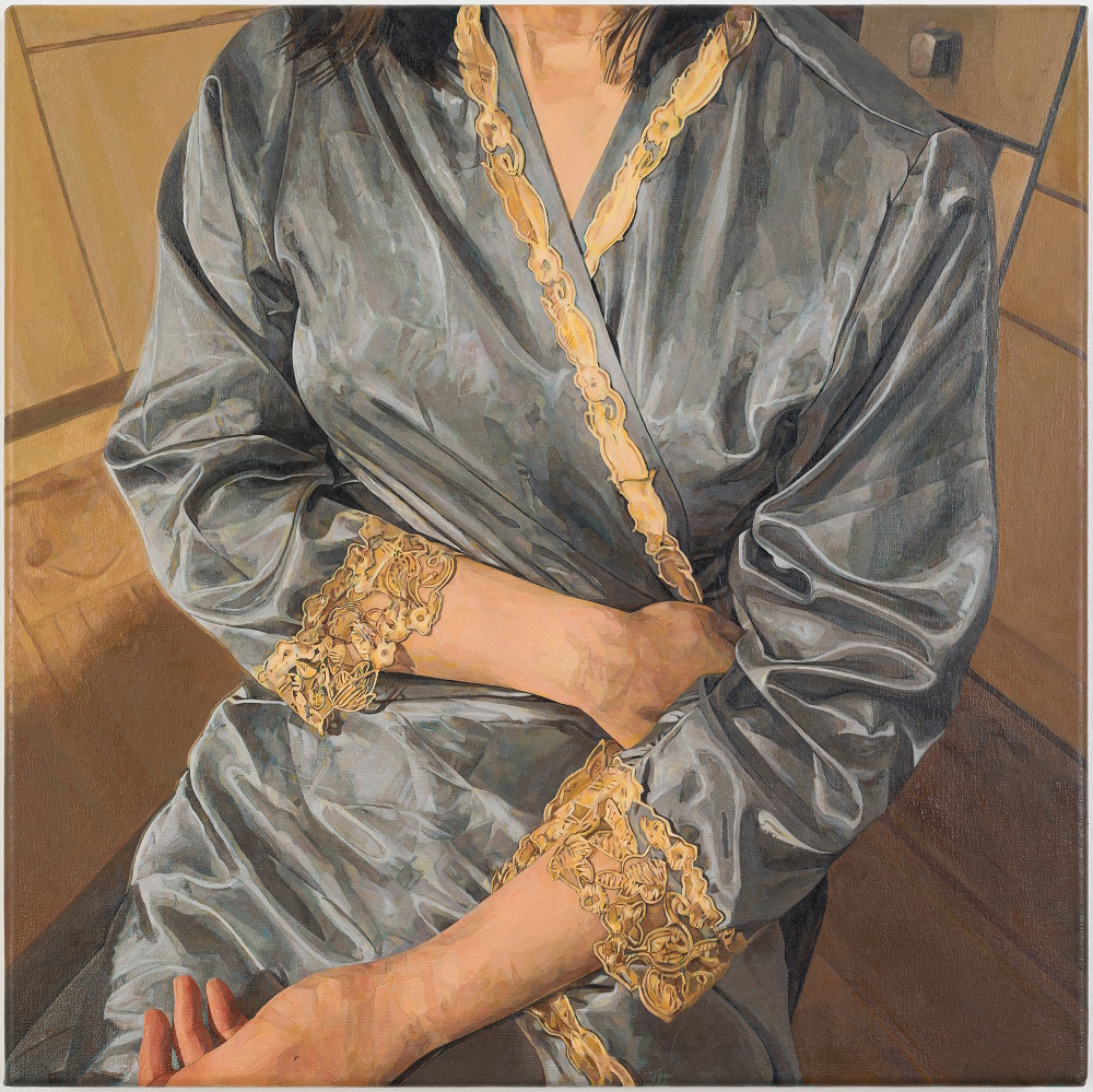
Seated Woman with nightdress (2024)
Oil on Linen
I once met a young woman studying luxury management in the UK. She exuded kindness but also seemed vulnerable and unhappy. Despite the allure of luxury, she realised it couldn’t always satisfy her deeper emotional needs. Appearances can be often deceiving.
Curatorial Review
In Midnight Reflection at Ommaney Road (2024), the woman sits in a Victorian bay room which has been framed in the room symmetrically against the windows in the centre. Her face does not show any emotion as she glares at us calmly yet cold. There are five cards in front of her across the green cloth- some of these cards are not recognisable yet some are. We are left uncertain about what is happening with these cards thus adding an ominous air to the atmosphere of the painting. Everything in the room is neatly in control and seems to be a ritual while the silence within the painting could allude that the figure is perhaps a medium or something more eerie.
Interview
You mention that your work oftentimes explores the themes of mortality and the living body; how do you explore the tension between life and death within your art and what role do you believe the body plays within these explorations?
There has been extensive philosophical discussion and theorisation about the opposing forces in psychic life. For instance, H. Marcuse wrote about Eros and Thanatos, and Freud discussed the dichotomy of the death drive and the life drive (love). Lacan, on the other hand, perceived desire under the signifier of the phallus. Despite the nuances among these theories, they converge on the understanding that psychic life is fundamentally shaped by two dominant, opposing tendencies: the death drive and a life drive that encompasses the subject’s aspirations, fantasies and the seeking of pleasure and fulfilment. In my work, I continuously examine the relationship between the inner tensions of life and death at the level of symbolism. A lying body on a bench, often perceived as a corpse, can symbolise not merely physical death but also serve as a metaphor for something deeper (as seen in my painting: The End of (Patriarchal) Masculinity). This notion intersects with my broader research interests in societal power structures, feminism, and queer theory.
Moreover, another dimension of my work concerning life and death delves into a “darker” aspect, particularly in relation to religion. I draw considerable influence from the writings of Georges Bataille, as well as from anthropologists like Marcel Mauss and their radical theories of sacrifice. My focus is not on any one particular religion but rather on the intersections between religion, eroticism, and the production of the sacred. Additionally, I am intrigued by how the body responds to these profound experiences—be it the tremors of ecstasy or the horror, pleasure and pain, violence and affection or the withered, fragmented body. In this context, the body emerges as a site of inscription, often assuming a performative role in my work.
Furthermore, your work also merges eroticism with the sacred and mystical elements- how do you approach balancing these concepts that are seemingly opposing to each other within your art? How do you think this fusion of the two concepts impacts the viewer’s perceptions?
I think that eroticism and the sacred are intertwined. I know that sounds quite confusing, but philosophers like Nietzsche and Bataille provide amazing theorisations. Without the intention to expand too far, l want to stress the similarities between religious ecstasy and erotic ecstasy. If we look at Bernini’s marble sculpture of the ecstasy of Saint Teresa, we find that the saint looks unmistakably like the face of someone caught in the throes of passion. Eroticism intricately weaves together the elements of love, death, and religion, uncovering the shared drives and experiences that connect these seemingly disparate facets of life. Rather than attempting to balance eroticism with the sacred, I seek to identify their common point of origin. Since ancient times, we have constructed “the rational world” through societal taboos, yet this construction is accompanied by “an undercurrent of violence,” for Nature itself is inherently violent. It is this undercurrent of violence that particularly fascinates me, as it does not shy away but instead manifests itself sometimes with explosive power.
Can you take us through the process of your work? From the planning process to the finish?
Taking photographs with my camera serves as a form of drawing—a sketchbook filled with ideas. I maintain a photo bank where I periodically return to revisit my images. If a particular photograph continues to resonate with me, I then embark on the process of planning a painting. This involves editing the image using Photoshop, which may include removing unwanted elements or adjusting the perspective as necessary. Once I have refined the image, I print it out to use as source material while creating the painting.
Currently, I prefer working in smaller sizes, often aligned with the dimensions of the printed image. This approach allows for desirable accuracy when translating or re-describing the photographic image into a painting. I constantly challenge myself to explore new textures with brush and paint dictated by each unique photographic image. This exploration allows me to “unlearn how to paint,” breaking away from the traditional practice of painting from life and paving the way for new realms of mark-making.
Starting with a relatively small canvas gives me the freedom to explore and understand my subject purely in visual terms, free from the pressure, time commitment, and costs associated with larger works. Once I complete a small piece that continues to intrigue me, I then consider the optimal canvas size for that particular work, aiming to allow it to resonate on a different frequency. Consequently, I view the size of the painting as a crucial factor in how a viewer engages with the artwork.
You mentioned that you capture quiet moments from everyday life- what brought you to these particular moments and how do they function within your themes of mortality and transformation?
When I refer to quiet moments, I envision a sense of clarity and being fully present in the moment. It’s about experiencing a genuine connection and engagement with what is happening around us. These moments arise when our inner impulses or fantasies find an external counterpart to hold onto. Even the smallest gesture can sometimes prove to be strikingly meaningful, as it allows us to release a hidden burden and perhaps reveal a small truth.
However, moments are inherently fleeting; they pass quickly and cannot be repeated. This transience is part of their beauty—knowing that these moments will not last forever reminds us of life’s impermanence and the presence of mortality. In contrast, a painted image offers a way to preserve and continue that moment, serving as a form of negation to mortality.
You begin small to find the ideal size for a painting. What kind of cues or instincts guide you when knowing when a piece needs to be bigger or remain small?
I previously touched on how I arrived at an optimal size for my paintings in question 3, but I’d like to expand on that here. I usually start with a small canvas to familiarize myself with the demands and formal aspects of my theme. A smaller canvas creates an intimate setting that helps me address challenges, understand how to approach various textures and see how the different elements of the composition interact. Translating an image from a photographic source is not always a straightforward task. There are times when the subtle nuances of the source image don’t translate well, which can result in a painting that feels unjustifiably flat. However, beyond the technical aspects, it’s equally crucial to consider how the image is intended to be perceived by the viewer. In this sense, the size of the artwork is closely related to the subject matter. For instance, a standing figure in the painting has a different resonance when depicted in life-size compared to a smaller representation. When portrayed at a natural scale, the figure carries a kind of performative presence among viewers. While this example illustrates how representation operates, it is not a hard-and-fast rule; working within the realm of images often defies strict rational logic and can lead to poor decisions. Consequently, my decision-making relies more on intuition than on rationality, and I could say that embracing one’s “eccentricities” is one of the more delightful aspects of making art.
You describe the atmosphere of your works as ‘soft yet unsettling horror’- what makes horror ‘soft’ to you? And why is that subtle disturbance important for the work?
I would describe the atmosphere of my works as having a quality of soft horror, largely because “soft” is a term often used to describe a subgenre of horror films. Specifically, it refers to psychological, atmospheric, and emotional elements that evoke a sense of unease and dread. The horror in my work is not overt; rather, my themes tend to suggest rather than explicitly present graphic details or horrific facts, and they occur after the actions have already taken place. This approach allows space for the imagination to explore various scenarios and narratives within the imagery, hinting at potential subsequent events while deliberately withholding any resolution. The result is an elevation of agony and unease, which I find truly fascinating. I am particularly interested in how viewers respond physically and psychologically when confronted with such images. I aspire to create works that provoke feelings of agony and fear, drawing inspiration from Nietzsche’s ‘The Birth of Tragedy’ and the impact that early ancient Greek tragedies, such as the works of the tragic poet Aeschylus, had on their audiences. While I’m not fully aware of why this kind of disturbance is important in my work, I do know that I enjoy constructing softly disturbing images. I am interested in theories that analyse the psychological underpinnings of horror, and I believe this kind of analysis will offer me a deeper insight into why I am so compelled by it. To give an example, what I found intriguing in Sunny Hawkins’s book Deleuze and the Genesis of Horror is how the techniques of a horror film – editing, sound and visual effects, lighting and colour, and camera movement – work in tandem with a film’s content to affect the viewer’s body in ways that disrupt the sense of self as a whole, unified subject with a stable, monolithic identity and, in some cases, can serve to breakdown the binary between self/Other.
How do you hope that viewers will engage with your work? Are they invited to project themselves onto the scenes or perhaps are they meant to witness something more unknowable?
I hope that my viewers will not just observe but enter my work—stepping into the (illusionary) space of the painting and immersing themselves fully. That’s why I am deeply invested in rendering a convincing three-dimensional space; it acts as a portal, drawing the viewer beyond the surface and into the world the painting suggests. My work extends an invitation—an opportunity to momentarily inhabit a space that is at once tangible and elusive, familiar yet unsettling. Whether the viewer projects themselves onto the scene or remains a witness to something more unknowable is left deliberately open—what matters is that they engage, that they linger, and that they feel the pull of what lies beyond the picture frame.
Where do you see your practice in the next ten years, and do you have any upcoming projects you want to share?
I envision my practice expanding over the next ten years by incorporating other mediums such as video and performance, all while maintaining its deep connection to painting. This evolution has already begun—recently, a painting I created for my degree show at Goldsmiths College sparked the idea for an installation performance. Drawing from that painting, I constructed a “room within a room,” mirroring the space depicted in the painting, but instead of a painted figure, I introduced a live performer.
These two works weren’t meant to be experienced side by side; instead, they retained their autonomy, existing in separate exhibition spaces. Only those who had first “stepped into” the painting and later, unknowingly, entered the installation, experienced the eerie realization of having physically entered a world they had previously only encountered in two dimensions. Many viewers later described this as unsettling, even uncanny—a moment where art breached the boundaries of perception.
Moving forward, I aspire to further experiment with video performance, live performance, and installation, exploring how these mediums can push my practice into new, uncharted territories. I’m particularly interested in how they might offer alternative ways to engage with the themes I’m currently working on.
ADA QI YING
adaqiying is a Chinese artist & film director and educator based in Nottingham, UK and Beijing, China. She holds master degree from Arts Politics at the Tisch School of Arts, New York University. She leverages film production and visual arts disciplines to create works that on the discourses of identity politics, intersectionality, social justice, and gender-based violence.
Her work has been selected by NYShorts International Film festival, Toronto Woman Film festival, featured by the UNWomen China, won and nominated twice for the best PSA(Public Service Advertisement) in Shanghai JCDecaux awards, as well as in publications like Southern Weekend China.
Artworks

Black Sea (2025)
Painting on Canvas
Black Sea This painting captures a fleeting moment—one that exists between life and death, between holding on and letting go. I painted Black Sea as an attempt to grasp that moment, to give shape to the invisible boundary that separates existence from the unknown. The wave is not just water; it is a force, a transition, an unspoken passage. In the deep, shifting blackness, I see both fear and peace. The movement of the sea mirrors the movement of time—unstoppable, carrying us forward whether we are ready or not. This is my way of holding onto the moment before it disappears.
Curatorial Review
Black Sea (2025) is an atmospheric painting in which the dark sea reflects the moonlight continuously shifting and changing yet staying in the same form: water. The sea has been changed from a location to more of a state- of time. The flowing of the waves may seem peaceful but they are always in a state of movement which will happen until the end of time which doesn’t stop but will continue indefinitely whether we attempt to stop it or not. Thus; it is turbulent and cannot be resolved. It doesn’t offer safety yet feels intimate at the same time- however, we cannot grasp what the waves or time try to tell us as like waves- they reveal themself once they arrive at our feet.
Interview
How has living and working between Nottingham and Beijing shaped or influenced your artistic practice?
Living and working between Nottingham and Beijing has profoundly shaped my artistic practice, allowing me to navigate and reflect on cultural intersections in a more fluid and nuanced way. The contrast between these environments has deepened my understanding of how identity, language, and history interact in artistic expression. Being immersed in multiple languages—both in daily life and in my creative process—has also become an essential part of my work. The blending of languages generates moments of dissonance and playfulness, which I explore through my storytelling, whether in film or performance. These experiences have pushed me to examine how linguistic and cultural hybridity shape emotional landscapes, which is a recurring theme in my work.
Do you find differences in how audiences in China versus the United Kingdom respond to your work?
Surprisingly, I’ve found that audience responses in China and the UK are more similar than I initially expected. The emotions and themes I explore—whether identity, loss, or the passage of time—are deeply visual and universal. While cultural references might be interpreted differently, the core feelings resonate across borders. This has reinforced my belief that storytelling, especially through imagery and sound, can transcend linguistic and cultural barriers. That said, I do notice subtle differences in engagement: UK audiences often approach my work with a critical and theoretical lens, while Chinese audiences tend to connect with it on a more emotional and personal level. Both perspectives enrich my understanding of how art is received and push me to refine my approach.
Can you take us through the creative process behind the work you’re exhibiting in this publication: Black Sea (2025)?
Black Sea is a multidisciplinary series comprising an oil painting, a poem, and a song, all centred around the motif of waves as a medium that divides life and death. The idea emerged from my contemplation of the sea—not just as a physical expanse but as a liminal space where memories, longing, and absence intertwine.
Furthermore, the work captures the moment ‘between life and death between holding on and letting go’ what led you towards this theme? Was there a personal experience that inspired this painting?
In early 2024, I lost my grandfather, and that experience deeply shaped Black Sea. The painting, along with the accompanying poem and song, became a reflection of that loss—of the liminal space between presence and absence, between holding on and letting go.That movement felt like a metaphor for grief—how it comes in waves, unpredictable yet inevitable. Black Sea emerged from that moment of reflection, as a way to process both the finality of death and the continuity of memory.
You described the wave as a ‘force, a transition, an unspoken passage’- how did you translate this concept into its visual form?
The process was largely intuitive—I painted what I felt. Waves, to me, are not just natural phenomena but emotional landscapes, constantly shifting yet never fully settling. I focused on movement and texture, allowing the brushstrokes to capture the fluidity of transition.
What does the sea symbolise for you in Black Sea, how do you see its differences from more traditional depictions of the sea?
For me, the sea in Black Sea is not just a setting but a spiritual threshold—an entity that consumes and transforms, blurring the boundaries between the living and the lost. Unlike traditional depictions of the sea as vast, romantic, or serene, I see it as something unknowable, almost sentient. It is both a bridge and an abyss, holding within it the weight of memory, time, and disappearance. Instead of depicting it as a mere backdrop, I wanted to evoke its presence as something that interacts with the human experience, something that draws us in and reshapes us.
What kind of emotional response do you hope viewers will have when standing in front of Black Sea?
I hope for a dual reaction—first, a sense of peace and calm, then a slow, creeping immersion into something deeper. I want viewers to feel as if they are being drawn into the unknown, much like the way water pulls at the shore. There’s a quiet mystery in the piece, an invitation to reflect on loss, transition, and what lies beyond. If the painting leaves them with a lingering sense of being “swallowed” by something larger than themselves—whether that is memory, time, or the vastness of the unknown—then it has done its job.
Where do you see your artistic practice evolving in the next ten years? Are there any projects you’d like to share here?
Painting will always be a deeply personal outlet for me—a space where I can process emotions and ideas that words cannot fully express. Over the next decade, I see my practice expanding beyond individual pieces into more immersive, interdisciplinary work, incorporating film, performance, and sound. I’m particularly interested in exploring the relationship between language and visual art—how the things we struggle to articulate can take form through image and space. One upcoming project builds on the themes in Black Sea, examining how language and memory interact through fragmented storytelling across different mediums. I want my work to continue evolving as a space where personal and collective histories intersect.
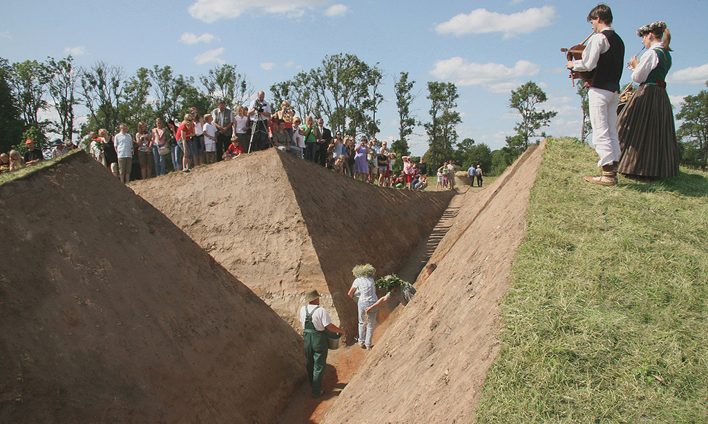
TANYA PREMINGER
My purpose is to express the immaterial essence of things in physical stuff: to make tangible the universal essence of the creation
Artworks

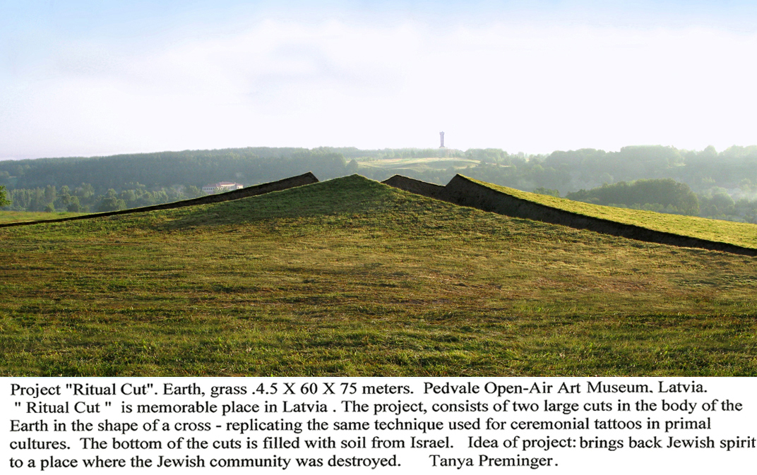
Ritual Cut (2009)
Earth and Grass
The project “Ritual Cut” was created for the Pedvale Open-Air Art Museum, Latvia. I was invited to residence for create an environmental work as a part of an international project “Memories from the Past” Idea of project Ritual Cut is brings earth of Israel and Jewish spirit to a place where the Jewish community was destroyed. Soothe the souls of the dead. The work, “Ritual Cut”, consists of two large cuts in the body of the Earth in the shape of a cross. It is replicating the same technique used for ceremonial tattoos in primal cultures. The bottom of the cuts is filled with soil from Israel. The project is made only from natural materials- soil and grass, and on top of its aesthetic value carries spiritual significance. In this photo we see the project from the outside. Latvia.
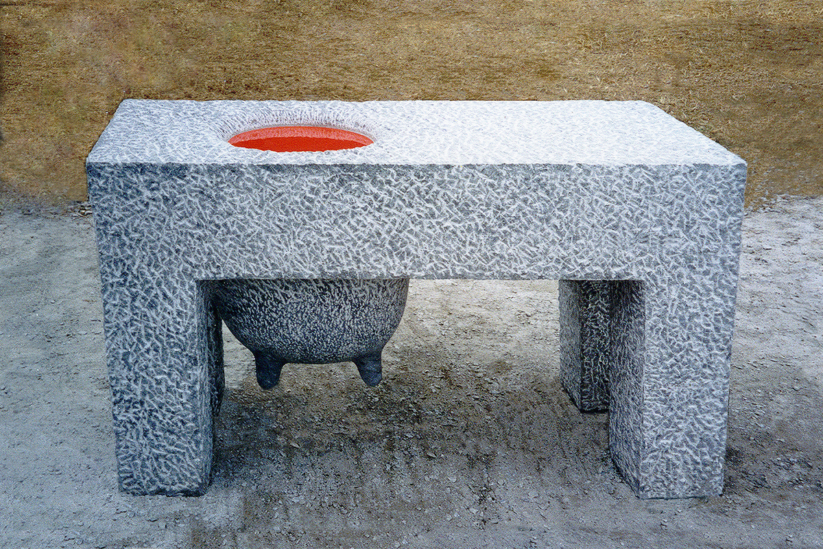
Super Woman (1995)
Marble, painted aluminium
The sculpture was made at a stone sculpture competition. It won first place and remained in the Stone Sculpture Museum in the city Hualien, Taiwan. Dedicated to the Woman who gives her life to children.
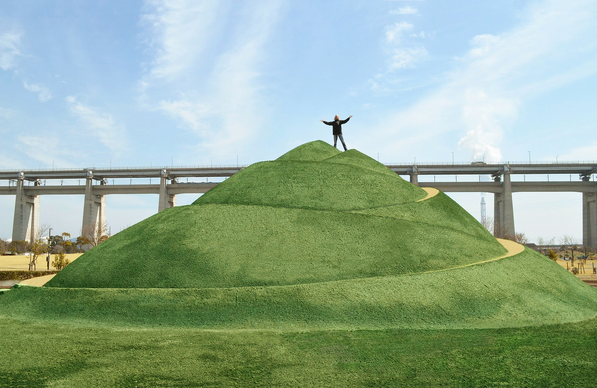
Stratum (2013)
Earth and Grass
The project has the shape of an unopened bud. The theme of this project is the creation of the future, the process of development. Development starts from the earth as a symbol of all the basic physical concepts, and yearns to the sky, as a symbol of spirituality The process of creation is a natural process, that’s why I use only soil and vegetation. The project was created for Setouchi Triennale, Shamijima, Japan.
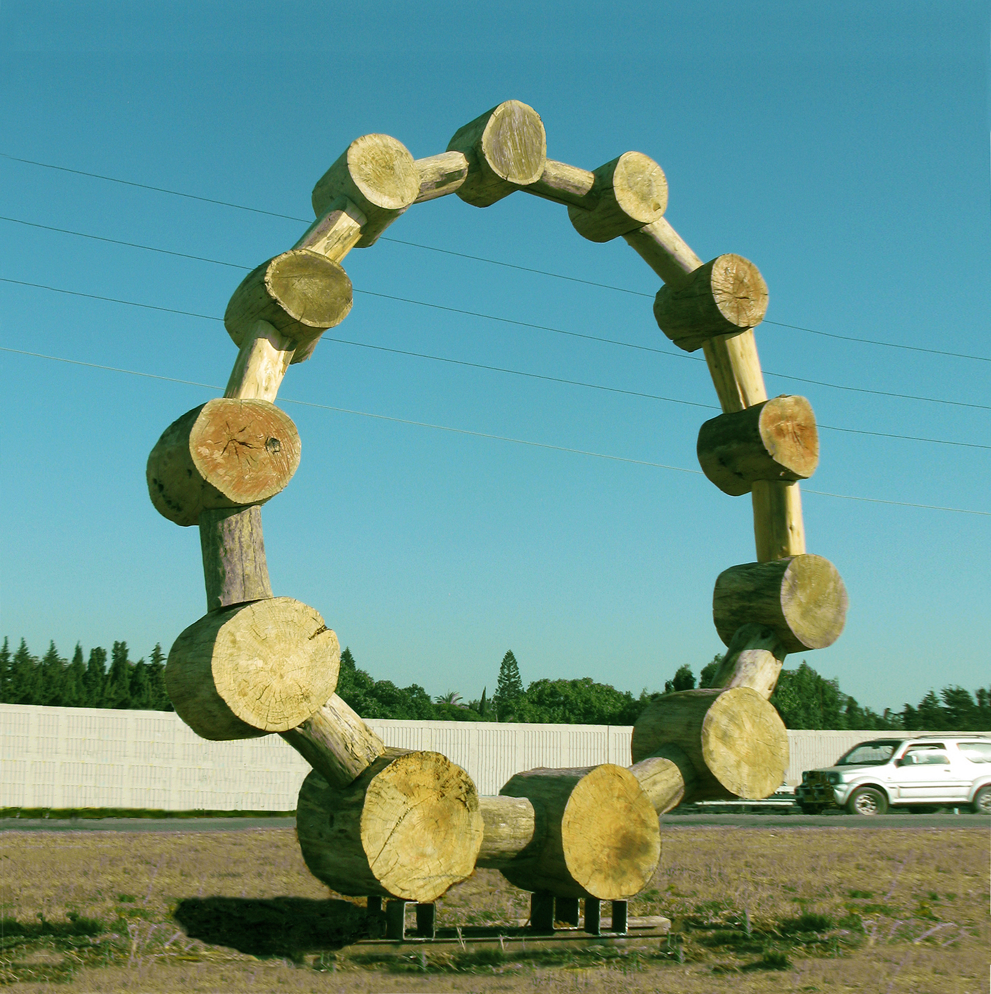
Chaplet (2012)
Wood
“Chaplet” this is God’s necklace. Each piece contains a record of the tree’s life time. And time and life are priceless. Israel
Landscape of Motherland (2006)
Earth, polystyrene, synthetic grass.
A coat made of earth is a symbol of the Motherland, which protects and warms you and which you remember in a cold foreign land. The work was created for a personal exhibition. Israel.
Rotate Rolling (2016)
Wood
The Wooden Rainbow is a rainbow of material life energy, unlike its prototype, the Celestial Rainbow, which carries the colours and esoteric energy of the heavens. Installation, Israel
Ladder to Heaven and Back (2023)
Iron
This work depicts a ladder rising straight up, where at the top the ladder turns sharply downwards and meanders down to the ground. The work expresses the general natural law of the cyclical development of all things. Russia
Door Game (2011)
Stone
Steps of history – Stepwise development, where each step stands on the previous one and supports the next one. Israel
Saucepan (2004)
Stone, Iron and Concrete
The boiling Land of Israel. This is God roasting his beloved people. Israel
A spoonful of Sky (2022)
Stone
To you, passerby, who runs in the vanity of his life, looking under his feet, I give a piece of the sky. Stop and look up into its bottomlessness. Israel
Towards the Sky (2022)
Earth and Grass
And the Earth speaks to the Heavens. Biennale of OPENART. Orebro, Sweden.
Curatorial Review
Ritual Cut (2009), as the title suggests, cuts into the land creating a ceremonial cross. These cross-shaped interventions are 4.5 x 60 x 75 meters and the geometricity of them suggests more of a ritualistic precision rather than a random cut. The cuts are not for decorative purposes and serve as a reminder of where a Jewish community had once stood and how it had been erased. The cuts are symbolic of ceremonial tattooing in which cuts are made into the flesh and then filled with a pigment to complete the tattoo. Here; the Earth is the body.
Interview
What inspired the creation of A Spoonful of Sky (2022)?
I always start from the material I see around me. The reflection of the sky in a mirror that laid on the ground gave birth to the idea.
The ‘sky’ inside the bowl creates an illusion- how was this effect achieved technically?
The mirror gave the idea and it remained the main element in the sculpture. Stone is an auxiliary material. It can be replaced by another material. I have two works on the theme of a spoon. One is made of wood, the other of stone. (I don’t remember whether I gave you a photo with a stone or a tree). In the stone spoon, which is monumental in size and should stand in public in the city, the mirror is not made of glass but of polished steel to protect it from vandalism.
The metaphor in your work Saucepan (2004) is distinctive; what inspired you to portray Israel as a ‘boiling’ land and its people as being roasted?
I don’t fry people 🙂 It is the earth that burns. The standing stones are tongues of flame. It is a metaphor. There is an expression (I’m not sure if you have it in English) “The earth burns underfoot”. Israel is not a calm country. It is forced to fight for its land all the time.
For Door Game (2011) what was the creative process behind the work? Did you use any logic or system behind the proportion and alignment of the doors?
The thickness of the stone slab from which the work is made was the measure I used for the proportions of “Game of Doors.”
In Ladder to Heaven and Back (2023); what inspired this concept of a ladder that ascends only to bend back down to the Earth?
Nothing can develop forever. It’s a matter of time. And a stone thrown up will fall down and a large empire will fall apart.
In Rotate Rolling (2016), you mention ‘material life energy’- what do you mean by this and how does it contrast with the esoteric energy of the heavens?
A coil is a form that has the potential for movement – rolling – turning around its axis of gravity. I gave the coils another direction of rotation, perpendicular to the natural one. This is a different perception of reality.
Do the industrial wooden cable spools symbolise anything for you and why did you choose them as the core material in the work?
I did not choose the coils for the idea, rather I saw the coils and they gave me an idea. This is a complex form that contains movement and I saw it.
You describe Chaplet (2012) as ‘God’s necklace’- what does that metaphor evoke for you?
Firstly, this is a large project. This is a significant magnification of the decoration. Secondly, this is a living material – wood. Where pieces of wood are especially left unprocessed. So that their natural origin is better felt. Pieces of wood, changing direction, create a living rhythm. And the very shape of the circle symbolises the circle of life. The deity here is Mother Nature.
Each piece in the work represents a record of a tree’s life- how do you see the connection between memory, time and nature?
Each natural form carries its own story, its own memory and its own time. You just have to be able to see it.
What kind of interaction do you envision between the sculpture, the environment and the public?
The landscape sculptures that I create have connection with the earth and therefore require more space for the viewer to perceive.
WEIYI CHEN
Weiyi Chen (b. 1997, Chongqing, China) is a London-based textile artist. She graduated from Chelsea College of Arts with an MA in Textile Design in 2023. Her artistic practice explores primal subconscious using the fluid and ever-changing nature of different materials.
Working across textiles, painting, and performance, Chen’s practice is rooted in an intuitive approach that engages with both personal narratives and material experimentation. She incorporates Chinese traditional medicinal dyeing as a method of reconnecting with her cultural heritage, allowing materiality and memory to intertwine. Her work exists in a state of transformation—fading, unravelling, and deconstructing over time—becoming increasingly unstable with the passage of time. Investigating the intersection of craftsmanship, sustainability, and impermanence, she challenges conventional notions of textiles as a stable medium, prompting viewers to consider the evolving nature of art beyond its back.
Artworks

window (2024)
Indigo Dye on Kitting Textiles
“Window” is a fibre-based installation that explores the shifting power balance between mother and daughter, maternal influence, authority, personal resistance, and the search for spiritual escape. Constructed using hand-spun cotton yarn and naturally dyed with indigo, the piece embodies both tension and transformation. Stretched and worn fibres form a fragile, window-like structure—symbolising a liminal space between constraint and freedom. The indigo-dyed cotton evokes introspection and longing, while the flexible form allows for expansion and compression, emphasising instability and change. By manipulating fibre’s structure, Window challenges notions of inherited influence, autonomy, and evolving familial bonds.
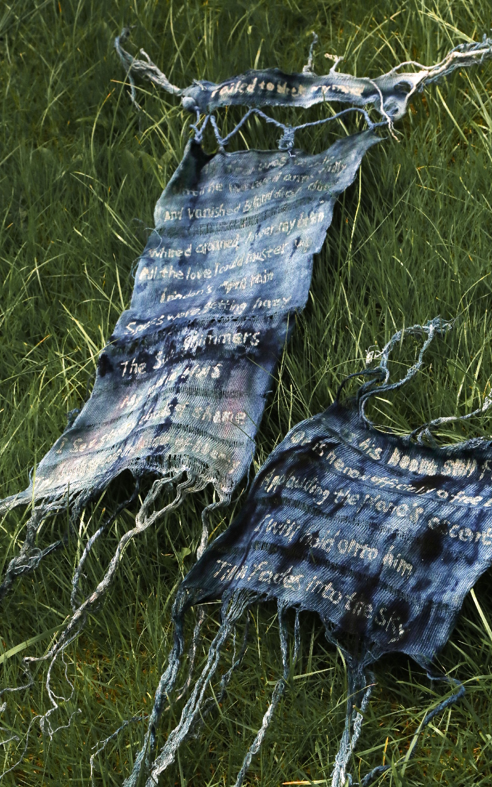
Letter (2024)
Knitting, Batik, Cotton, Indigo pigments
This piece, “Letter”, was a visualisation of a poem I wrote for my distant lover. The poem was published earlier this year in the book “Force Majeure”. “Letter” merges knitting and batik and ice dye to explore the fluidity of Emotions through the making process. The work was inspired by the artist’s experience of feeling nothing painful immediately while separating from her lover, and the sorrow delayed until days later. Every stitch of the knitting represents the effort of building emotional connection with others, the poems written by the wax symbolised the neglected bond. The unique dyeing method of ice dyeing allows the dye to flow uncontrollably on the fabric and forming irregular marks which temporarily blurs the poem. The words reappears with the use of a hot iron to remove the batik, symbolising the delayed emergence of sorrow.
Curatorial Review
Window (2024) is a textile installation that seems as though it’s about to collapse- its structure looks similar to a web and is surrounded by leaves and great shadows allowing the work to be both a part of the scene yet also out of place. The strands of this installation are pulled out of the centre making it as though they are struggling- confronting the viewer. However, on closer inspection one will notice indigo dyes staining the textile – some parts slightly diffused and other parts much more sharp. The natural dye adds a character to the work which resists the more industrialised method of fabric production in a factory.
Interview
Can you tell us about your early experiences with art and what had led you to pursue textures as you primary medium?
Growing up within a family deeply rooted in Chinese traditional art profoundly influenced my early artistic sensibilities. My grandfather, a prominent Chinese painter, instilled in me an appreciation for fluidity and emotional resonance within art. Additionally, growing up during a time of rapid internet and technological advancements in Chongqing, I experienced constant change and a sense of disconnection. Before fully embracing art, I studied fashion for my bachelor’s degree, a field that often kept me immersed in relentless trends and demanding schedules, leaving little room for reflection. Eventually, I realised that my body and mind were disconnected from the earth and myself, leading me to question my place within the fashion industry. Deep down, I found myself more interested in the emotional and conceptual potential of textiles rather than solely their aesthetic qualities. My background in fashion provided me with a robust understanding of materials, structures, and textile techniques, guiding me naturally towards using textiles as an expressive medium to share personal stories and emotions.
How did growing up in Chongqing and then relocating to London shape your creative identity?
Growing up in Chongqing deeply informed my aesthetic—particularly the city’s vertical tension, reflected in my textile sculptures through layers of compression, expansion, and suspension. The persistent mist and ambiguity of Chongqing echo in my unpredictable dye processes and shifting forms, capturing a sense of uncertainty and flux. The contrasts of flow and resistance, mirrored by the turbulent rivers and urban chaos, inspire my embrace of randomness and uncontrollable textures in materials. Emotionally, Chongqing’s intensity—its hot cuisine against the cool mist—resonates through my explorations of emotional extremes, particularly in my mother-daughter narratives. Additionally, the city’s intimate connection to earth, mountains, and local materials continues to guide my practice toward sustainable, soil-based pigments and natural dyeing. Relocating to London then provided a global perspective, enriching these foundations by merging my deeply rooted Chinese aesthetics with broader contemporary dialogues.
What drew you to work with unstable or transformative materials?
Instability and transformation mirror life’s inherent uncertainties and emotional fluctuations, aspects that continually attract me compared to stable, predictable outcomes. I’m always struck by uncertainty and randomness in art, and I dislike feeling overly in control of my creative process—I prefer my work to flow organically. Textiles naturally balance structure with unpredictability, allowing materials to transform under tension, dyeing, or environmental factors. This interplay symbolises emotional resilience, vulnerability, and the ongoing flux within relationships and personal identity.
You described your practice as engaging with the ‘primal subconscious.’ How do you translate the subconscious state into a physical form?
Translating the primal subconscious into textiles involves intuitive, embodied processes like repetitive knitting, spontaneous dyeing techniques such as ice dye, and performance-based creation. These methods encourage a loss of conscious control, allowing subconscious emotions to guide my hands, resulting in unpredictable patterns, textures, and forms that authentically capture internal emotional landscapes.
In what ways do you see your work as a bridge between contemporary practice and Chinese cultural traditions?
My work actively integrates traditional Chinese textile techniques, natural dye practices, and philosophical concepts such as harmony and impermanence. By utilising contemporary art forms like performance, installation, and sculpture, I position these traditional methods in dialogue with current issues around identity, ecology, and interpersonal relationships. This bridging provides a nuanced perspective that honours my cultural heritage while addressing contemporary global conversations.
In Window (2024), how do you interpret the window as both a physical and symbolic threshold in the piece?
In Window, the fragile knitted structure physically embodies a threshold—a suspended form that hovers delicately in space, simultaneously present and elusive. Symbolically, this window represents the emotional boundary between inherited expectations, authority, and the personal desire for freedom and spiritual escape. Created from hand-spun cotton yarn naturally dyed with indigo, the piece mirrors the nuanced complexities of maternal influence and resistance within East Asian mother-daughter relationships. It offers a quiet space of introspection, suspended between visibility and concealment, obedience and rebellion, tenderness and tension.
How does Window relate to your broader exploration of impermanence and transformation within your textile work?
Window encapsulates the central themes of impermanence and transformation present throughout my textile practice. Its fibres—hand-spun cotton yarn—are inherently fragile and naturally break during knitting, spontaneously creating holes. Rather than attempting to fix these imperfections, I intentionally leave them untouched, allowing the piece to evolve organically and vulnerably over time. This deliberate embrace of instability highlights identity as fluid and continuously shifting, never static or fully defined. By preserving these imperfections and dropped stitches, the work becomes an ongoing reflection on the transient nature of emotional bonds, personal growth, and the delicate balance between constraint and freedom.
Letter (2024) addresses a deeply personal experience of delayed sorrow. How did you translate this emotion into a textile form to help you process it?
Letter became a textile vessel to externalise and process my delayed sorrow through a multi-layered, meditative process. I began by knitting a soft “fabric letter paper,” creating an intimate foundation for emotional expression. Using batik techniques, I hand wrote poetry onto the knitted surface with wax, embedding personal emotions directly into the fabric. The piece was then ice-dyed, allowing colours to flow unpredictably and obscure the wax-covered words, mirroring the internal complexity and uncertainty of my emotions. Finally, removing the wax with heat revealed softened traces of text beneath shifting colour gradients—symbolising the gradual clarity and relief emerging from previously submerged feelings.
When did you realise that you needed to create Letter—did it come before or after writing the poem?
The need to create Letter emerged simultaneously with the poem. Both mediums intertwined from the start, as I intuitively felt that words alone could not fully encapsulate my emotions. The poetry and textile work evolved concurrently, each informing and deepening the others meaning and emotional resonance.
Where do you see your artistic practice in the next ten years? Are there any upcoming projects you would like to share?
Over the next decade, I envision expanding my practice through collaborative and interdisciplinary projects across textile, performance, and the body. Also, I wish I could take part in diverse international projects, fostering dialogues connecting contemporary art practices with community engagement, sustainability, and cultural exchange. For now I am continuing developing TearSlaly, an ongoing collaboration integrating textiles, photography, and ecological awareness, as well as continuing curating more meaningful exhibitions with my curatorial team SilverCanArt.
