CONTRAST ISSUE 3
@
META SPACE
GALLERY
ARTISts
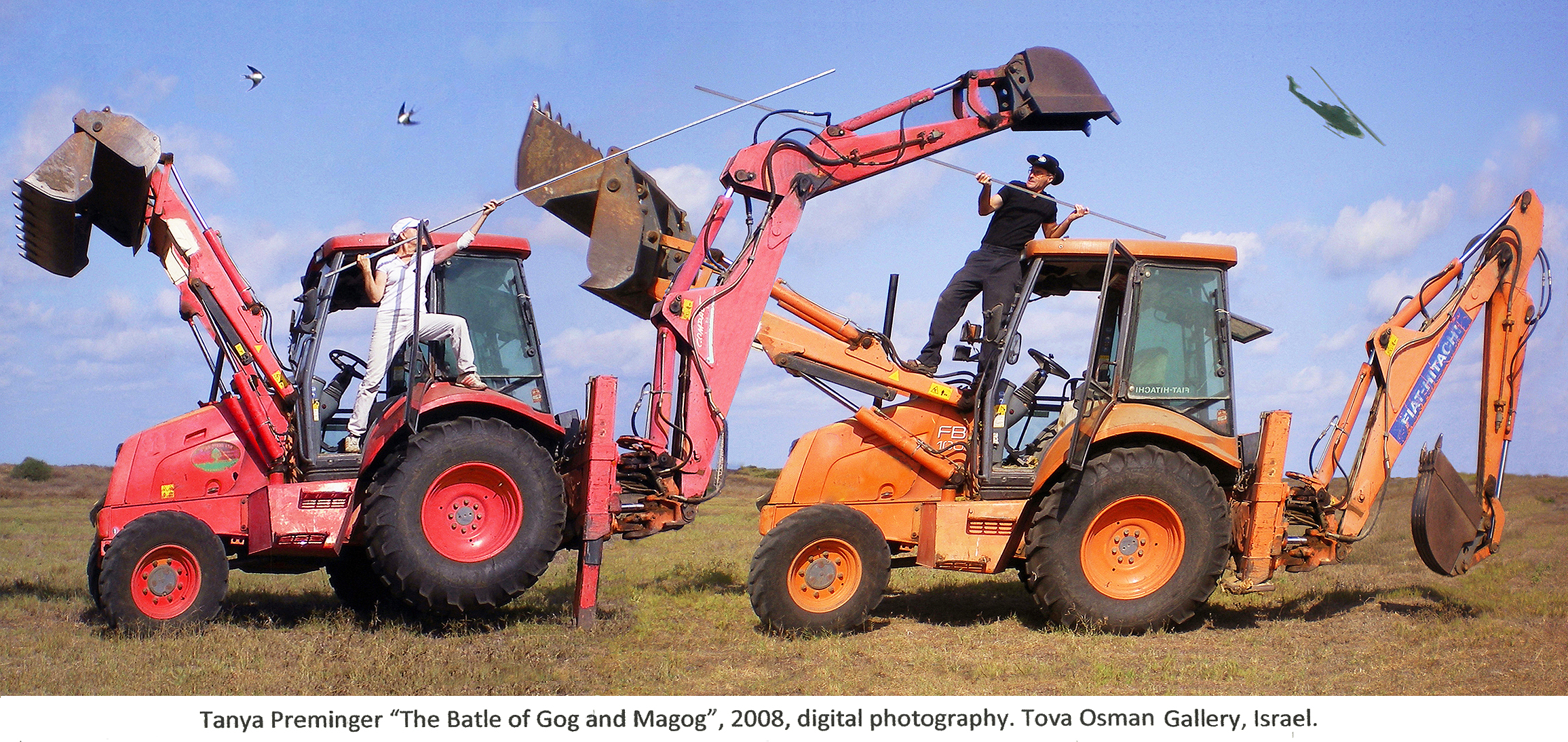
Tanya Preminger
Stefanie Carnevale
Chong Liu
Laura Bernardeschi Nelson
Igal Stulbach
Guanhua Yao
Sonia Trevisan
Emily Greenwood
THRESHOLD LAB
CHARLIE VALENTINE
ISABELA CASTELAN
SHERIHAN KHALIL
EKATERINA KUZMINA
JEAN STOCKWELL
ZIXIANG ZHANG
ISABELLE M LARSSON
DR HELEN IMOGEN FIELD

Contrast! is an online and virtual exhibition and a publication surrounding the theme and concept of contrast- what it means in art and how it is portrayed. The artists in this third issue of Contrast tackle the concept with artistic integrity and through thought-provoking means.
If you would like to navigate the online exhibition easily; you can press the artists name at the top to go to their section of the exhibition.
21 JAN TO 6 FEB 2025
FOLLOW OUR :: INSTAGRAM
Tanya Preminger
Artist Statement
My purpose is to express the immaterial essence of things in physical stuff: to make tangible the universal essence of the creation.
The unity and struggle of opposites is one of the three laws of Hegelian dialectics. Opposites are the contrast that exists in every essence and phenomenon. So every thing contains a contrast. You just have to see it. In a work of art, the strength of this contrast influences the impression of the work.
Yin and Yang
The project expresses, in a material form, the philo-sophical law of life, of the balance between the opposite sides of one entity.
Relationship of parts to the whole.
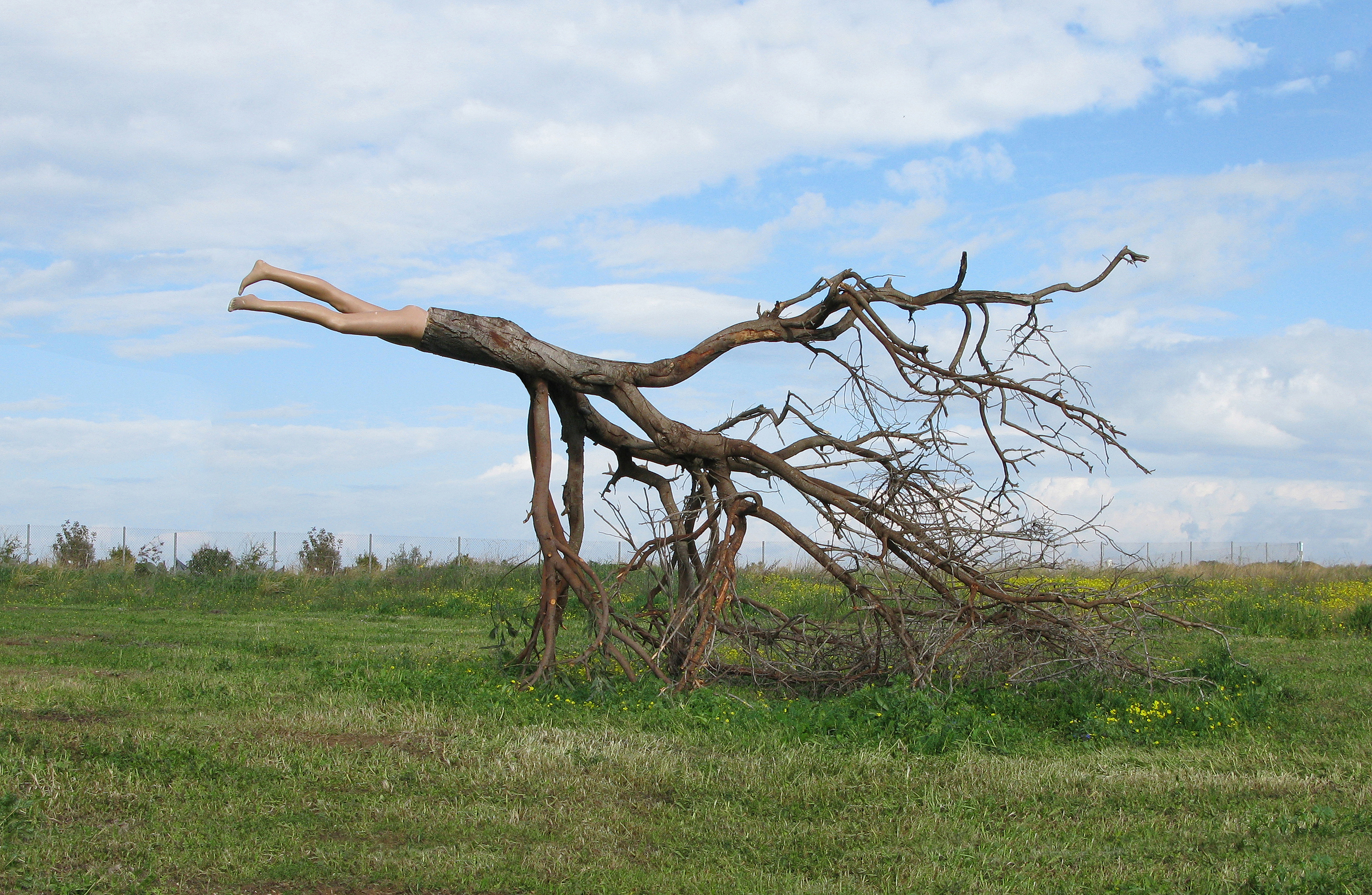
And Time to Displace (2009) – Tree, plastic mannequin [Land Art] (250 x 400 x 230 cm)
A man is like a tree. He dies if he is torn out of the Earth.
The struggle of two elements. Water and stone.
Life has two ends. First you go up – in the end you roll down.
From the earth you came and to the earth you will return.
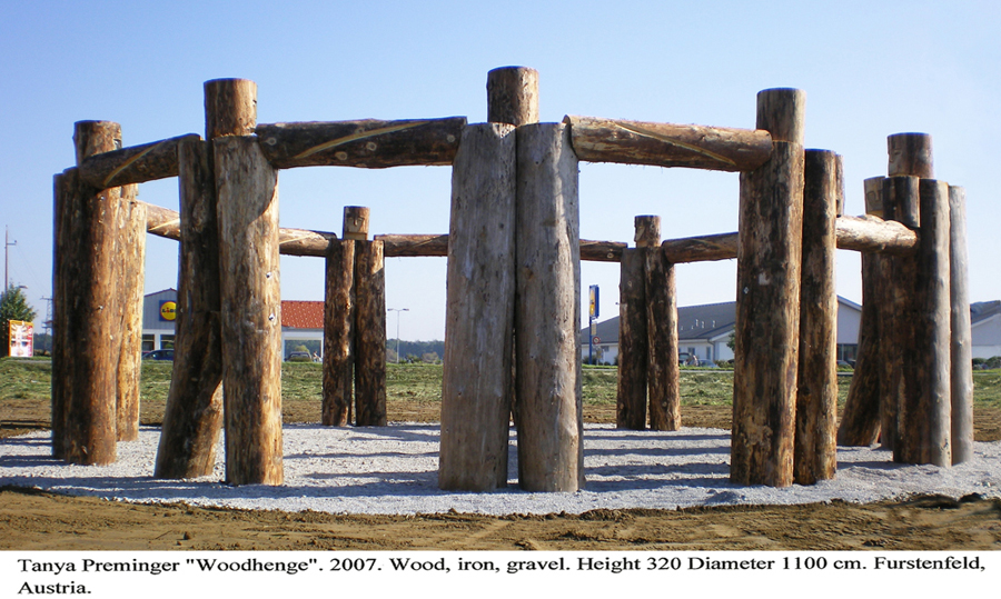
The monumental mass conveys warm human feelings. “Woodhenge” is a wood replica of the famous English archaeological monument “Stonehenge”. It was built during LAND ART festival as a part of a promenade around the town of Furstenfeld.
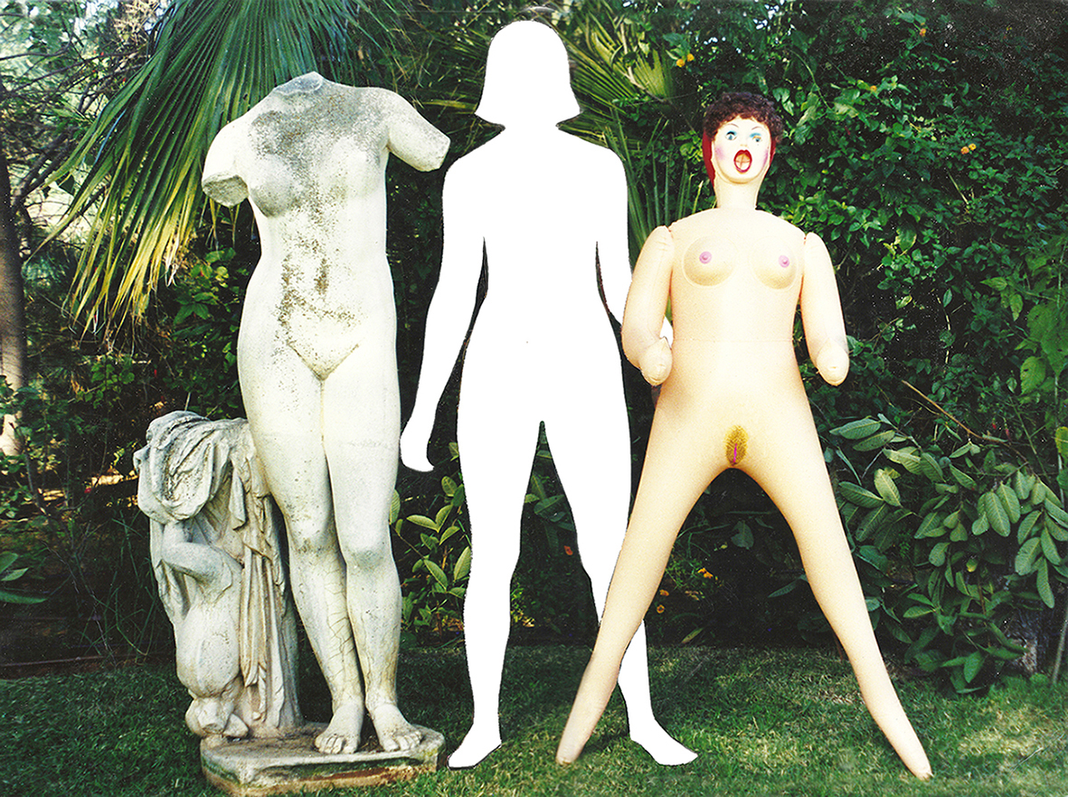
The Trinity (1998) – Analogue Photography
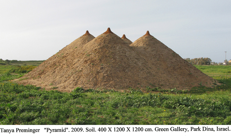
The sculpture consists of four large udders pointing upwards – the answer to the gift of life granted to us by the supreme creator. These four piles of earth are image of a temple, an altar, and the firmament of heaven. They all originate from the large belly of the creator, Mother Nature.
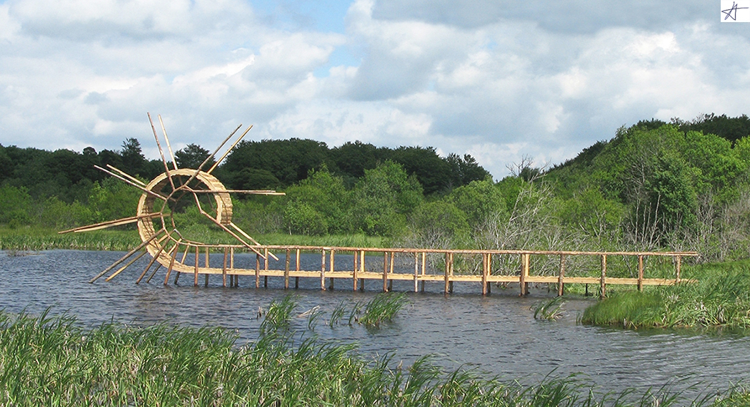
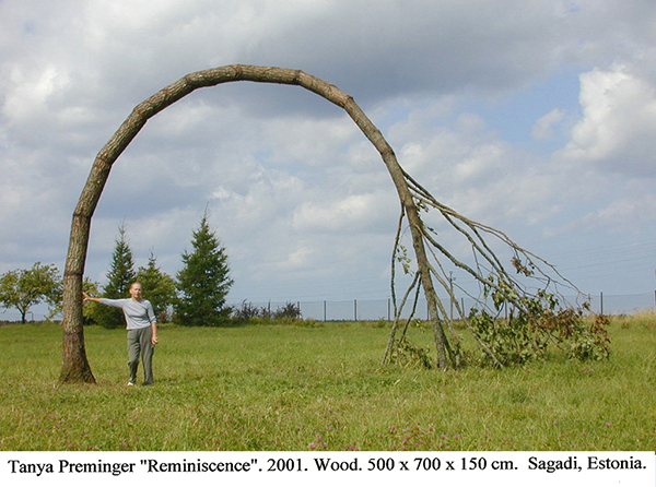
Back Flip Bridge (2009) – Wood (550 x 1850 x 80 cm); Massif du Sancy, France.
The eternal struggle between the sexes.
Curatorial Review
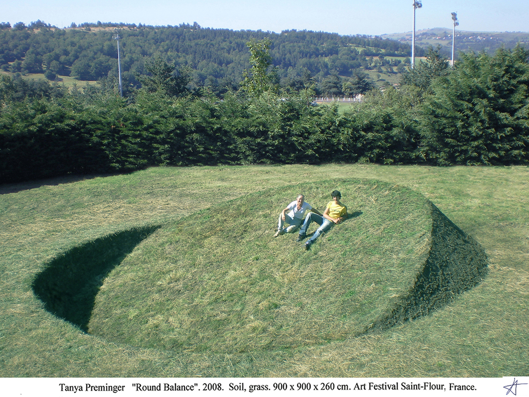
Tanya Preminger is an environmental artist and sculptor who also creates work in numerous other forms of media. In terms of contrast, Preminger’s work utilises this concept extraordinarily well, especially with the work Round Balance (2008).
Round Balance (2008) is a minimalistic yet powerful land artwork. The work is a circular mound that seems inverted from the ground, creating a balance between what is inside the ground and what is above. The title, “Round Balance,” along with the form of the work, suggests a state of equilibrium.
Being a land artwork allows the viewer to become a participant and step into the artwork. As the artwork is meditative and encourages the balance of life- it becomes a space of reflection. As such, the juxtaposition and contrast of the soft and smooth grassy surfaces against the geometry of form embeds this state of equilibrium within it, as previously mentioned. Thus, this suggests the land itself, as a balance, as one side is higher than the other like a scale shows that when one side has more, the other side must have less.
Interview with Tanya Preminger
Growing up in Russia and then later moving to Israel, how has these cultural backgrounds influenced your artistic vision and approach to land artwork?
My student years coincided with period “The Ottepel – 12 Years of Freedom in an Unfree Country.” Students of the Art Institute were allowed to visit the Library of Foreign Literature and look at foreign magazines and books on art. So, even before moving to Israel, I knew about the multifaceted nature of the art world. But six years of sculpting the human body from life influenced my perception of the sculptural form. In the new world of Israel, it took me ten years to find my way of expression. And as is natural for a mother of four, the themes of the works were related to motherhood, giving, feeding, growth, land, life…
Your work ranges from various mediums (including clay, wood, stone, earth and grass). Can you explain which materials you choose for a project and what drives the selection of said material and how the choice of your materials has evolved over time?
Like the themes of the works, the materials were those that I saw around me and which already carried an image and concept close to me.
How do you conceptualise a new land art project and what is the process of integrating the natural landscape into the design?
For me, each work of land art is a part of the body of our planet. Unfortunately, this type of art is not widespread in Israel and I submit my projects to other countries. Therefore, it is impossible to see the installation site before creating a project and often there are problems with adapting a project to a specific landscape.
What are some of the challenges you have encountered during the creation of large-scale land artworks and how have you overcome them?
It is not easy to find a sponsor who is able to see in a drawing or a photograph of a sketch how the finished project will look like.
How do you choose the specific locations for your land art projects? Are there any certain elements to the area you select for a work which you find preferable to the creation of the work?
I have been offering projects that I am confident in to many Land Art Festivals or Residences, but since my Earth projects are expensive projects, this of course limits their acceptance.
How does the natural environment (for example weather) affect the execution and longevity of your work?
The most important thing for creating a sculpture from Earth is the type of soil that moulds well, as well as the people involved. Several people participate in a large project: a curator, a sponsor, an engineer, a bulldozer driver, gardeners. In a foreign language environment, organising mutual understanding among the entire team is the most difficult part of the project. An additional challenge is that Land Art projects need maintenance. Without proper maintenance, they stand for one summer. But for example, my Stratum project in Japan has been standing for 10 years in good condition because the organisers are taking good care of the work.
How do you think about the audience participation or interaction with your works, are there any reactions that have surprised you?
My projects are causing strong emotions and inspiration. Even people that only view the work online express excitement and strong feelings. My land art projects call for interaction, thus people like to climb on my earth projects. On the one hand, it ruins my work, but on the other hand, it is an unconscious manifestation of their wish to personally communicate and get involved in the artistic work. A person you hug with your hands and Earth you hug with your legs. Furthermore, I know some artists imitate my works, I view this also as a manifestation of recognition.
Looking back at your work, which of your works do you feel most connected to and why?
Some of my most powerful works have emerged from a place of pure intuition. These works still surprise me, even though they came from my own hand. Their idea came to me in its entirety. There was no need to look for it. And they are characterized by their conceptual depth and the simplicity of the form.
You mention on your website that you also teach, what do you hope to instil in the next generation of artists?
I taught for 30 years in art schools and institutes. This is also a creative activity. You give away your ideas. You create an artist. And teaching is also satisfying, as is working on your own sculpture.
How has the art world’s reception to the land art movement changed since you began your career?
I do not have many Landscape art works. They are simply more famous. I mainly worked in stone, since stone, as a material, is more accessible, and the space for Land Art is difficult to access. It seems to me that recently fewer large Land Art projects have been created. I think that these days there are more Land Art festivals but the works are more similar to land installation versus the large landscape work that was more common in the past.
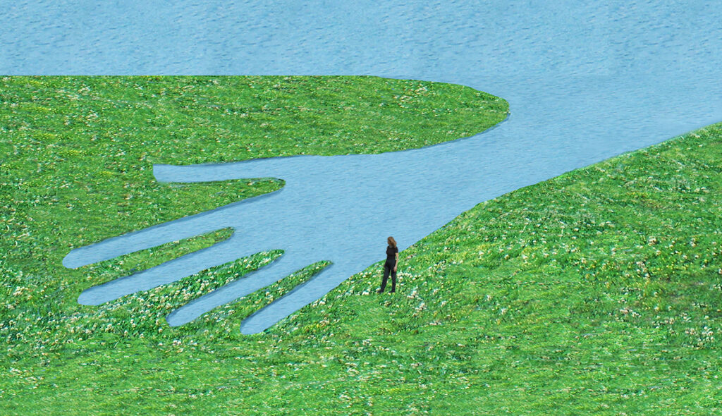
Do you have any upcoming projects that you’re excited to share?
On my computer I have several sketches that I’m passionate about, I’m attaching here one of them. (see below)
Stefanie Carnevale
Artist Statement
Stefanie Carnevale was born in 1977 in Hobart Australia, she studied a Bachelor of Fine Arts at the University Of Tasmania in painting and sculpture (1997). Her work has been exhibited throughout Australia and overseas. Working mainly in painting, she uses nature to show life as a spiritual journey, with a combination of elements representing the interconnected web of life.
The Poetry Of Evolution is a painting that depicts bones re-forming a pattern or structure, the work references the ever regenerating states of nature. The work also shows the great contrasts that can occur in life, between what someone builds and the devastation life can bring, such as loss.
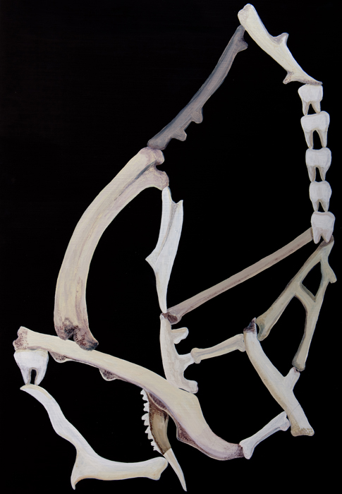
The Poetry of Evolution (2010) – Acrylic on Board
Curatorial Review
The Poetry of Evolution (2010) contrasts well with the black background against the bones, symbolising regeneration. The black background may perhaps symbolise mortality and loss. The skeletal form created by the composition of the bones is a metaphor for the framework of life. Bones are the remains of life and eventually decompose to become new life, which reminds us of rebirth and, therefore, implements a meditative characteristic to the work.
Interview with Stefanie Carnevale
How did your upbringing in Hobart, Australia influence your artistic interests and connection to nature?
Where this started is when I was about 5 years old, I visited an art gallery with my mother. I saw a painting and got a strong feeling I’d be an artist when I was older – you could say I realised it was my fate. Throughout my life I’ve also been greatly effected by the wilderness of Tasmania and have integrated this into my art.
How has showcasing your work both in Australia and internationally impacted your artistic perspective?
I believe it has made me a more experienced artist.
You mentioned life as a spiritual journey through nature; how did you translate this concept into your work?
My art explores the meaning of life, and I use the style and symbolism of nature to depict this.
What inspired you to explore the theme of regeneration and contrast in your work; The Poetry of Evolution?
The Poetry Of Evolution (detail) is a painting that depicts bones re-forming a pattern or structure, the work references the ever-regenerating states of nature. The work also shows the great contrasts that can occur in life, between what someone builds and the devastation life can bring, such as loss.
Bones are central to the work- what do they represent in the context of regeneration and transformation?
In my work bones are symbolic of the framework of life. Bones have the ability to regrow and self-heal, the same as us in our lives.
How does the piece reflect the tension between creation and devastation, such as the contrast between building and loss?
The bones appear in a pattern or re-formation, which represents growth, but the black background shows that there can be devastation in life.
Loss is a recurring theme within your practice, how do you hope that your audience will connect with this aspect emotionally?
I hope people connect with my work on an emotional level through it’s depiction of the natural world.
How has your artistic style evolved over time; particularly in response to your own life experiences?
The work has evolved over time to retain certain symbols and styles, such as bones representing the framework of life.
Do you have any upcoming projects that you’re excited to share?
For now they’ll have to remain a mystery.
Chong Liu
Artist Statement
As a digital illustrator and concept artist immersed in the dynamic world of game development, Chong Liu’s creative journey is a fusion of imagination and technical expertise. His work is a testament to the passion for bringing fantastical worlds to life, and captivating audiences through visually compelling narratives.
In the realm of digital illustration, Chong explores the intersection of traditional artistry and cutting-edge technology. His process involves meticulous attention to detail, utilizing a diverse palette of digital tools to craft vibrant and evocative pieces. Whether depicting otherworldly landscapes, charismatic characters, or intricate scenes, each artwork is an opportunity to transport viewers to realms beyond the confines of reality.
The Flower of War is a powerful digital illustration series that juxtaposes innocence and devastation. It follows a young girl and her loyal pony as they traverse a war-torn landscape. Despite the destruction around her—burning ruins, displaced families, and shattered towns—the girl smiles, a haunting symbol of resilience and innocence amidst misery.
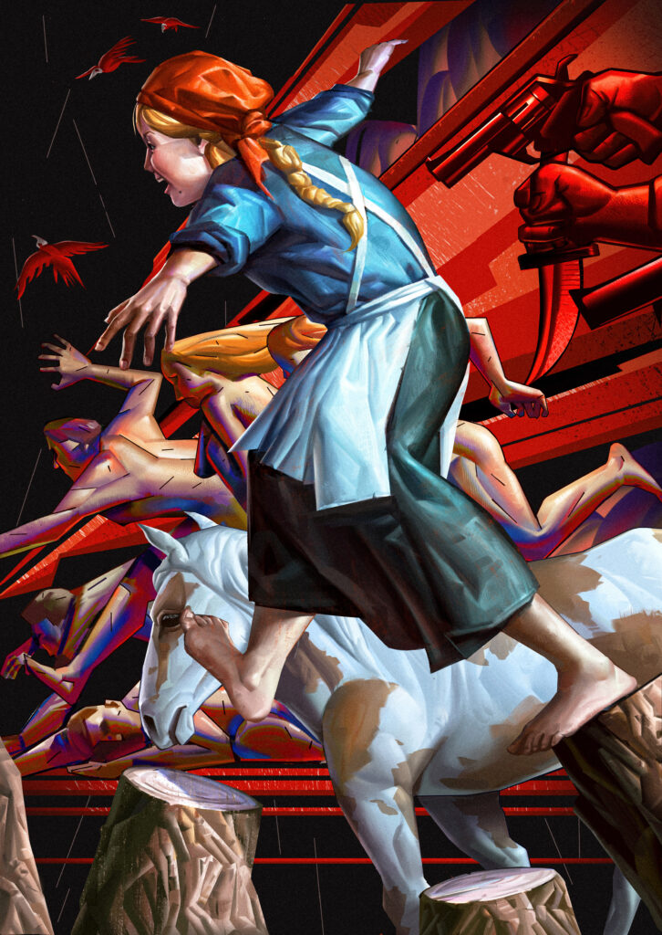


The Flower of War (2024) – Digital Painting
Curatorial Review
The first artwork in the series, “The Flower of War”, juxtaposes (as with the other two artworks in the series) innocence against the horrific reality of conflict, thus showcasing resilience in the face of adversity. In the first work, the girl is moving and does not seem to be discouraged by the chaos and disorientation that is happening in the background.
The background of the work showcases burning ruins, destroyed buildings and figures being murdered or attempting to escape the horrors. Hence serving as a reminder of war being traumatic and horrendous. The background is an active force interacting with the girl as they seem to encroach upon the girl and the pony, which suggests that the girl is vulnerable to war and that their existence is under constant threat of conflict.
The figures in the background look as though their faces have been reduced (though not fully faceless), rendering them in a somewhat ghostly form. Therefore, it can be asserted that this may be alluding to the emotional numbness that war brings in that it doesn’t discriminate and kills, eroding the victim’s personal identities in the ensuing destruction…
Interview with Chong Liu
Can you tell us about what brought you to digital illustration and concept art? What inspired you to pursue those two fields in art?
I began my journey in art and painting during childhood, and it naturally evolved into my career as I grew older. As a devoted fan of Japanese anime, I initially aspired to become an animator. However, while studying art, I discovered that concept art and entertainment design intrigued me more. These fields allowed me to combine my artistic sensibilities with a rational design process.
During college, I remember a class where our professor showed us a video about the production of Blizzard’s Diablo trailer. It was my first time witnessing concept artists at work, helping their teams visualize extraordinary characters and scenes. That moment left a lasting impression on me. Inspired by a strong desire to bring ideas to life and express my artistic vision, I set my sights on becoming a concept artist in the entertainment industry. After years of learning and honing my skills, I achieved my first concept artist role in 2020
While concept art focuses heavily on design and problem-solving, I often turn to illustration as a creative outlet when the demands of concept design feel overwhelming. Illustration allows me to concentrate purely on the art itself, offering greater freedom to express my thoughts, insights, and artistic preferences. I began exploring illustration as a side pursuit several years ago and continue to find joy in navigating both disciplines today.
Can you walk us through the process of creating concept art for a game?
In the game industry, working on concepts might sound exciting, but it’s important to understand that it’s still part of the production pipeline. This means we must adhere to the briefs provided by art directors, ensuring that the art we create serves specific functions or solves particular problems.
The process begins with carefully reading and understanding the design briefs. It’s essential to fully grasp what the director wants, identify any constraints, and, most importantly, know the deadline. Once these aspects are clear, we move on to reference gathering. Often, we compile and present these references to the team to ensure alignment before proceeding.
When we begin creating the concept images, it’s a collaborative effort. We frequently check in with the team, produce multiple design iterations, and rely on the director to decide which concept will be finalized. In conclusion, what sets concept art apart from other art forms is its strong production focus and its reliance on teamwork.
How do you collaborate with other team members (such as the game designers and developers) to ensure that your art aligns with the creative vision of a project?
When working on a specific task, directors and game designers often serve as the front-end collaborators for concept artists. Typically, they provide plans and briefs that form the foundation of our creative process. In some cases, the art director or principal artists will create an art bible for the project, ensuring that all subsequent work aligns with the established style.
However, we interact far more frequently with back-end collaborators, such as 3D artists, animators, and VFX artists. Since the ultimate goal of game development is to ship a playable product, concept artists often need to coordinate with 3D and animation teams to ensure that our designs are both feasible and practical for implementation. For example, if a design becomes too complex or unconventional, it could be extremely time-consuming for the 3D team to model. In a production environment, I strongly believe that a design that is “okay” but workable often holds more value than a design that is perfect in theory but unrealizable in practice.
Going on to your ‘Flower of War’ series, what inspired you to create the work?
Wars and massacres have been a part of human history and, tragically, continue to occur around the world today. I’m fortunate to live far away from war, but watching footage of innocent people losing their homes or soldiers bidding farewell to their families deeply moves me.
Throughout art history, countless works have depicted the horrors of war and its impact on humanity. One of my favorites is Picasso’s Guernica. The painting’s intensity and chaos transport me to that night in Spain, evoking the hellish scene with haunting clarity. Inspired by these emotions and historical works, I decided to use my artistic tools to create an illustration series centered on the theme of war, expressed through my own style.
Are there any specific events or stories from history that have influenced the setting of the work?
My biggest influence comes from the Polish film Hatred (2016), which follows a young Polish woman caught in the ethnic tensions and wars between Poles and Ukrainians. The film powerfully depicts the horrors and devastating impact of war. One of my illustrations in this series is inspired by a haunting scene in Hatred, where the young woman returns to her village after narrowly escaping a massacre, only to find it in ruins—engulfed in flames, with lifeless bodies scattered.
Do you view the girl’s smile as hopeful or as a symbolism of resistance against war or something much more complex?
The smile on her face symbolizes both naivety and sincerity. When planning this illustration series, I aimed to create a strong contrast in emotional expression. Amid the devastation of war, a young woman playing hide-and-seek and traveling with her little pet pony felt like an ideal choice for the main character. Her smile accentuates her innocence, creating a striking contrast against the misery and chaos of the war surrounding her.
Are there any interesting responses you’ve received from viewers on the series?
Yes, the series was exhibited at a gallery in Brazil and won a silver award from the Japanese Illustration Association. It was well-received by audiences, and I’d like to highlight an insightful review from Lucas Leon, a judge for the Japanese Illustration Association, who focused on the artistic elements:
“The way Chong used his painting with futuristic features is incredible. It reminded me of certain diagonals used in Soviet art in its posters. This makes this aesthetic have a deep connection with the atmosphere of terror of war, in an exquisite style of volumes that play with Picasso-style shapes. His works have a very well-worked dynamic force, because of the diagonals of the compositions and the broken volumes of the painting. It is a beautiful aesthetic success, using it to express violence, desperation, tenderness, and the closeness of death.”
This review highlights the unique blend of artistic techniques and emotional depth that resonated strongly with viewers.
How do you hope the series contributes to the wider conversation surrounding the consequences of conflict especially for those who are most vulnerable?
I hope The Flower of War highlights the profound impact of conflict on the most vulnerable, particularly children. By focusing on the young girl and her pet pony, the series invites viewers to empathize with those caught in the crossfire, emphasizing the fragility of innocence in the face of war’s devastation. My goal is to spark meaningful conversations about the need to protect and preserve humanity during crisis.
Laura Bernardeschi Nelson
Artist Statement
In this new artwork, Laura’s captures a deeply evocative and timeless character—one who embodies a rare kind of wisdom that transcends age and is rooted in harmony with nature. The choice of grey hair as a symbol of maturity is particularly poignant, as it suggests a person who has lived and learnt yet who remains youthful in spirit, untouched by the pressures of time. Her eyes, conveying contentment, are like windows into her soul—reflecting not just the wisdom of experience but also the peace that comes from embracing life’s simple joys and truths.
This figure, embodying the essence of a “hippie,” seems to represent an idealised vision of how life can be lived with grace, without the external noise of modernity and materialism. Instead, she finds richness in the quiet moments—whether it’s in a serene connection to the earth or in the profound love and peace she shares with the world around her.
It’s also a powerful commentary on how one can age not as a process of decline but as a deepening of one’s connection to the world and to the self. Ageing gracefully in this context is not just about physical vitality but about the radiant inner energy that comes from living authentically, aligned with nature’s rhythms.
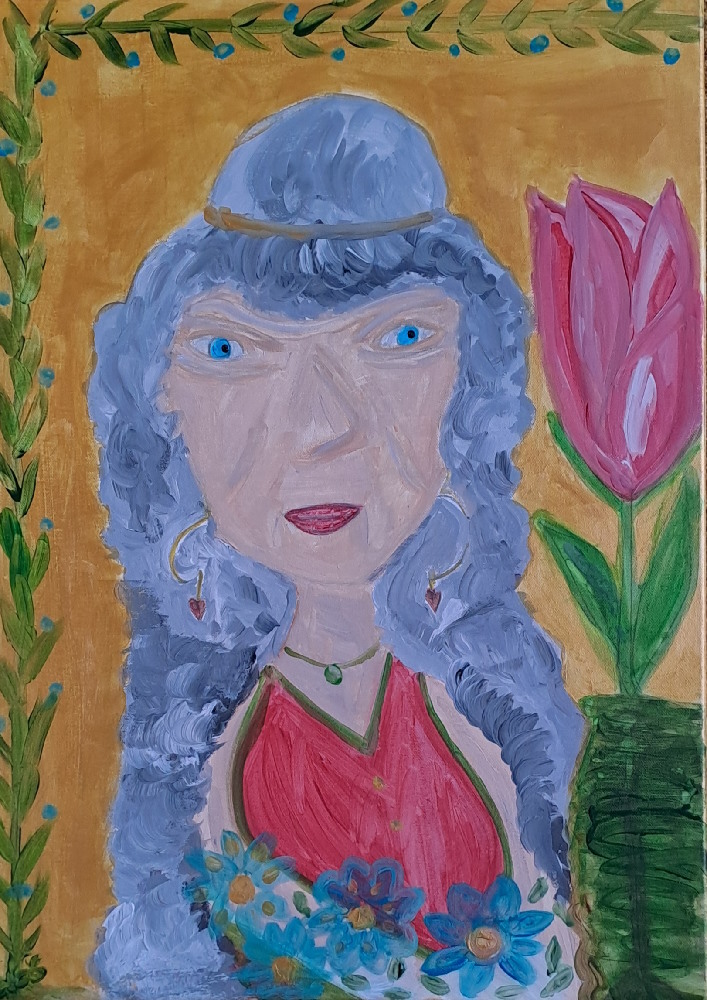
A Forever Young Soul (2024) – Acrylic on Canvas
Curatorial Review
A Forever Young Soul (2024) features a female figure in the centre of the composition, who has been set against a golden background in which the colour emanates wisdom and a warm, welcoming feel. A pink tulip inside of a vase to the side of the woman complements her peaceful demeanour. The flowers at the bottom of the composition are blue and white, which harmonises the woman with the environment.
Interview with Laura Bernardeschi Nelson
What led you to embody the essence of a “hippy” in A Forever Young Soul (2024). Is it from personal experiences, cultural observation or an inspirational vision? Furthermore, what is the process of visually representing this “radiant inner energy” within your work and your work critiques the “external noise of modernity and materialism”- how do you hope the viewer will interpret this message?
In this new artwork, Laura Bernardeschi Nelson’ s captures a deeply evocative and timeless character—one who embodies a rare kind of wisdom that transcends age and is rooted in harmony with nature. The choice of grey hair as a symbol of maturity is particularly poignant, as it suggests a person who has lived and learnt yet who remains youthful in spirit, untouched by the pressures of time. Her eyes, conveying contentment, are like windows into her soul—reflecting not just the wisdom of experience but also the peace that comes from embracing life’s simple joys and truths.
This figure, embodying the essence of a “hippie,” seems to represent an idealised vision of how life can be lived with grace, without the external noise of modernity and materialism. Instead, she finds richness in the quiet moments—whether it’s in a serene connection to the earth or in the profound love and peace she shares with the world around her.
It’s also a powerful commentary on how one can age not as a process of decline but as a deepening of one’s connection to the world and to the self. Aging gracefully in this context is not just about physical vitality but about the radiant inner energy that comes from living authentically, aligned with nature’s rhythms
Aircraft, traffic, and the voices of foolish people engrossed in pointless gossip are all sources of noise in the modern world. However, Laura stopped listening to this constant noise at one point in her life. For her mental health and wellbeing, it is pointless. These days, she is very picky about the friends and time she spends . Often, she would rather work alone in her studio and enjoy the sound of pencils and brushes on paper.
Silence is gold is her new life philosophy.
What truths or values do you believe are often overlooked in todays society that your practice and art seeks to highlight? How has your understanding of both wisdom and ageing influenced your work over time?
Laura has gone through an incredible shift in both her personal life and her art. Her transformation from focusing on abstract art and sales to diving deeper into social issues, self-discovery, and personal empowerment reflects a profound change in her perspective. She’s moved from a more external, perhaps commercial, approach to art to creating with intention, rooted in real-world connection and awareness.
Her daily interactions, especially with people who seem self-centred or harmful, have pushed her to focus on themes like self-love, boundaries, and standing up for what’s right. It’s clear that Laura’s art is now driven by a desire to promote change, to inspire people to look inward, and to reclaim their power. Her bravery in confronting challenges and not letting the negativity of others affect her speaks volumes about her growth. She’s shedding any fear of judgement or criticism, embracing her true self just as freely and unapologetically as her lovely cat.
The image of Laura as someone who is grounded, confident, and clear on what she stands for, both in her personal life and in her work, is empowering. She’s learnt to protect her peace, draw boundaries, and most importantly, to not feel guilty about it. Her commitment to not letting others—especially those who seem intent on bringing negativity or harm—control her narrative is inspiring.
In her art, I imagine she’s likely exploring ideas around empowerment, resilience, and the importance of self-care in a world that can often be draining or toxic. Her message feels like a call to action: to live authentically, to love oneself, and to challenge the forces that try to pull us down.
Igal Stulbach
Artist Statement
Igal Stulbach specializes in photography, documentary films and video art. Stulbach was born in Krakow, Poland to Holocaust survivors and he has lived in Israel since 1959. His artistic career began later in life to which he has creating works such as the documentary in 2015: “Group Portrait” that explores second-generation Holocaust survivor experiences.
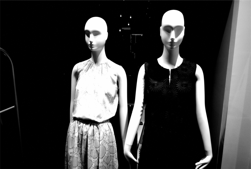
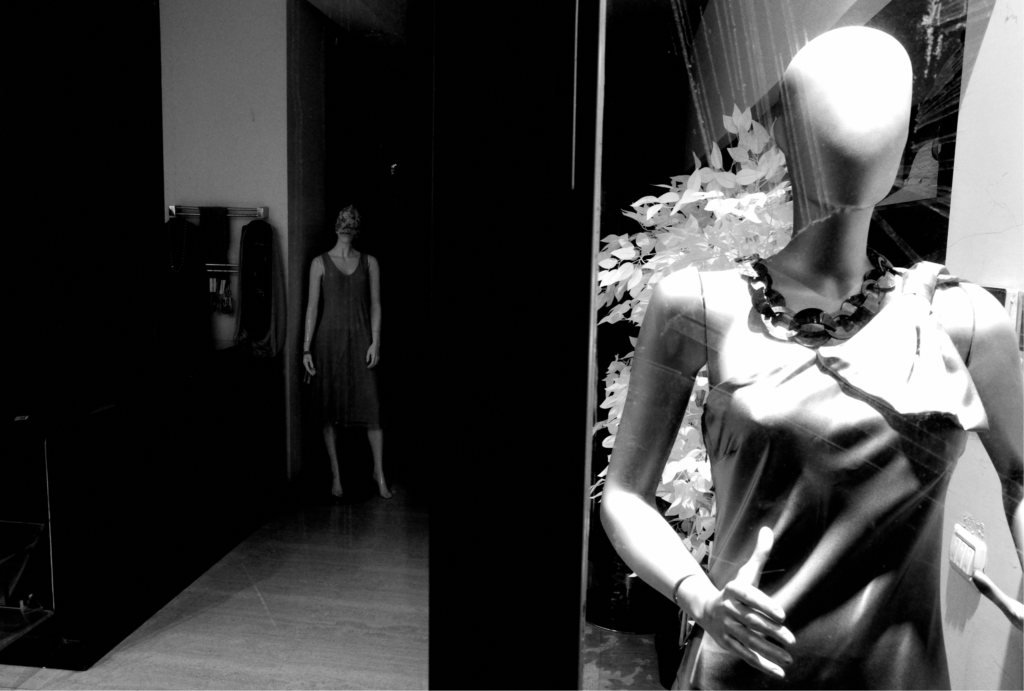
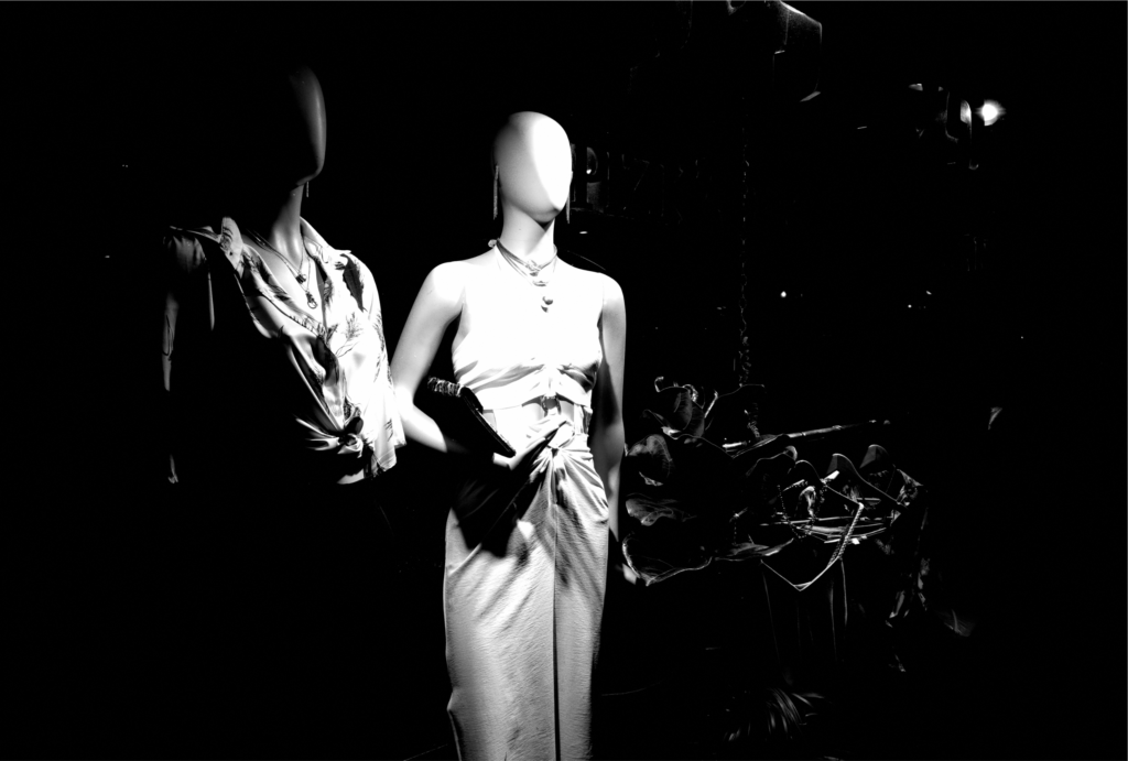
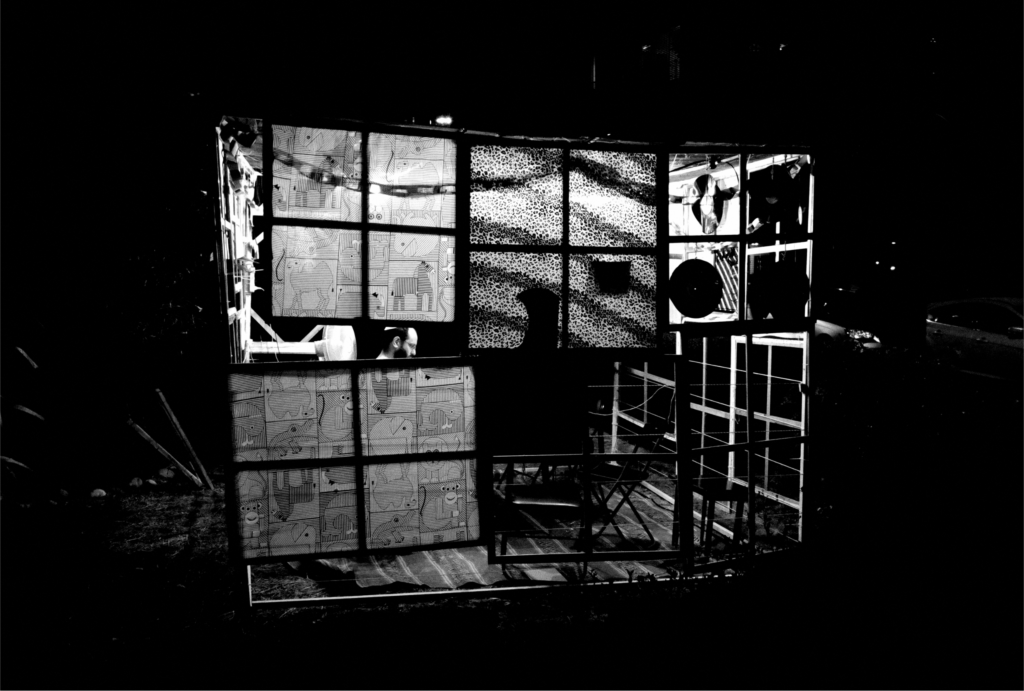
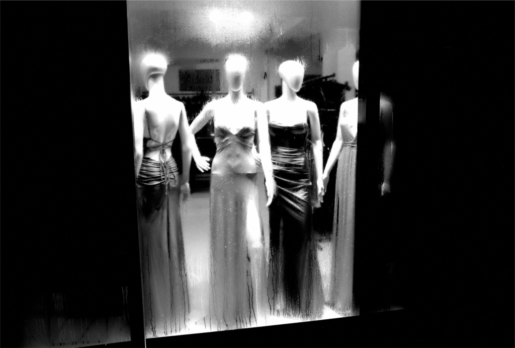
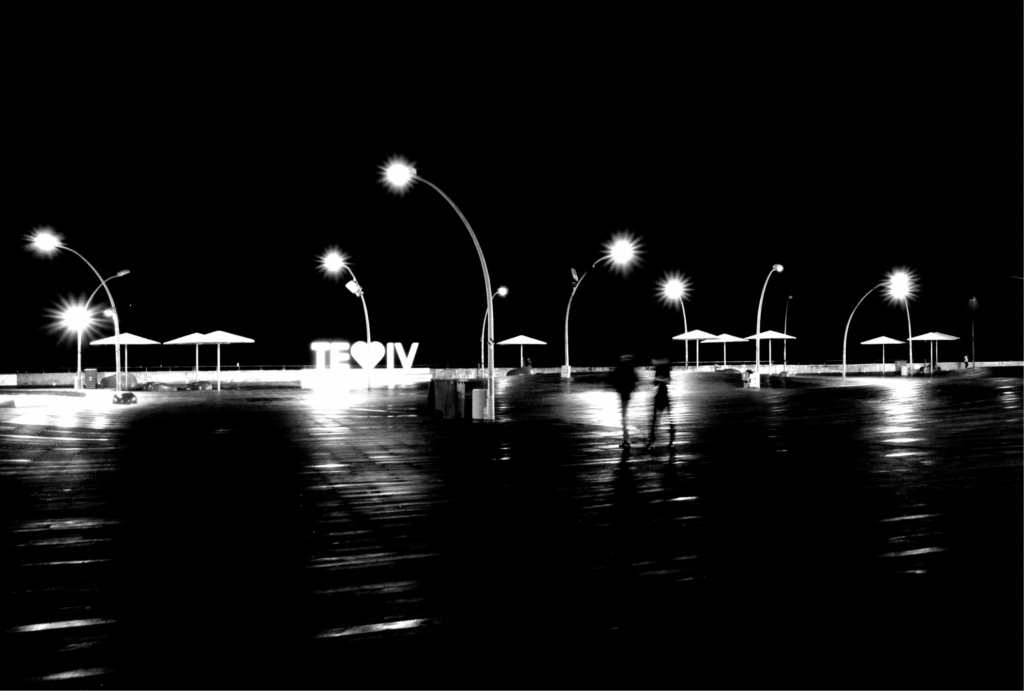
The series presented in this publication explores the streets of Tel Aviv during late autumn nights. The monochromatic black and white photographs have high contrast (which is exemplified by the absence of colour).
The photographs featured in this publication (from first to last) include: Black and White, Back and Front, Shadow, Ladies and Promenade.
Curatorial Review
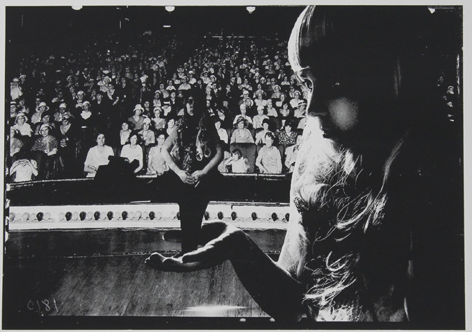
Stulbach’s series Tel Aviv has captured the nightlife in moments of peace against what nightlife usually is (active and vibrant). The high-count, high-contrast photography has stripped the images of their colours instead, bringing the viewer to examine the light and shadow along with the compositional elements of the photos. Furthermore, many of the photographs utilise or replace humans with mannequins, which, due to their materiality, create a reflection of light which glows in the photographs….
Interview with Igal Stulbach
Can you share how your upbringing in Israel and your parents’ experiences as Holocaust survivors has influenced your artistic career and the themes within your work?
My parents were survivors who passed to me feelings of sadness, fear and existential threat. No doubt that this burden influences my art. That is probably also why I started my artistic practice later in life – I was struggling for security and stability before that.
What inspired you to pursue your artistic career later in your life? How has that timing shaped your perspective and creative expression?
I always loved many kinds of art, especially literature, cinema and photography. I regard creating art as an exalted activity. Since a young age, I felt that I had a certain talent for photography, but I did not like the analogue/chemical process, so I started serious photography practice only when it switched to digital. I do not regret the delay because time enriched my intellectual and spiritual endowment.
For the series showcased in this publication; you’ve captured the streets of Tel Aviv during late autumn nights. What drew you to this particular time of day and the theme for your work?
I am a flaneur. I am also a night owl, so night is my preferred time to stroll the streets. I find mystery and poetry at night.
In the series, it seems that the people have been replaced with mannequins. Could you explain why you chose to photograph mannequins rather than people?
I like to explore the sense of ambiguity that photographs of mannequins cause.
What does photography mean to you as a medium compared to video art or documentary filmmaking?
Photography is the most personal and easy way to express and observe the world. It enables you to catch the essence of something in one image; I think it is a kind of poetry.
Are there any photographers, filmmakers or artists that have inspired you? And why?
Many photographers and filmmakers have inspired me, but I don’t follow anyone directly. Among the photographers are Lee Friedlander, Daido Moriyama, Harry Callahan, and more. Filmmakers I especially like are Jim Jarmusch and Wim Wenders.
On your website you have another series of Tel Aviv nightlife in colour. Why did you choose to take this series in black and white? Does the absence of colour contribute to the mood?
I like experimenting. Every project is a new adventure with different rules and styles. The absence of colour probably contributes to the melancholic mood, but I like colours, too; they reflect other parts of my personality.
What do you hope viewers take away from the atmosphere of your series?
I think that I want to share my inner world with the viewers.
Do you have any upcoming projects that you’re excited to share?
In recent years, I have mostly been doing photography. Now, I am making preparations for a documentary film project.
Guanhua Yao
Artist Statement
My work as a photographer, educator, and qualitative researcher is deeply rooted in exploring the boundaries of human perception and imagination. Drawing from surrealism, fine art, and documentary photography, I strive to capture the extraordinary within the mundane, creating visual narratives that challenge conventional thinking and ponder the intersection of imagination and reality.

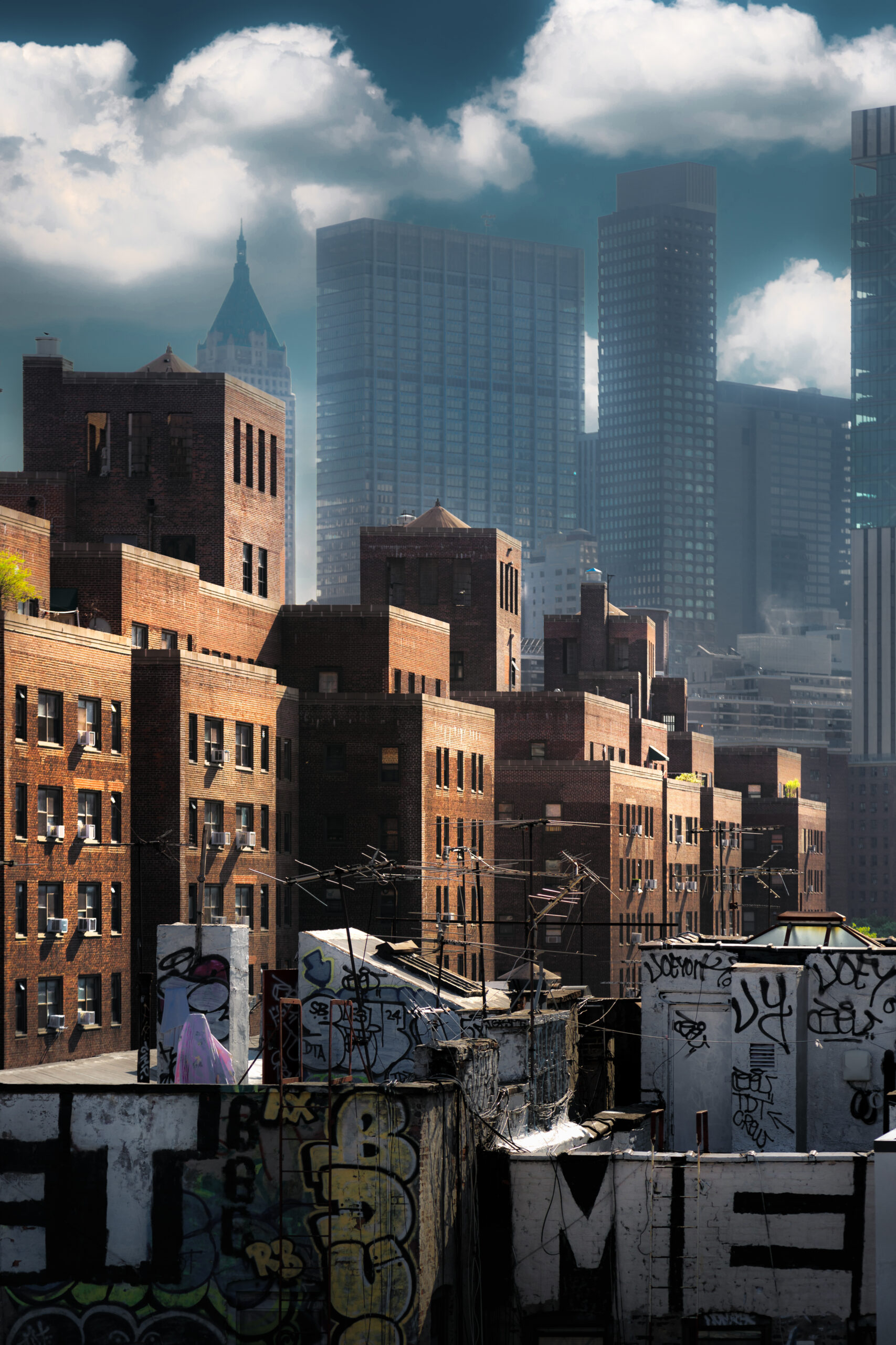
New York (2024) – Digital Photography
New York’s long history is encapsulated in this street, where the historic buildings nearby stand in sharp contrast to the towering skyscrapers in the distance. The solitary figure walking by highlights the city’s supposed liveliness.
Curatorial Review
New York (2024) is a well-composed photograph in that it is clear that Guanhua Yao has paid attention to the light, framing and colour grading. The colour composition of the work is earthy, with warm orange-browns that come out of the historic brownstone buildings. In contrast, the much more modern skyscrapers contrast these brownstones with their cool blues and greys. The area in which this photograph was taken consists of the two periods of architecture from New York’s history while also showcasing the contrasts of the two eras through warm and cool colours.
The photograph has a very cinematic feel. The solitary figure in the centre of the composition captures the viewer’s eye as it juxtaposes the supposed busyness of New York. The smallness of the figure compared to the buildings around them also alludes to a meditative emotion. The viewer can picture themselves in the photograph, especially as it seems that the picture may have been taken at a much earlier part of the day.
Yao’s statement mentions the “extraordinary within the mundane”, which is captured through the photograph when taking the solitary figure in a supposedly busy city in context. The photograph thus feels as though it has frozen the city, withholding human interaction, allowing the viewer of the work to slow down when reflecting on usually fast-paced city life.
Overall, the photograph captures the great contrast between the old and the new in the context of its architecture while also capturing a scene in which what is usually a busy city has been reduced to a meditative scene in which there is only one figure left. This helps to turn it from a bustling city to a contemplative area in which one slows down.
Interview with Guanhua Yao
You mentioned in your statement that you are drawn to surrealism. What is it about surrealism that influences your work and are there any specific artists from that movement you are inspired by?
Surrealism intrigues me because of its ability to unravel hidden layers of reality and evoke subconscious emotions through unexpected juxtapositions. It inspires me to explore fragmented identities and reimagine the boundaries of perception. I draw particular inspiration from René Magritte’s play with illusion and meaning, as well as Man Ray’s experimental approach to photography, both of which challenge conventional visual narratives and deepen my exploration of constructed realities.
When working on a project, how do you approach the mundane? What is the process that transforms them into a visual narrative?
I approach the mundane by seeing it as a source of hidden beauty and meaning. Photography lets me capture light, texture, and time in a way that reveals something new about ordinary moments. By focusing on overlooked details and reframing them, I turn the everyday into a visual story. This process transforms simple scenes into something deeper, showing that even the most common moments can hold unexpected richness.
Are there any personal experiences or moments that have helped shape your perspective as a photographer and researcher?
My background in architectural photography taught me to see space as more than structure—it’s a reflection of identity. Teaching visual storytelling helped me understand how different perspectives shape narratives, deepening my interest in cultural context. Additionally, my research on identity and postcolonial theory has influenced how I use photography to explore and reconstruct personal and cultural narratives. These experiences guide my work, blending art with deeper inquiry.
You mentioned that you are a qualitative researcher; how does this influence or inform your photography or vice versa?
As a qualitative researcher, I focus on understanding experiences and uncovering hidden meanings, which directly shapes my photography. I approach both with the same curiosity—observing details, finding patterns, and telling stories. Photography, in turn, sharpens my observation skills and helps me embrace ambiguity, allowing me to explore identity and culture in a personal and analytical way.
Do you see New York as a recurring subject in your practice and what does New York mean to you?
To me, New York symbolizes both diversity and connection—it’s a place where different cultures, histories, and identities collide, and where individual stories intersect with the collective narrative. Its urban landscapes, full of contrasts and contradictions, mirror the complexity of identity and existence, making it a rich source of inspiration for my work.
Where there any technical choices (editing, lighting (time of day) or perspective, etc.) that are crucial in achieving the mood of the photograph? If not, do you do anything to your photographs after taking it and what is the process behind that?
The light at different times of the day often inspires me. I usually work with the existing light rather than waiting for it to change. In post-production, of course, there’s much work to be done, such as reshaping the light and shadow, among other things.
Do you have any upcoming projects that you’re excited to share?
I am working on a portrait series that will be presented with a relatively detached, film-like or analogue atmosphere. The focus is on reflecting the state of the individual. The creative approach returns to the purity of photography itself, rather than an interdisciplinary approach.
Sonia Trevisan
Artist Statement
Sonia Trevisan is an artist, painter and ceramic sculptor based in the Welsh Borders. Her artworks celebrate the beauty, magic and power of nature, aiming to instill both awe and anguish. Through her art, Sonia seeks to raise awareness of environmental issues and urges viewers to admire the beauty and complexity of the natural world.
Inspired by poetry, natural sciences and her surroundings, Sonia explores the intricate dance between life and death, the impact of society on the environment, and the resilience of the natural world. Through her evocative paintings and ceramic sculptures, she showcases the wonders of nature, from the tranquil British countryside to the raw forces that shape Earth. Her contrasting forms highlight the tension between fragility and strength, a visual echo of the natural worldʼs ability to endure.
Her latest project, Chaos & Balance, explores the delicate interplay between destruction and renewal in the natural world. Inspired by the forces of tectonic shifts and volcanic eruptions, the artworks showcase the power of nature to both create and destroy. The collection of ceramic sculptures and watercolour paintings evoke images of both devastation and rebirth, highlighting the interconnectedness of these seemingly opposing processes.
Through the destructive yet creative forces, the dramatic forms aim to inspire contemplation on the cyclical nature of life and the resilience of the natural world. Chaos & Balance serves as a reminder of the interconnectedness of the environment, and invites viewers to admire the beauty and complexity of nature.
Surge & Stillness (2024) – Watercolour
Highlighting the rugged textures of lava cooling, the watercolour painting Surge & Stillness captures the raw energy of nature. The vibrant watercolour invites viewers to admire the astonishing beauty and destructive power of natural forces.
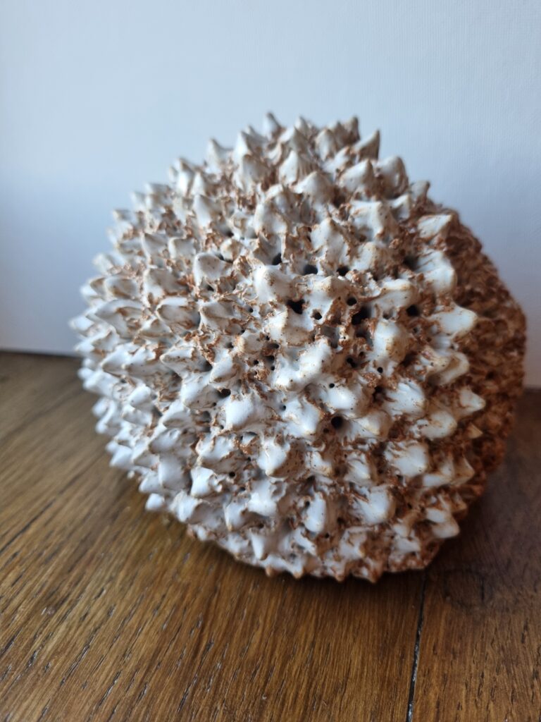
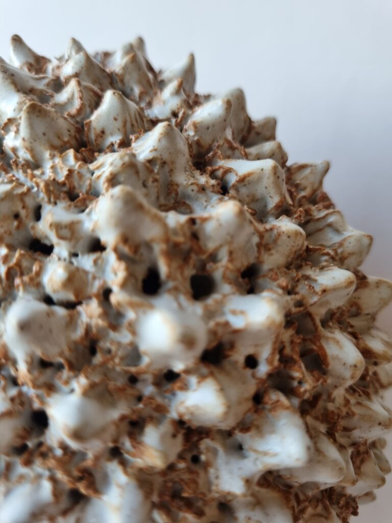
Eruption & Creation (2024) – Ceramic Sculpture
The ceramic sculpture Eruption & Creation captures the devastating power and awe-inspiring beauty of a volcanic explosion. The dramatic artwork showcases the dynamic interplay of destruction and renewal, and explores the paradoxical nature of volcanic activity.
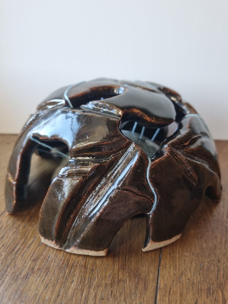
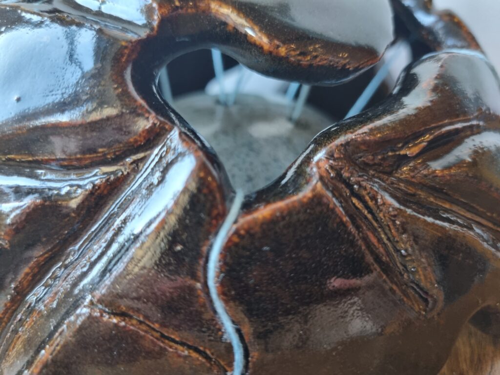
Quake & Threads (2024) – Ceramic Sculpture
Inspired by tectonic shifts, the ceramic sculpture Quake & Threads highlights how the geological phenomenon is essential to life on Earth. The intriguing artwork evokes a sense of both destructive power and delicate balance.
Curatorial Review
Surge and Stillness (2024) is a watercolour painting that successfully replicates the rawness and power of volcanic tension through the flow of the lava and its clashing with its cooling and the creation of rock at the end.
There is a great contrast between the lava cooling (and the resulting rock) and the vibrant, fiery tones of the viscous lava. This, therefore, has captured the energy of the natural process of volcanic activity through the violent creation of magma freezing into basalt….
Interview with Sonia Trevisan
You live in the countryside; how does your surroundings influence your artistic practice, particularly in regards to your exploration of nature’s resilience and fragility?
My countryside surroundings deeply influence my art and inspire me to create work that reflects the resilience and fragility of nature. For my project ‘i am water’, I was drawn to the Wye River and Broadmead Brook, a local stream. Witnessing the sheer power of the river influenced my understanding of water as an indomitable force and informed the dark and mysterious forms I created.
Similarly, for my project ‘Dead & Reborn’, the neighbouring woodlands provided invaluable inspiration. Observing the intricate interplay of life and death, with fallen trees providing sustenance and shelter, deepened my understanding of the cyclical nature of existence. This concept of renewal and interconnectedness became a central theme in my artworks.
For my latest project ‘Chaos & Balance’ exploring volcanic and tectonic activity, finding direct inspiration in my surroundings proved challenging. However, Corsica, with its dramatic volcanic landscapes, provided a powerful visual when I visited. Witnessing the power of geological forces first-hand further solidified my fascination with the constant interplay of chaos and renewal within the natural world.
How do the natural sciences inform your work, especially when addressing tectonic shifts and volcanic eruptions?
My artistic practice is informed by my fascination with geology and geophysics. I find the intricate mechanisms that govern our planet awe-inspiring.
For my recent project ‘Chaos & Balance’, I studied volcanoes and tectonic shifts. My research revealed not only their destructive power but also their crucial role in creating the conditions for life. I was particularly intrigued by how these chaotic events ultimately lead to renewal and the emergence of new ecosystems. This informed the contrasting imagery within the series.
Similarly, my previous project ‘i am water’ was influenced by my studies on water erosion and its impact on landscapes. By exploring the geological process, I admired the immense power and transformative nature of water, inspiring the confident forms in my artworks.
You’ve mentioned that you are inspired by poetry; are there any specific poets or work of poetry that have inspired you and why?
Poetry plays a vital role in my artistic process, serving as a wellspring of inspiration and a catalyst for exploration. I’m particularly drawn to poets who explore themes of nature and activism.
Rupi Kaur’s poem ‘i am water’ influenced my project of the same name. The poem’s emphasis on both the softness and the strength of water, particularly as it relates to women, became a focus for my exploration of river erosion and its transformative power.
Similarly, Lawrence Ferlinghetti’s ‘A Vast Confusion’ inspired my project ‘Dead & Reborn’. The poem’s recognition of the essential role of death in the cycle of life, inspired me to investigate the impact of dead trees on the ecosystem, highlighting their contribution to the ongoing cycle of renewal.
During your creative career, has your perspective on art changed since the start? If so, how?
Initially, I simply captured the aesthetic beauty of nature through traditional landscape paintings. However, following my foundation degree, I started incorporating my environmental values into my art. I began to see my art as a vehicle for raising awareness about environmental challenges and highlighting nature’s vulnerability and resilience.
I now strive to evoke a deeper emotional response in viewers, not just admiration but also a sense of awe and fear. My art is no longer solely about creating aesthetically pleasing landscapes; it has become a powerful medium for conveying urgent messages about the need to protect our planet.
How do you hope your art raises awareness about environmental issues?
By showcasing the beauty and fragility of the natural world, my art aims to raise awareness about urgent environmental challenges, such as climate chaos and chemical pollution. I hope to evoke empathy in viewers, fostering a connection to nature and inspiring them to consider their own environmental impact.
Emily Greenwood
Artist Statement
My aim is to produce visually stimulating silkscreen prints that intrigue the viewer and hopefully enable them to establish a narrative for themselves. Although I do have my own reasons behind each work and know what it means for me, I do not wish to give an obvious explanation for the work as I created it to remain ambiguous. I created the works as a series, and with the intention of them being viewed as a sequence, although they can also be interpreted as individual images.
My work explores the notion of dreams and hallucinations, or scenarios that could represent either of these. This stems from a fascination I have with listening to people’s interpretations and recollections of their own dreams, and the bizarre inner workings of our subconscious. When we dream we have no control over what our minds choose to show us, and I like to play with this vulnerability. As my work has changed and developed, I have built upon a ‘character’ as a way of creating a protagonist which appears in nearly all the works, sometimes multiple times in the same print.
This evokes ideas surrounding doppelgangers, identity and ambiguity. I often work with vintage photographs/retro imagery, taking images from theatre, cinema and the domestic setting, acting as a reference to memory and the past. I take inspiration from a variety of artists, mainly photographers of the surrealist tradition such as Francesca Woodman, the film work of David Lynch and Louis Bunuel, and the collage juxtapositions of Sigmar Polke. All of these artists work with narratives and play on ‘dream stories.’
My prints are all in greyscale, which I chose deliberately to evoke themes of memory and the past. I think each one has contrast as not only are they visually contrasting, but I play on the contrast between reality and the sub-conscious.
Smoke and Mirrors (2014) – Silkscreen Print [Part of Series: Smoke and Mirrors]
Curatorial Review
Greenwood’s series “Smoke and Mirrors” (2014) explores the subconscious, memory, and identity through the use of surrealist vintage imagery. Through monochromatic silkscreen prints, Greenwood creates a form of nostalgia and a mirror into the past, which allows the viewer to interact with the artworks by creating their own interpretations and perhaps entering the work themselves.
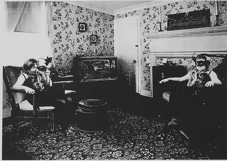
Emily Greenwood’s first work on the page brings the viewer to a domestic setting—a room that is usually a place for safety and the main space of a home. However, it has been distorted—it looks as though two of the same person are inside the work facing each other in a somewhat mirrored way. The two seemingly look at each other, creating an uncertain atmosphere, while the retro television plays an indiscernible film or show (however from the series we can understand that what plays on the TV is what is on the next print)…
Interview with Emily Greenwood
Francesca Woodman, David Lynch, and Sigmar Polke are some of the artists you are inspired by. What about these artists have inspired you?
All of these artists work with narratives and play on ‘dream stories.’ Woodman in particular worked with role-playing and self-portraiture, which I have adopted in my own practice. I also love the collage juxtaposition of Polke’s work.
What about the physical qualities of silkscreen printing (such as the texture, layering and imperfections, etc.) help to convey the themes you explore in your work?
I think the process of printing adds to the vintage feel of my work in a way that other mediums, such as photography doesn’t quite capture. Each print is slightly different which I like, I also really enjoy the process of creating each screen and seeing it in print form. There is something about it that makes the works look older than they actually are.
Moving on from silkscreen printing- have you experimented with other mediums or techniques other than silkscreen- how has it gone? What do they compare to silkscreen?
I briefly tried displaying the works as stand alone photographs – as I said above, I enjoy the printmaking process and like the ability to play around with colours/textures in a way that Photoshop cannot achieve. I have also tried making a short film which I enjoyed but I think the stand alone images are more open to other people’s interpretation which I always like hearing.
Are there any limitations or rules you impose upon yourself when working with found imagery? What qualities are you looking for with found imagery for your work?
I try not to use anything with people in (aside from myself) and look for anything that fits the vintage/cinema setting. I like to use images that unnerve people in some way or look generally ‘odd’, just as they would be in a dream.
You’ve mentioned that you are fascinated by other people’s recollections of their dreams. Are there any recent dreams or stories that have influenced your work lately?
COVID19 influenced my work massively. I had an elderly relative in hospital with COVID and made a couple of pieces that reflected a feeling of being ‘trapped.’ Also not being able to physically make prints during that time was difficult as I was totally emersed in my work in the NHS.
What is the most memorable interpretation of your work by a viewer?
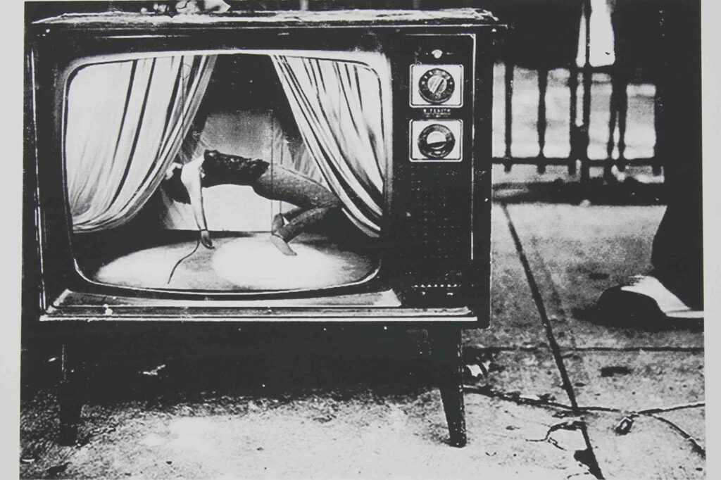
Probably a response I had to the second work in the series, which features myself inside a TV on stage, being held up by puppet strings and being operated by an anonymous figure. People have said they view it as a metaphor for being ‘puppets to the media’, which wasn’t my intention but I can see why people would draw that conclusion.
Outside of David Lynch and Luis Buñuel; are there any particular films or literary works that have inspired the dreamlike themes within your work?
I am also inspired by writers including Angela Carter and Gabriel Garcia Marquez who explore fantasy and ‘adult fairytales.’ I really love Christiane Cegavske as she uses stop motion and her work has a nostalgic feel to it. It reminds me of Bagpuss which I used to love watching as a child. And of course Alice in Wonderland by Lewis Carroll.
Could you share an example of one of your own dreams that have inspired one of your works?
I’ve had plenty of dreams about running away from someone, falling and being watched by someone in my sleep. Some of my pieces show a nod to this as the characters shown are often watching something or being watched.
Do you have any upcoming projects that you’re excited to share?
At the moment I’m concentrating on exhibitions, I’ve had a few online ones recently and have also entered the Royal Academy summer exhibition. I’ve also got an upcoming exhibition at Boomer Gallery in London which I’m quite excited about as I’ve never exhibited there before.
Threshold Lab
Artist Statement
Threshold Lab explores the intersection between technology and culture, examining their shared boundaries. It is a dynamic collective of six artists from diverse backgrounds in Interactive Arts, Architecture, Computer Science, and Technology Innovation, based in the USA and China. Their interdisciplinary approach combines creativity and technology to foster dialogue and drive transformative change between humans and AI.
ARTISTS IN THE THRESHOLD LAB
Amo Zeng
Amo is an digital artist who is into visualizing the invisible – she focuses on the connection between the virtual and physical presentation of the human body and gesture. She crafts interactive projections that transform the human body into a canvas and projection light into paint, establishing an intimate connection between her messages and the audience. Her works involve com puter vision, artificial intelligence, code, sensors and projection.
Ziwei Ji
Ziwei Ji is a new media artist and creative technologist who graduated from NYU’s Interactive Telecommunications Program (ITP) in 2023. Drawing inspiration from scientific facts, she applies computational techniques to craft surreal scenes and explores alternative ways to narrate the reality we inhabit.
Xiesiyuan Shu
Xiesiyuan Shu, a multidisciplinary designer specializing in landscape design and user experience design. Her work is deeply rooted in the integration of physical and virtual realms by leveraging 3D modeling, computer vision, and artificial intelligence. Drawing inspiration from social issues, traditional culture, and the intricate relationship between humans and nature, Xiesiyuan creates innovative and impactful designs. Moreover, Xiesiyuan’s artistic talents have earned her several prestigious international awards.
Devu
Devu is an AIGC multimedia designer, creative technologist and digital artist who focuses on the intersection of art, technology and culture. Devu is passionate about excavating cultural elements and transforming interactive experiences to make modern interpretations; Devu also immerse into connecting multimedia and AIGC-related technologies to expand the boundaries of perception and creative possibilities.
Yin Li
Yin Li is a multidisciplinary designer and product manager whose work traverses digital, physical, theatrical, and artistic experiences. Focusing on the nuanced intersection of emerging technologies and human connection, Yin creates immersive experiences that bridge the tangible and intangible. By integrating tools like artificial intelligence, interactive media, and spatial design, their work fosters a meaningful dialogue between audiences and their environments.
Sirui Li
Li Sirui specializes in interaction and spatial design, with a strong expertise in integrating data analysis and visualization. He brings a unique perspective to information visualization and demonstrates a deep interest in emerging technologies. Passionate about exploring the fusion of new technologies with design concepts, he strives to create works that highlight societal issues and inspire contemplation about the future.

Sweat for Generation – Experiencing the Labor Unseen (2024)
“Sweat for Generation – Experiencing the Labor Unseen” transforms AI’s effortless facade into a raw display of human labour, revealing the hidden power consumption behind seamless digital interactions we exploit daily. Participants turn the hand crank intensely to generate a single query, exposing the resource-demanding process masked behind. A single AI query materialises as hours of sustained physical exertion- sweat, muscle strain, raw human effort powering complex machine learning models. By bodily mapping the energy economy of AI, the artwork exposes data centres, global supply chains, and mineral extraction obscured by digital interfaces. They challenge audiences to confront the true cost of digital convenience and reflect on the abuse of it.
Curatorial Review
When first viewing the work, Sweat for Generation seems like a simple contraption. Yet, as you get closer, you will realise that the work is a prompt page for ChatGPT connecting to a hand crank. Above the contraption, there is what looks to be paper or a receipt coming out of it, which seems to represent the response from the prompt…
Interview with the Threshold Lab
How do you feel that Sweat For Generation helps to change audiences’ perceptions of AI and its energy economy?
Sweat For Generation challenges audiences to rethink the energy economy of AI by creatively tying human effort to machine intelligence. It reframes AI’s energy consumption — often perceived as intangible and detached — into something directly relatable: physical human labor. By integrating bodily sweat into the process of powering AI systems, the project creates an immediate and visceral connection between the human body, the energy economy, and the output of machine intelligence.
Can you share the collaboration process within the Threshold Lab? What is the process of creating an artwork collaboratively?
At the start, each of us wrote a proposal based on our interests, and we voted on the most exciting topic. From there, we brainstormed and held weekly meetings to ensure steady progress. Coming from different disciplines, we each contributed our expertise, taking on tasks that aligned with our strengths. When challenges arose, we worked together to brainstorm solutions and move forward as a team.
Going forward from the previous question- what was the process behind the “Sweat for Generation” work?
We’ve all seen AI’s rapid rise, with new tools emerging daily and people eager to try them out. But this accessibility comes with deeper issues—inequalities, misuse, environmental impacts, and the burden some bear from others’ usage. As artists, we feel strongly about reflecting on these dynamics, creating work that bridges divides and questions AI’s broader implications. Through discussions and iterations, we’ve crafted work that embodies these complexities and continues to evolve conceptually and in its forms of expression.
How do you think that art can be used to contribute to a conversation surrounding ethical uses of current technology and potential future technologies that may appear?
Our work aims to draw attention to the advent of new technologies, particularly AI, and the deep-seated issues of computational power waste and energy consumption that often accompany them. Behind many of today’s technologies lies significant resource consumption or waste. We hope for a future where technologies become more efficient and precise, while acknowledging that the development of any new technology inevitably involves resource expenditure. This is a reality that should not be overlooked. Through our project, we seek to inspire reflection on how technological advancements can balance innovation with sustainability, ensuring that progress does not come at an unsustainable cost to our environment.
(To Amo Zeng) What does it mean to “visualize the invisible”? How does this concept guide your work?
Visualize the invisible means to visualize the subtle connection between the reality and the virtual. I enjoy projects computer generated images (the virtual) on existing object in reality like human bodies, books, ceramics.
(To Amo Zeng) How has working with advanced technology (the computer vision, artificial intelligence, etc. for example) influenced your creative practice over time?
I’ve been using some computer vision techniques, mainly OpenCV to track objects or moving body gestures in space and generate images based on it with tools like openFrameworks, Kinect and Unity. Creating art with these tools has been giving me surprises since bugs in artwork sometimes give a more interesting output than what you planned at the beginning.
(To Ziwei Ji) What does “narrating the reality we inhabit” mean to you, how do you approach and showcase this through your art?
I believe reality has multiple layers, many of which are not directly perceptible to us. I use technology as a tool to uncover these hidden dimensions of realities, and art as a medium to bring them into perceptible form. For example, in my project Re-Landscape, I collected soil data using sensors and translated the land’s unseen dynamics into the movement of a sculpture. Through this process, technology reveals the unseen reality, and art constructs a tangible way for us to experience it.
(To Ziwei Ji) What role does audience interaction have in your surrealist storytelling?
It depends. In some installations, I use interaction as a gateway to invite the audience into the scenario. I love sharing speculative topics with the audience and seeing them begin to debate and exchange ideas.
(To Xiesiyuan Shu) Can you share how landscape and user experience design influences your processes of merging technology and art?
Both designs are disciplines that merge technology and art. Landscape design transforms physical spaces into functional and aesthetic environments, blending natural elements with artistic vision, enhanced by technological tools for visualization. UX design, on the other hand, shapes digital environments by focusing on intuitive and engaging user interactions, where technology drives innovation while art ensures aesthetics. Together, these fields demonstrate how art and technology can collaborate to enhance both physical and digital experiences.
(To Xiesiyuan Shu) How has receiving international awards influenced your practice? What is the most memorable award you have won and what was the project behind it?
Receiving awards is both a form of recognition and a source of motivation for me. They inspire my practice and encourage growth. The most memorable award I’ve received is the UX Design Award, as it was the first international award I achieved.
(To Yin Li) How do you view the role of technology to enhance human connection?
I see technology enhancing human connection in three ways. It allows us to connect more tangibly and instantly through tools like video or immersive spaces, while expanding our sensory experiences with greater depth, richness, and new dimensions. At the same time, it introduces challenges that encourage reflection and foster deeper intellectual connections.
(To Yin Li) How do you design immersive experiences which encourage audiences to engage more with their environments?
Drawing on my background in spatial and stage design, as well as various art forms and digital technologies, I craft experiences that spark curiosity and meaningful connections with the environment, emotions, and people. Each experience is a dialogue, encouraging exploration and deeper reflection on the dynamics at play.
(To Devu) How do you utilise AIGC technology in your practice,what challenges do you face with this medium,and can you explain the process behind using it?
In my practice,AIGC serves as both a creative partner and a catalyst for innovation.I use it to explore themes of human experience and societal dynamics,generating initial concepts that I refine through iterative collaboration.The process begins with carefully crafted prompts that guide the AI’s output,which I then sculpt into cohesive artworks.This approach allows me to rapidly prototype ideas and experiment with forms that traditional methods might not easily achieve.However,the medium’s reliance on data means it can sometimes produce outputs that lack emotional depth or cultural nuance.Balancing the AI’s efficiency with the need for authentic human expression is an ongoing challenge.I address this by critically evaluating each output,ensuring it aligns with my artistic vision and ethical standards,ultimately creating works that bridge the gap between technology and human creativity.
(To Devu) What inspired you to explore the intersection of art,technology,and culture?
The intersection of art,technology,and culture fascinates me because it represents the cutting edge of human expression and understanding.Art has always been a reflection of our collective consciousness,while technology offers new ways to explore and expand that consciousness.By combining these realms,I aim to create works that not only captivate but also provoke thought and inspire empathy.
(To Sirui Li) What are some of the societal issues that you are most passionate about addressing throughout your projects?
I believe that art serves to uncover societal issues, while design aims to solve them. In the context of rapid technological advancement, I am deeply concerned about whether we have overlooked the negative impacts of technology and the accompanying resource waste. This is precisely the perspective our project seeks to convey. While the revolution of technology is undeniably urgent, it is equally crucial to carefully consider the potential negative consequences that lie behind it. We hope to inspire a balanced approach—one that embraces innovation while remaining mindful of its broader implications.
(To Sirui Li) Can you describe how you translate raw data into interactive designs? What is the process behind this?
Every day, we generate an enormous amount of data. When working with this data, my first step is to organize and clarify the logical relationships between different datasets, uncovering how they influence one another—this itself is a form of interaction between data. Once these connections are established, the next step is to effectively communicate the insights or stories hidden within the data. For this reason, I place a strong emphasis on data visualization. A well-crafted visualization not only captures the audience’s attention by highlighting key elements but also facilitates understanding by presenting critical data and demonstrating how variations in these data lead to different outcomes. This approach enables the audience to grasp complex insights in a more intuitive and engaging way.
Charlie Valentine
Artist Statement
Charlie Valentine is a multi-disciplinary Photographer and Printmaker based in Nottingham, UK. Charlie’s work focuses on the everyday experience of noticed banality. Inspired by colour theory and abstraction, Charlie’s work is a combination of street and abstract photography, focussing on urban landscapes and the isolation of the overlooked objects within them. Attempting to reimagine the mundane, Charlie’s artwork seeks to reveal the charm of the ordinary, reframing the monotonous nature of day-to-day life.
Charlie studied Fine Art Foundation at Loughborough University and has a First Class Degree in Commercial Photography from the University of Derby. In 2021 Charlie was selected as the winner of the FORMAT Photography Graduate Award.
Focused on the subject of banality and the mundane, Charlie’s imagery is always centred around the key concepts of abstraction, light and texture.
Taking the overlooked, neglected and dismissed parts of Charlie’s every day surroundings, capturing them and reframing them, seems to give them more context and importance. Documenting what most would not notice, manipulating it and presenting it back to them in a vivid, dynamic and often abstract way, has a way of forcing people to actual consider the subject portrayed; giving context, importance and substance to the mundane, changing the unseen by the simple act of taking a photograph.
The images Charlie has submitted all focus on reframing banality and all lean heavily on either one, or many, of these key themes and use a combination of them to create high contrast compositions. Whether through use of vivid colour, linear compositions, abstracts textures or dynamic intersection of light and dark, Charlie feels the imagery submitted shows strong ties to the theme of ‘contrast’.
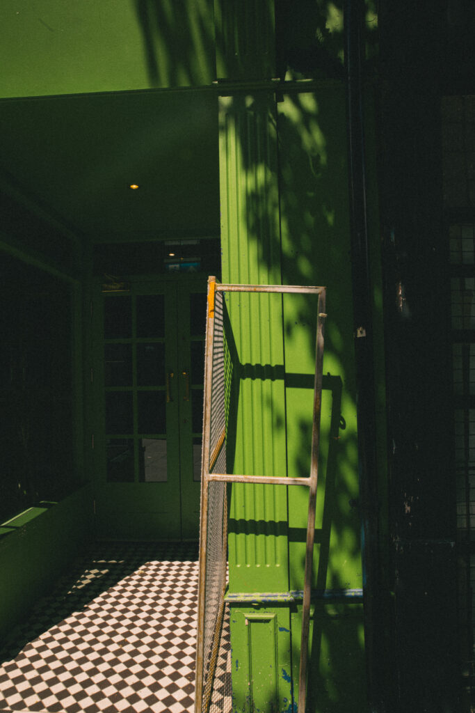
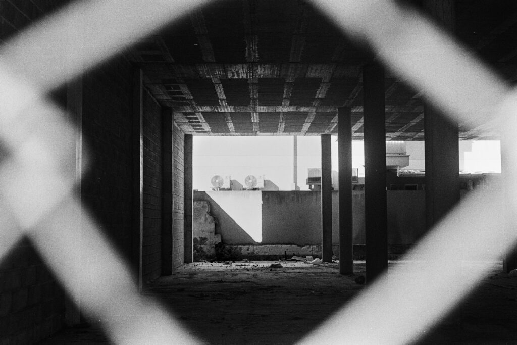
Pogo (2024) – Digital Photograph
Security railings propped up in the door way of a local restaurant, preparing to open its doors for the days service.
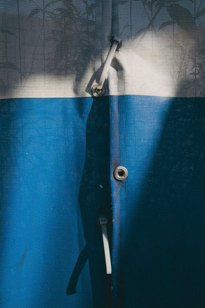
Tethered To Light (2024) – Digital Photograph
A dynamic beam of light, creating interesting shapes and strong shadows down the join of a demolition site canvas.
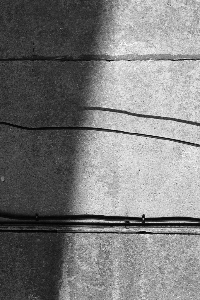
Headwires (2024) – Analogue Photograph, Ilford HP5, 35mm Film
An outbuilding concrete wall covered in small cables and subtle textures.
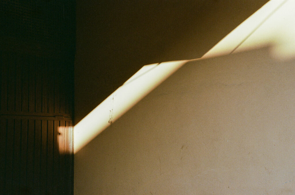
Pockets (2024) – Analogue Photograph, Kodak Portra 400, 35mm Film
A beam of sunlight cascading into a tucked away doorway in Old Town Alcudia, Mallorca.
Construction (2024) – Analogue Photograph, Ilford HP5 35mm Film
An empty construction site, filled with large expanses of empty space and pockets of beaming light

Hollywood 1989 (2017) – Analogue Photograph, Kodak Portra 400, 35mm Film
A pocket of light, shining through a bus shelter onto the back of the now demolished Broad Marsh Bus Station in Nottingham.
Curatorial Review
Headwires (2024) depicts a concrete wall with small cables through a photograph of a small section, allowing us to see the textures of the wall. The greyscale monochromatic tone of the work allows the viewer to examine between the shadows and the lights of the work. The shadow covers around a third of the wall and up to the halfway crack within the centre of the wall. This allows the viewer to guide themselves across the wall’s texture and draws attention to the cracks, grooves and weariness.
The cable splits the photograph into two sections: one uniform and perfect (the bottom half) and the other imperfect and showcasing the damage of the concrete. To explore the “noticed banality,” we are to look for elements that we do not see as we pass through these textures or structures every day…
Isabela Castelan
Artist Statement
Sometimes, I work more directly with performance which is recorded photographically. These works are records of small improvised performances composed between myself and my surroundings and documented intimately by myself. The images often have a symbolic function or meaning for me, that is related to my personal life, my identity. Many times directed to my culture.In my photos I explore myth, fantasy, as well as other stories that at some point were part of my life. Inside this frame work I tend to explore different subject matter in series. In which most of the time, my identity gets mixed with iconic, symbolic, ornamented figures.
Conceptually speaking, we see ourselves in contrast with nature, rather than part of it. The egoistical side of mankind is reluctant to acknowledge the bond between man and nature, we want to be ecologically right, but within a contrasting frame.
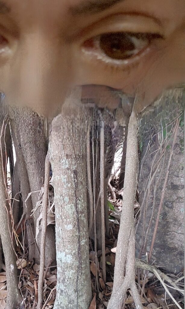
Never seen before (2025) – Digital photography and digital media
This image was made up of a selfie a nearby trees and blended with digital media.
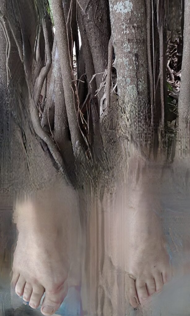
Step by Step (2025) – Digital photography and digital media
In this image, I imagined that my feet were tree roots.
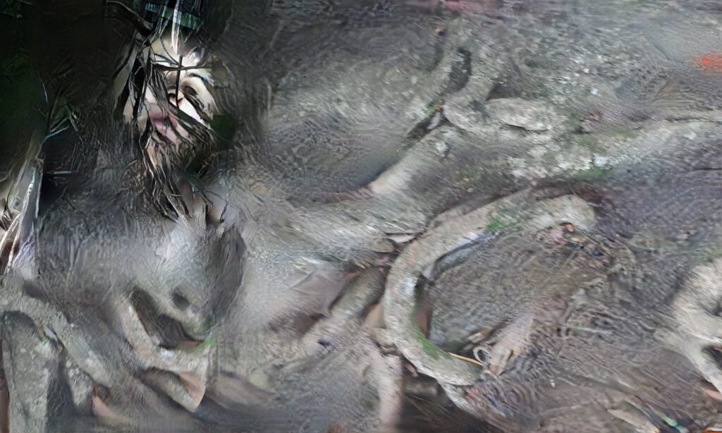
Rooted (2025) – Digital photography and digital media
In this work I explore my body as part of earth.
Curatorial Review
Never Seen Before (2025) merges Castelan with the Earth, which has been created through a selfie and a photograph via digital manipulation. The result is that the trees and Castelan have become one with nature. This challenges the concept that humanity dominates nature or cannot be the same as nature, as within the photograph, it is a merging of humanity and nature.
The work’s title, “Never Seen Before,” frames nature and humanity as one and directs it to those who believe humanity is above nature to question their egos. By using the selfie (or the self) the artwork has become a self-reflective work which invites the viewer to explore their own connections to the environment…
Sherihan Khalil
Artist Statement
I am a multidisciplinary artist based in Dubai, UAE, working across mixed media and photography. My practice is influenced by over a decade of work in education and consulting in Iraq and Afghanistan— regions often associated with conflict but brimming with stories of human resilience. These experiences shape my exploration of cultural heritage, politics, mysticism, and humanity’s enduring (and increasingly technologized) spirit.
While my photography captures overlooked everyday resilience and allure, my visual works merge abstraction with figurative elements, reflecting a dialogue between my role as a conduit for energy and an active observer of it. Central to my process is the organic translation of energy onto canvas, enriched by historical research and imaginative reconstruction.
My recent series, Epochgraphy I, attempts to make new connections across past, present, and future epochs. What began as an exploration of channeling energy through music evolved into energy taps that went much deeper. The works feature spontaneous markings, occasional figurative forms, dots and sinewy lines, inadvertently echoing the aesthetics of Pleistocene cave art and petroglyphs. I chose to frame the works as both a critique of the marginalization of cave art within art history— and even more so the arts from East Asia and Africa—and an homage to the lasting inspiration of my visit to the Shanidar Caves in Iraq in 2010.
NEW YORK WE LOVE YOU (2020) – Photograph

Citizens (2023) – Oil on canvas [70 x 50 cm]
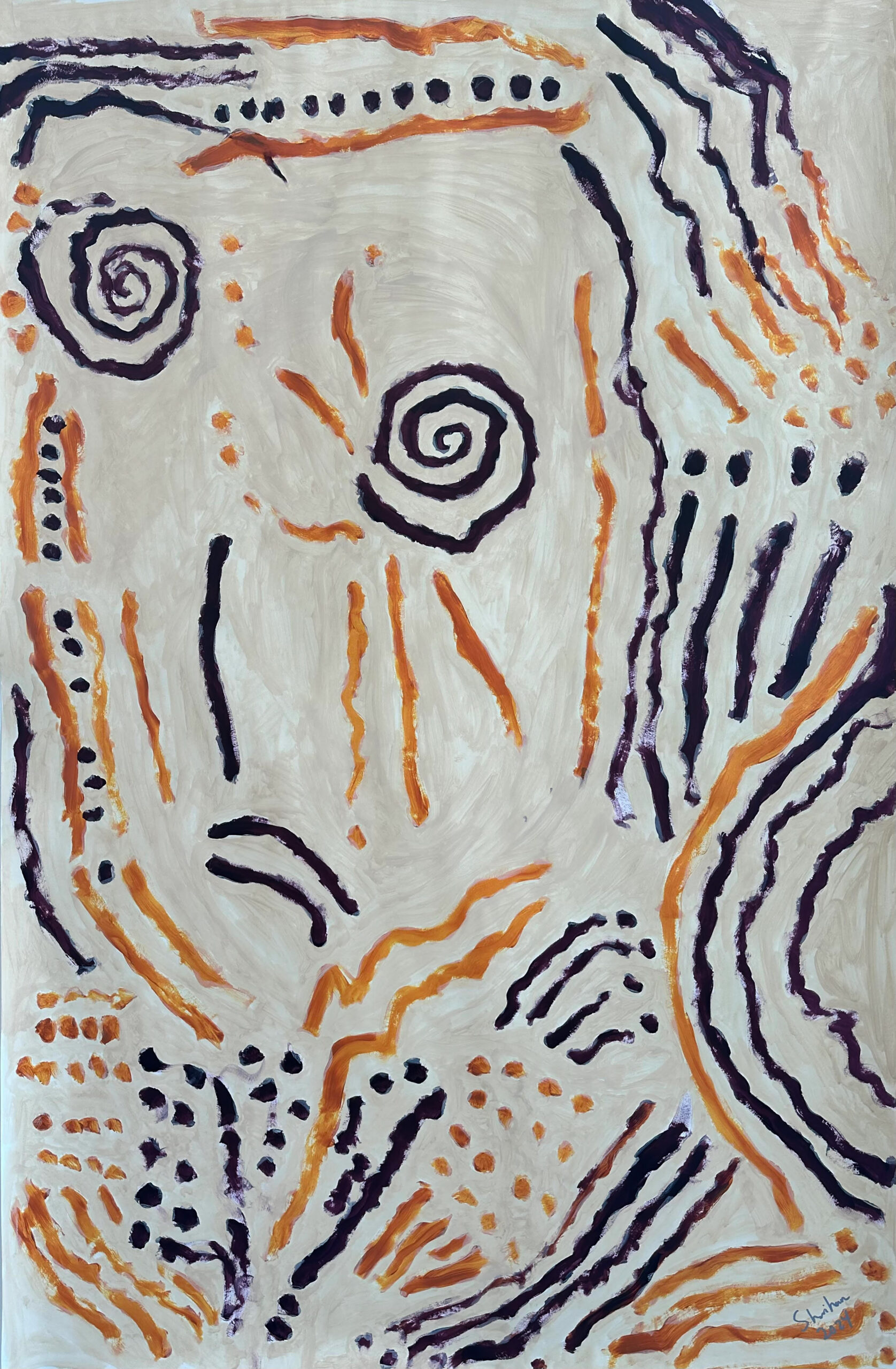
Epochgraphy III (2024) – acrylic on paper [159 x 106 cm]
Curatorial Review
NEW YORK WE LOVE YOU (2020) is a very personal work that explores Khalil’s experience of disconnecting and longing in New York during the COVID-19 pandemic. The photograph presents the city which “never sleeps” as quiet and empty.
At the centre of the composition, Webster Hall’s marquee holds the words: “NEW YORK, WE LOVE YOU”. The message used as the photograph’s title is ironically surrounded by empty streets, making it seem as though the city has been abandoned. Surrounding the words is graffiti on the walls, fractured pavements and a general grittiness to the road. These elements contrast with the city’s gentrification, which continues to make New York City more and more commercialized and perhaps is driving out some of the personality along with it in this process.
Thus, the photograph reflects Khalil’s disconnect from the current form of the area as it has changed and become gentrified, yet some elements of its past are still lingering. The two parts of the photograph’s composition, in which the graffiti wall is opposite to the more modern architecture, contrast the two through change. Yet despite this gentrification; these elements of the past community identity remain and will linger on. Though some of its personality will become muted – the character the area has grown through its history survive; even if they are in smaller forms.
The choice of black and white in the composition creates a slightly nostalgic feel- while connecting to Khalil’s longing for what it was in the 1980s. Removing the colours turns the photograph into a memory snapshot which is being invaded by gentrification. Yet, the silence allows for contemplation and to remember the old New York City. The original identity may not be there fully. However, there are still pockets of it, and despite the gentrification, New York continues to be a diverse and chaotic place, which perhaps- may create new identities within the city in the future.
Citizens (2023) highlights the complexity of the modern concept of citizenship in an extremely globalized (which perhaps is getting more connected as time goes on) and technologically entangled world. Khalil has cited Herbert Marcuse’s critique of the industrial state as an inspiration for this work. Which Marcuse asserts, in the short term, that modern society engineers conformity and suppresses individuality.
The oil painting has what seems to be an abstract form of human beings pushed into each other and condensed. The dark purple background pushes these out of the canvas like they’re overflowing and cannot be contained within the painting. It is as though these figures are forming a hivemind, and the figures that climb above the others enforce an order despite some looking as though they are attempting to leave the canvas. This represents the feeling of individuality yet being restricted and falling into the order of the society that is enforced by the modern nation-state.
Another interpretation could be that the movement of the figures trying to go above the others also could be seen as an attempt to move up in this society, which allows for their life to get better yet ironically only strengthens the system. The movement seems guided so that it seems it is intentional for these citizens to attempt to get better in the system- yet to do so, they must collectivize themselves into society and devoid them of their individuality.
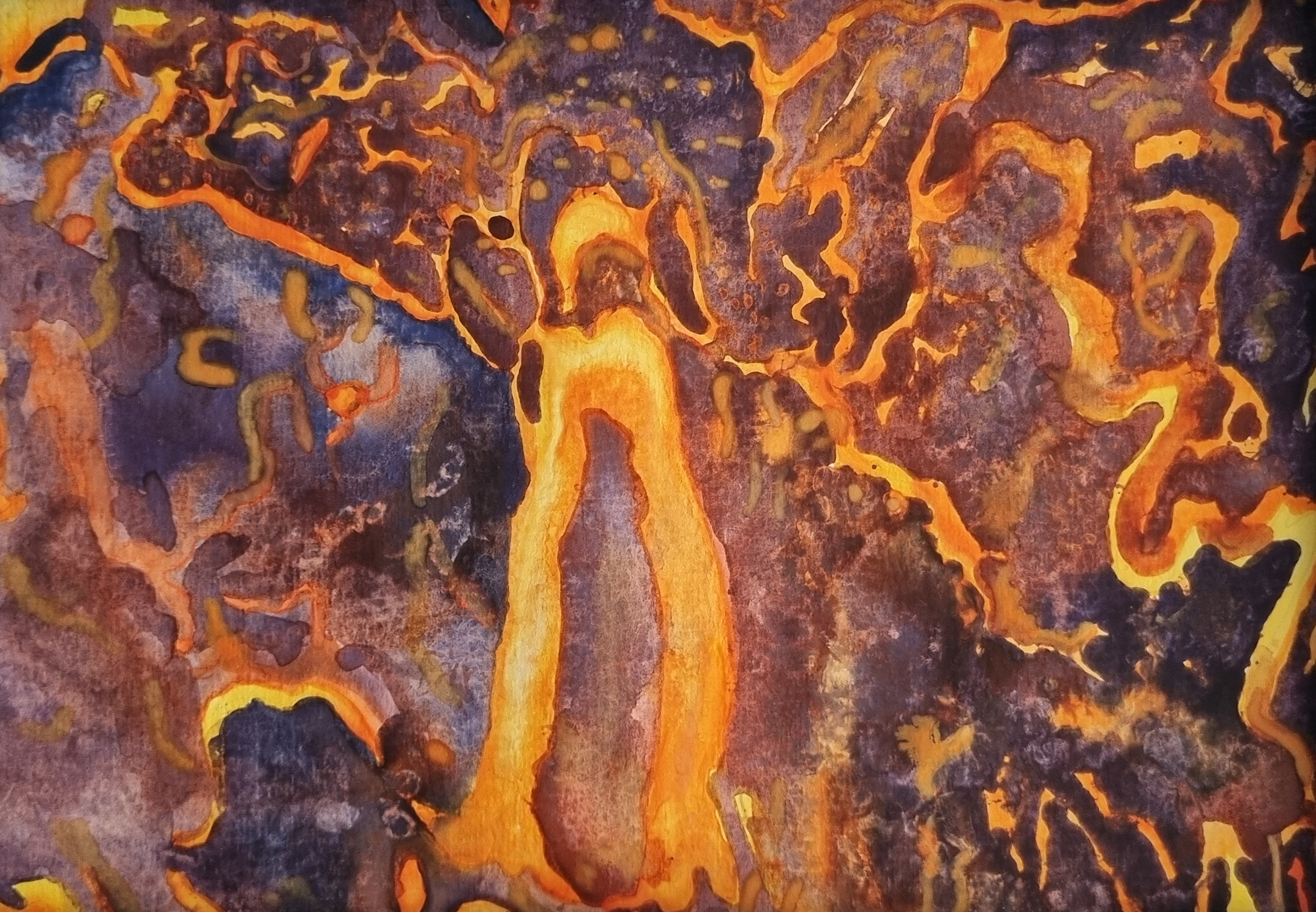
Epochgraphy III (2024) is inspired by petroglyphs and cave art. It represents the contrast between the past and the present narrative of art history within the context of prehistoric art. As part of Khalil’s Epochgraphy series, it was inspired by a visit to the Shanidar Caves in Iraq.
The work flows freely and features spirals and dots in both orange and black. Although acrylic, these colours could be referencing the colours that early human paints used: iron oxide for oranges and charcoal for the black pigments. It seems the paper has been painted over with white paint and then painted over with the colour. The paper’s texture, as a result, slightly resembles or mirrors the surfaces of the cave walls.
Through this work, Khalil is critiquing how cave art and ancient art, in general, have been marginalized within the canon of art history (in particular, in the regions of East Asia and Africa). The channelling of energy to create the work brings the question of why it is marginalized and not included to the forefront. It challenges the Western-centric academic art history canon and, thus, correctly implores that cave art is a form of art that is important within art history, especially so as it is the foundation and the first marker of human creativity.
Interview with Sherihan Khalil
You mention in your biography that you consulted across Iraq and Afghanistan. Can you share the story behind the transition from this to becoming a multidisciplinary artist?
It was a slow and organic transition over the years. The COVID-19 pandemic was a turning point for me. By then, I had been living in Kabul for a few years and needed to return to NYC for a few months to be with my family. Missing Kabul, I began translating my longing onto the canvas. Went back to Kabul after this phase, and by the time I moved to Dubai in 2021, I had a small body of work, and access to art supplies, courses, and printers became easier. Naturally, my studio hours increased, and I set a dedicated studio space until I began exhibiting and committing full-time. There were many other factors and signs too that this was the right move. Looking back, I really think I needed all of those experiences to arrive here.
The photograph “NEW YORK WE LOVE YOU” (2020) contrasts nostalgia with transformation. How do you reconcile the New York of your 1980s childhood with its current gentrified form?
What a great question. You’re right about the contrast. I don’t think I’ve fully reconciled it. The NYC in my childhood imagination persists, and despite the changes the city continues to undergo, its richness, diversity, chaos, and character remain. I don’t think any level of gentrification (and now congestion pricing!) can change that.
About the marquee’s message—how do you think it reflects New York’s spirit during the pandemic period?
I’m not sure if it was aspirational or defiant. It was a tough time, and everyone had a different coping mechanism—some people left, and some, like me, returned.
Your work “Citizens” (2023)—what inspired you to explore the concept of citizenship?
I studied and taught political science. My discussions and debates with my Iraqi university students, just as their country was in the constitution-making and government-formation phase, were captivating. I really saw how “ethnic divides” and other categories are often pitted against one another by external influences. One thing to read and know about it in history, another thing altogether to learn people’s personal experiences of it.
What emotional response do you hope viewers will have when encountering the work for the first time?
Introspection and wonderment. What was yours?
The climbing and overlapping figures suggest both collaboration and entrapment. What message (or conversation) do you hope viewers will take from this scene?
I want viewers to reflect on how citizenship is sometimes preordained by broader structures and what they can do to dismantle those systems, both independently and collectively. You may notice that some figures are posed devotionally—this is an intentional reference to the questions we citizens of humanity must ask themselves: Who exactly are we ‘worshiping,’ and why?
You described the “Epochgraphy” series as a form of channeling energy. How do you translate this energy into a more physical visual form?
It usually starts with music—classical, chants, sacred music. I go back and forth between the work and dialogue with it and myself to determine what best conveys the energy. I don’t begin with a plan; the process unfolds as I work, and I have a meditative way of doing it.
What conversation are you hoping this series will encourage regarding the marginalisation of cave art within art history?
Cave art reminds us of humanity’s basic need to settle and the rights, dignity, and progressive flourishing that come with it. I hope to spark conversations about appreciating the past in its entirety, decoloniality, and retaining our humanity in an increasingly technologized and conflict-ridden world. Interestingly, the term epoch typically describes a stretch of history over tens of thousands of years, yet in modern tech linguistics, it’s been appropriated to describe stages of machine learning developed in mere months.
Are there any other historical influences you’re planning to explore in future works?
Yes in-fact for the past few months, I’ve been working with dinosaurs—exploring the fragility of life despite great power, and historical imagination to revive them. I’m searching for a mural-sized outdoor space to make the work accessible and spark conversations with a broader audience. My other project takes inspiration from a glorious 13th century encyclopaedic and mystical Arabic book by Zakaria Al Qazwini titled Ajaib al Makhlukat wa Gharaib al Mawjudat, the Marvels of Creation and the Oddities of Existence.
Ekaterina Kuzmina
Artist Statement
My art is a journey into myself and at the same time a way out of the ordinary. I try to find the fragile balance that exists between chaos and order, light and darkness, matter and spirit. Equilibrium is not a static state, but an eternal dance between opposites. Each of my works is an attempt to capture the fine line where happiness becomes not a fleeting sensation, but a state of being.
Esotericism, astronomy and psychology are my guides in this search. Through symbols, forms and colours, I strive to convey the threads of energy that connect us with the cosmos. The Universe is not just a space beyond the Earth, it is a reflection of our inner world, and the world is a mirror.
My works invite the viewer to stop, think and feel a connection with something greater. I believe that art is a bridge between the visible and the invisible, between the rational and the mystical In every stroke, in every line, I seek harmony that can become the key to understanding yourself and the world around you. This is my way of talking about the eternal, about what unites us all.
In my understanding, contrast is a way to show extremes. And one of the main tasks in life is to learn to balance in the middle between the two. My work is about choice, about the contrast between the system and freedom.

Fifth Element (2023) – Oil on canvas [70x100cm]
The fifth main element, man, is shown in contrast to air. All other elements are painted in similar tones.
Real and Unreal (2022) – Oil on canvas [60x50cm]
The work shows the contrast of forms, colors and planes. Possible and impossible combinations for our world

Day and night (2022) – Oil on canvas [140x50cm]
Curatorial Review
Real and Unreal (2022) is an oil painting on canvas which successfully explores the concept of opposites. The still life consists of objects that have been halved (as in the case of the pumpkin and the fruit in the centre right) and in an imperfect form (the left fruit has warts and other imperfections).
The table and the tablecloth are not symmetrical at all, as you can see that the glass jug separates them, and one side is higher than the other. Another opposite you can notice is that the walls and the tablecloths are contrasting colours on the opposite sides. This helps to draw the viewer’s eye to the centre, where the jug is the balancing object within the whole composition and brings the viewer down to the unusual pumpkin…
Jean Stockwell
Artist Statement
Jean Stockwell’s work uses the mediums of photography, 3D and installation to explore traditional or overlooked objects and materials by a process of transformation and juxtaposition. Research into both their historical background and where appropriate, the site, inform the work. In addition, the process of researching into the history of the objects and materials uncovers political and social themes.
The photograph entitled ‘Hat’ and the installation ‘Rhythm’ were both conceived in a studio in an old factory building, built in the late 19th century. Being in this environment gave a sense of working in the past. Research was undertaken into the machine age and mass production. It was discovered that working men, at that time, often wore bowler hats to work.
‘Rhythm’, an arrangement of bowler hats with salt poured systematically over them was a response to the repetitive nature of factory work. The black and white film ‘Modern Times’ starring Charlie Chaplin, who, complete with bowler hat, works on an assembly line, was also an influence. Salt is a preservative and a major component of the human body. The saying ‘blood, sweat and tears,’ which all contain salt, may be an appropriate description for the conditions of working class people in the machine age.
Rhythm (2019) – Bowler Hats, Salt
Installation of bowler hats and salt at OXO Tower Wharf London
Hat (2019) – Photograph
Photograph of a bowler hat and salt installed in a late 19th century factory building.
Curatorial Review
Hat (2019) uses the bowler hat and salt to explore exploitation, labour, and memory. The work is set in a 19th-century factory building, and the lack of colour makes it seem as though you are stepping into the time period in which the exploitation of the working class was taking place…
Interview with Jean Stockwell
Can you share more about your journey as an artist? What inspired you to work with photography, 3D art and installation art?
Studying fine art at the City Lit, followed by a BA degree (Hons) at Central Saint Martins, laid the foundations for my practice. Given opportunities to work across all media, I found a certain freedom and spontaneity working in 3D, installation and photography. I was also influenced by numerous artists who worked in similar media, for example Carl Andre and Doris Salcedo. The philosophical writings of Benjamin and Arendt, also contributed to my development as an artist. Experimentation became an essential part of my practice, often recorded photographically. Researching into the history of traditional objects also began at this time. Since then I have created work in response to themes of exhibitions and in some cases, the site of the work.
The bowler hat is a recurring object in your work, what does it symbolize to you?
For me, the bowler hat suggests a symbol of class. Before research, I viewed it as a stereotypical representation of an Englishman- the city gent wearing a bowler. To my surprise, I discovered it was worn by working class men in the late 19th century. I am interested in how, in the past, it was a visible marker of social class, of being part of a distinct group.
As your work reflects on historical conditions of the working class- do you think that the work can also reflect current contemporary issues and how?
Yes! Although a different industrial era, with robots assisting on assembly lines, there are still many situations globally where workers are involved in exploitative, repetitive work. For example, migrants picking fruit, elements of the textile industry, the processing of packages in enormous warehouses; often insecure work, earning low wages in poor conditions.
What do you hope viewers will experience viewing Hat (2019) and Rhythm (2019)?
I hope that viewers will initially be drawn to the work on a visual level and then begin to question its significance. The site of ‘Rhythm’ in the Bargehouse, a warehouse, is something I would like the audience to consider. Also, the link with the past in the use of bowler hats in both ‘Rhythm’ and ‘Hat’. Hopefully, they would recognise the repetition of the hats and the pouring of the salt as an arduous, physical task, reflecting the conditions of work in a previous industrial era and possibly compare this observation with working conditions today.
As research is a major role in your process- how do you balance the historical and factual information with the creative aspects of your art?
I think this happens when I begin to investigate the objects physically. By the time I reach this stage a lot of research has taken place and informs the work. I feel the juxtaposition of objects and in some cases, objects and materials, elicits a contrast. In this case the combination of the salt and hats, for example, opens the door for a creative response, an interpretation beyond the initial research.
Can you describe the process of developing one of your installations from research to execution?
I begin by the exploration of an object’s history, by reading and where appropriate using other source material, for example, film, audio. If it is to be installed in a particular site, research into this will also take place. Then, experimentation begins with objects and materials, mainly found on the internet. I make simple sketches of possibilities and also photograph different combinations. Working from the suggestion of an idea, I select what to use and how to position the different elements, resolving practical issues.
Do you have any upcoming projects that you’re excited to share?
Recently, I have investigated the history of garden gnomes. In the mid 19th century they were collected by the wealthy. During the 20th century they became ubiquitous, due to the invention of plastic and mass production. Then gnomes fell out of favour. They were vilified by the garden press and banned from RHS gardens. I’m exploring ideas of kitsch, the hierarchy of objects and class through this theme in a humorous way. Also, I have introduced a way of drawing on a photographic ground with pastels, which is a new departure.
Zixiang Zhang
Artist Statement
My works explore the symbiotic relationship between human-made materials and nature. In my artworks, I delve into the interaction between textile waste and natural processes, focusing on how hand-knitted fabrics engage with mycelium, a natural decomposer. This work reflects on the intersection of industrial overproduction and nature’s slower, regenerative rhythms, examining how materials can transform and renew.
My techniques, including hand-knitting, wrapping, and layering, form the foundation of my practice. These slow, intentional methods offer a meditative contrast to the fast, impersonal pace of industrial production. The materials I use—textiles, yarns, straw, and mycelium— symbolize the meeting of human intervention and natural processes. Colour plays a key role, helping convey the emotional resonance of the work, from the melancholy of waste to the hope embedded in renewal.
A critical aspect of my work lies in the collaboration between nature and the sculptures. As the mycelium interacts with the textile materials, the artwork develops a life of its own, evolving and transforming in ways I cannot entirely control. The pieces do what they want to do, shifting in scent, texture, and structure over time. This unpredictable process is a true collaboration between my work and the forces of nature, where the materials are left to evolve organically, guided by natural cycles rather than my hand alone.
This transformation moment between nature and sculpture is key to my practice. I invite viewers to witness not only the transformation of materials but also the unpredictability and beauty of nature’s intervention.
My artworks, “Symbiosis” and “Life Touches Matter,” embody the concept of contrast by juxtaposing opposing forces, materials, and processes to explore the lifecycle of matter and the dialogue between human intervention and nature’s regenerative power. Through the interplay of industrial waste, natural processes, and sustainable materials, these pieces reflect on the dualities inherent in the modern world—creation versus destruction, waste versus renewal, and speed versus deliberation.
Biography
Zixiang Zhang is a BioArt artist currently working and living in London. She graduated from the Royal College of Art in 2023 with an MA in Product Design. Her conceptual works explore the intricate, symbiotic relationship between human-made materials and the natural world. In her practice, she brings a unique blend of material experimentation and biological insight to her art, creating artworks that are as alive and unpredictable as the ecological themes they represent. Through these unpredictable transformations, Zixiang not only invites audiences to witness the physical change of materials but emphasises the urgent need for sustainable solutions, drawing from scientific inquiry and artistic expression.
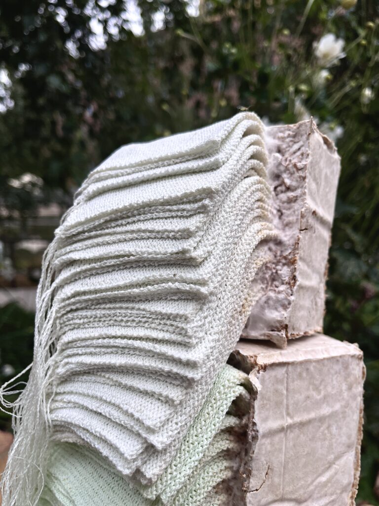
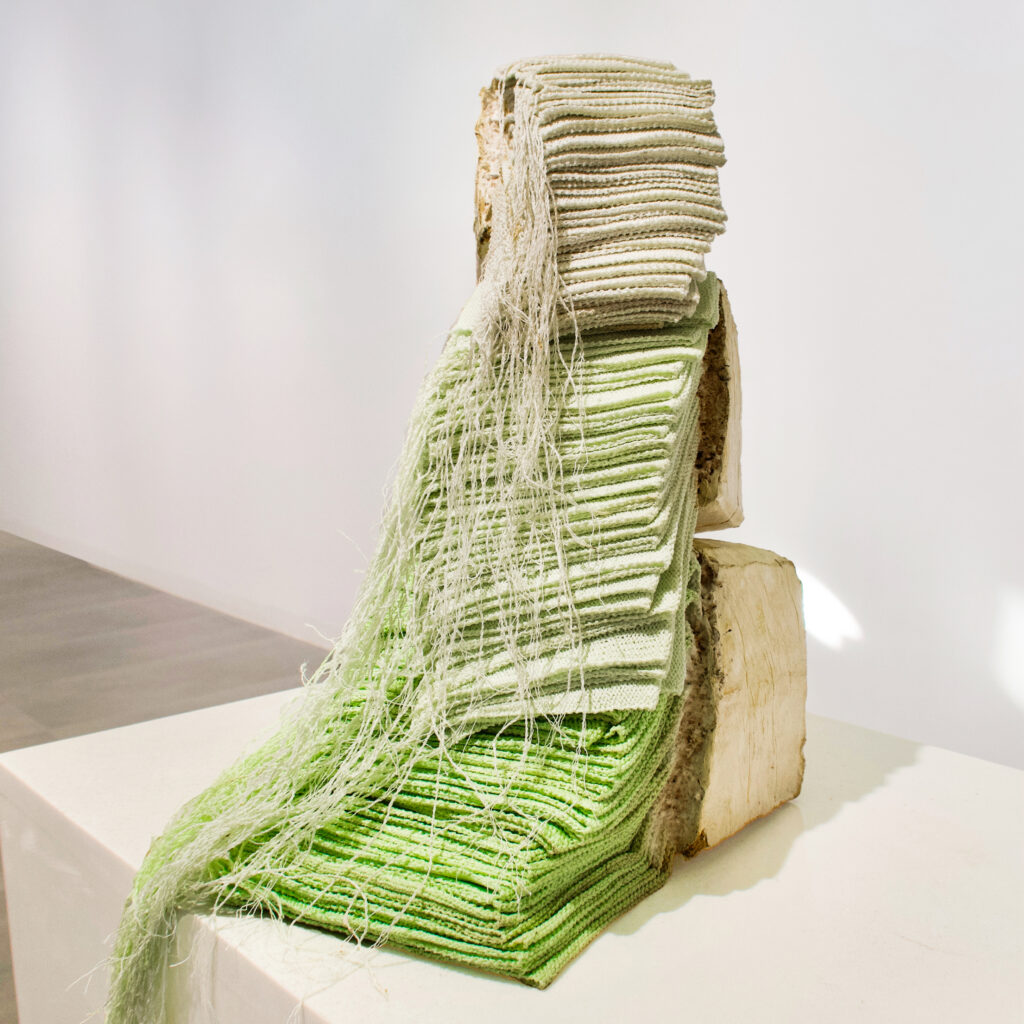
Symbiosis (2024) – Fabric, Straw, and Mycelium
“Symbiosis” examines the connection between natural processes and industrial waste, especially in textiles. The artwork combines hand-knitted fabrics, straw, and mycelium—a fungus used in sustainable materials—to highlight the relationship between material origins, production, and renewal. Addressing the waste generated by fast fashion, this piece explores the harmony between human waste and nature’s regenerative power. Hand-knitted textiles stacked to mimic industrial piles reflect a personal, deliberate contrast to mass production’s impersonal speed. Each material—knitted fabric, straw, and mycelium—represents a distinct facet of human and natural production. The textiles symbolize wasteful mass production, straw evokes simple, sustainable practices, and mycelium, with its power to decompose, embodies renewal and environmental hope. The mycelium interacts with discarded textiles in two ways: Devourer: Mycelium, as a natural decomposer, breaks down textiles, suggesting a future where waste is reclaimed. Growth Matrix: Alternatively, the textiles could serve as a nourishing base for mycelium, creating a new, living material from waste. Through this interplay, “Symbiosis” reflects on material transformation, ecological responsibility, and the role of human intervention in nature. It opens a conversation on the lifecycle of materials, proposing a future where waste could support growth rather than merely pollute.
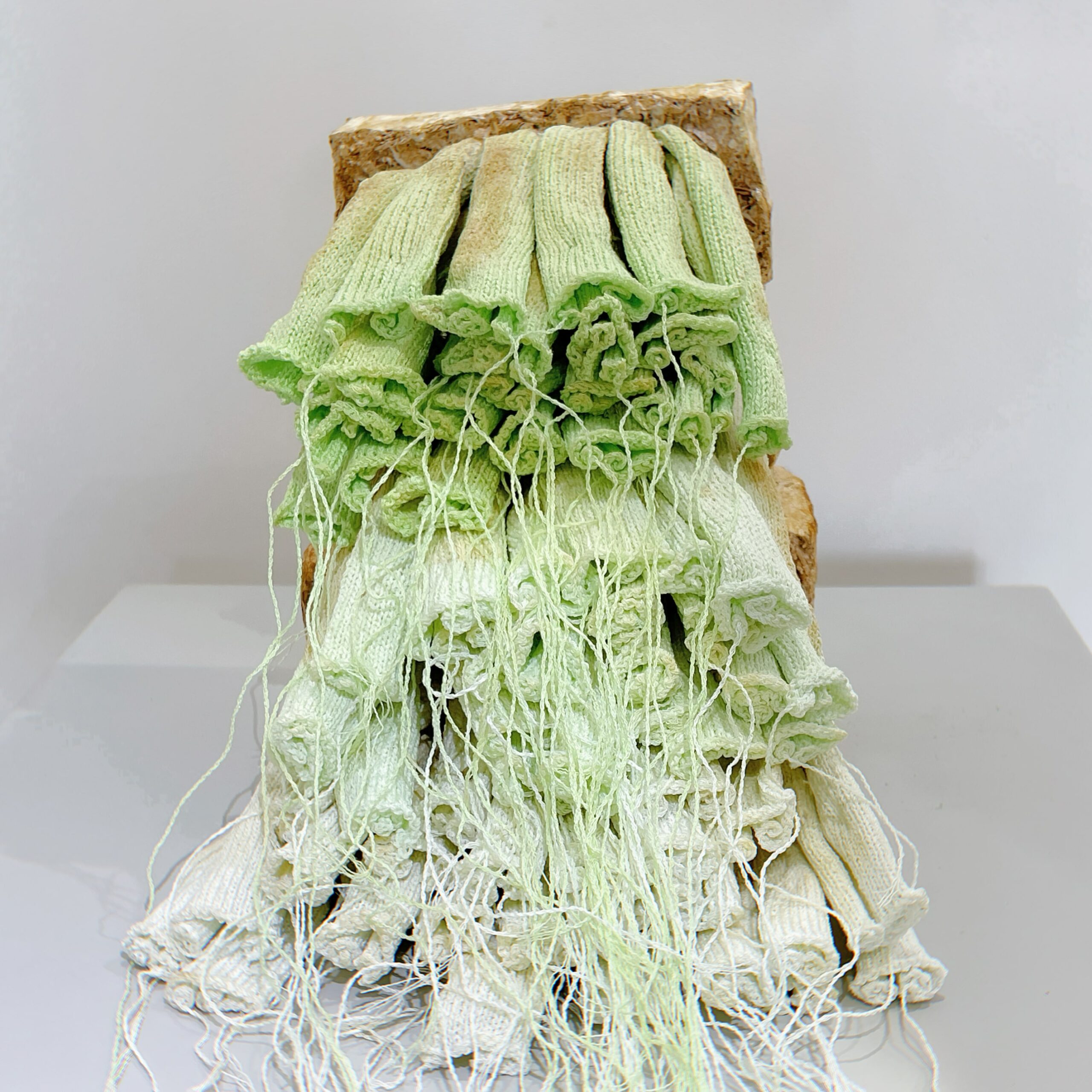
Life Touches Matter (2024) – Fabric, Straw, and Mycelium
“Life Touches Matter” invites audiences to reconsider the lifecycle of materials by blending hand-knitted textiles, straw, and living mycelium into a dynamic artwork that evolves over time. This piece acts as a catalyst for rethinking how we view and value the life cycle of matter, especially in an era dominated by industrial waste. As viewers observe the gradual fusion of discarded textiles with mycelium—a natural decomposer that transforms waste into a new life—they are prompted to question the assumed finality of materials labelled as ‘spent’ or ‘useless.’ Throughout its transformation, “Life Touches Matter” changes in scent, texture, and form, engaging the audience in a sensory experience that highlights the regenerative power of nature. The artwork’s gradual decay and rebirth through mycelium growth underscore the concept of a continuous life cycle, where waste is reabsorbed into nature’s processes rather than discarded. By witnessing this interplay of organic decay and regeneration, viewers are encouraged to see materials as part of an endless cycle rather than a linear journey from use to disposal. Through its evolving form, “Life Touches Matter” becomes a living testament to the potential for renewal, inviting a shift in perspective. The artwork suggests that every material has the capacity for reinvention within nature’s cycles, urging viewers to connect emotionally with the rhythms of transformation. In doing so, it fosters a reflective space where they can reconsider their own role within these cycles, challenging the conventional boundaries of waste and inspiring a renewed appreciation for the regenerative possibilities inherent in all matter.
Curatorial Review
Symbiosis (2024) explores the contrast between humanity’s culture of fast fashion wastefulness and the potential to reverse this change with sustainable materials that recycle themselves. Using hand-knitted textiles, straw, and mycelium, Zhang has created a living artwork that comments on the issues mentioned above with humanity. However, the work is a physical example of a sustainable future.
The hand-knitted textiles change from a very strong green at the bottom, and slowly, the dye disappears into a light tan-green. The bright green could potentially represent industrial dyes used in fabric dying that damage the environment…
Interview with Zixiang Zhang
Can you share how you came across BioArt and what inspired you to pursue this form of art?
I came across BioArt through my Biology and material research background, which naturally led me to explore the intersection of science and art. A significant inspiration for me was Neri Oxman, whose work integrates biology and nature into art, creating pieces that grow, regenerate, and evolve over time. Her approach inspired me to view art not just as a representation of life but as a living entity itself. What fascinates me most about BioArt is how it taps into nature’s profound wisdom, which goes beyond intelligence. By integrating biological processes, BioArt shows how technology can harmonize with nature rather than disrupt it. It also highlights the imbalance between human-made materials and biomass, urging us to adopt a material ecology approach in which things are grown, not built.
In my practice, I’m drawn to the unpredictable, regenerative nature of BioArt. Living systems allow the artwork to change over time, creating a dialogue between the artist, materials, and environment. This dynamic, evolving quality reflects the interconnectedness of Art, Biology, and Nature. For me, BioArt is not just creative expression but a way to reimagine our relationship with the natural world.
Are there any challenges you face when integrating the biological and art together?
Integrating biology and art presents several challenges. One significant difficulty is working with unpredictable living systems that require precise environmental conditions, such as temperature, humidity, and light, to survive and thrive. Maintaining these conditions over time adds complexity to the creative process Balancing scientific precision with artistic intuition is also significant. Science emphasises control and repeatability, whereas Art values exploration and unpredictability. Reconciling these approaches can be challenging but also provides a unique opportunity for innovation.
In addition, communicating BioArt to broader audiences can be challenging. It often asks audiences to question traditional notions of art and engage with deeper issues. Many audiences are unfamiliar with Biology, making it difficult for them to fully understand the concepts behind BioArt. Explaining complex biological processes in an accessible and engaging way is essential to helping audiences connect with the work.
Can you walk us through the creative process from a concept to the final piece of a BioArt project?
The creative process for a BioArt project often begins with a concept rooted in biological phenomena or pressing issues. For me, this journey started in 2020 when I began working with mycelium and conducting material experiments. I was fascinated by its ability to devour, transform, and regenerate. Mycelium not only decomposes pollutants but also converts them into sustainable materials, revealing its immense potential for environmental regeneration.
While studying for my master’s degree at RCA, my focus shifted toward climate change. During my research, I learned that large amounts of textile waste are either landfilled or incinerated. I was struck by the possibility that buried textiles might connect with mycelium underground, forming new, regenerative materials. This realisation became a key source of creative inspiration.
In the creative process, I combine textiles and mycelium to explore this synergy and inspire people to think about the future. My process involves experimenting with materials, cultivating mycelium, and designing systems where the biological and artistic elements can interact. This work allows me to reimagine how waste and biology collaborate to create new forms, encouraging audiences to reflect on sustainability and our relationship with the environment.
How do you view the role of BioArt encouraging and bringing conversations surrounding sustainability and ecological awareness?
I view BioArt as a vital tool for fostering sustainability and ecological awareness, particularly through Post-Anthropocene BioArt. This type of art explores the evolving relationship between humans and nature in a world beyond the Anthropocene, offering new ways to address climate change and envision the planet’s future.
BioArt helps reestablish connections with nature by integrating living systems into creative processes, encouraging reflection on how we coexist with the environment. For example, my work with mycelium and textiles highlights regenerative processes, demonstrating how waste can be transformed into sustainable materials. Post-Anthropocene BioArt also prompts us to consider future life on Earth, imagining how multicellular organisms might thrive after human dominance. It inspires us to rethink our reliance on power-driven infrastructures, envisioning alternative ways to illuminate and sustain the planet in times of crisis.
By making ecological topics accessible and thought-provoking, BioArt bridges science and art to spark dialogue and action. It motivates viewers to imagine innovative ways of living harmoniously with the natural world, reflecting both the challenges we face and the hope for a sustainable future.
In Symbiosis (2024) it uses mycelium as it devours and recycles the material. Can you explain the process of working with the mycelium as the material- are there any interesting traits to it and any challenges you faced with using it?
Working with mycelium in “Symbiosis” has been an exciting, experimental process. Mycelium’s unique traits allow it to devour and decompose materials like textiles, recycling them into entirely new forms. As a living organism, it transforms over time, making the process dynamic and unpredictable.
The artwork progresses through three distinct states during production: the original state of the textile, the form created by combining the textile with mycelium in a mold, and the natural form of the mycelium after continuous growth. This evolution highlights the interplay between human-made and biological elements, creating a striking visual contrast that emphasises regeneration and coexistence. However, challenges arise due to mycelium’s sensitivity to environmental factors. Contamination, particularly from other molds, is a frequent issue that can cause production failures. Ensuring environmental safety and maintaining precise conditions are crucial. Despite these challenges, mycelium’s adaptability and transformative potential make it an invaluable medium for exploring sustainability and ecological responsibility.
The work also seems to show hope through renewal- how optimistic are you about the potential for sustainability within the fast fashion industry in the future?
I remain cautiously optimistic about the potential for sustainability within the fast fashion industry, but it’s clear that addressing this issue requires a systemic shift. Solving the waste problem is not just about developing more innovative, environmentally friendly materials. In fact, many of the solutions to environmental challenges can be found by learning from nature itself. While we may not be able to save nature, we must save ourselves.
BioArt has inspired me with a sense of hope in this regard. As climate change, resource shortages, and the flood of waste become growing global concerns, learning from nature offers a new direction — “autonomy”. This means not just solving pollution but creating self-regulating products and manufacturing systems that can help reform the environment more comprehensively. For example, mycelium’s ability to transform textile waste shows how nature’s regenerative processes can help us rethink our relationship with materials. There is potential for sustainability through learning from nature, where we develop systems that naturally regulate themselves and contribute to a healthier planet.
How do you hope the work will influence the way viewers will think about waste, sustainability and recycling?
I hope “Symbiosis” inspires viewers to rethink their relationship with waste, sustainability, and recycling. The artwork invites us to see waste as a resource for regeneration rather than something to discard. Through integrating mycelium to transform textile waste into new forms, the piece illustrates how materials can be part of a renewal cycle, rather than a linear path to landfills. I invite viewers to recognise that sustainability isn’t just about reducing consumption but also about changing how we perceive and interact with materials. “Symbiosis” encourages a deeper connection with nature’s wisdom and prompts individuals to think creatively about how they can contribute to a more sustainable future. The work serves as a conversation starter, challenging the idea that waste is the end. Instead, it proposes that waste can be the beginning of something regenerative, hopeful, and transformative for both individuals and the planet.
In “Life Touches Matter” (2024) – the work changes and transforms over time. How do you anticipate that viewers will respond to the slow transformation of the work and its every stage of change?
“Life Touches Matter” evolves in scent, texture, and form throughout its transformation, offering a sensory experience that emphasises nature’s regenerative power. Engaging multiple senses enables the audiences to connect more intimately with biological materials and their dynamic processes. I aim to invite people to see, touch, and experience these materials firsthand, allowing them to appreciate the unique charm of biological substances and the life within them. In future exhibitions, I plan to incorporate dynamic visuals to enhance this sensory journey. This will enable viewers to intuitively witness the changes between materials and feel the pulse of life in action. This sensory engagement is crucial in encouraging viewers to interact with BioArt in a more holistic way. The gradual change allows them to witness the life cycle of the materials and, in turn, reflect on the broader themes of growth, decay, and regeneration.
Do you have any upcoming projects that you’re excited to share?
I’m currently working on a project that explores human identity in the post-Anthropocene, inspired by my childhood. My mother would knit sweaters for me, and these sweaters were continually re-knitted and reused, a tradition passed down from her mother. This act of reusing wool threads was not only a practice of sustainability but also left behind traces of microorganisms on the yarn, linking these objects to the biological world.
Through this project, I aim to explore how memory, identity, and materials are intertwined with biology. Additionally, I hope to use bio-art as a lens to consider what we can leave for future generations. How can we communicate our values and stories to them? How can they understand us through the biological traces we leave behind? I want my work to inspire a conversation about our legacy and the interconnectedness of human activity, nature, and memory.
Isabelle M Larsson
Artist Statement
I’m a Swedish photographer residing in Oslo, Norway. My photographic journey began in my childhood, when I first discovered the fascination of seeing the world through my parents’ camera. The joy of capturing life around me became so consuming that one Christmas Eve they gave me my own. Although experiencing a rough start into adulthood, with losing both my parents early on, I’ve always found solace and bliss behind my camera.
Since then, whether through street photography, portraits or with an artistic expression, my style of photography often shows that the ordinary everyday life can be interesting and beautiful. I like to place my subjects in a unique and distinctive composition. With my photos I want you to hopefully feel something subtle yet conspicuous. It is my wishes to have you exist only in this very moment.

Rusty Water (2024) – Photograph (50x50cm)
Under a bridge in my hometown the light reached the wall with letters and I was drawn to the beautiful colours.
Curatorial Review
Rusty Water (2024) is set beneath a bridge in Larsson’s hometown, which, with this context, gives the photograph a nostalgic and contemplative feel. The rust-coloured wall (and the water), along with the diagonal sunlight going through the composition, guides the viewer and creates a calming scene…
Interview with Isabelle M Larsson
Can you share more about your childhood memories of discovering photography? What was it about your parents camera that got you interested in photography?
As long as I can remember I’ve been reaching for the opportunity to capture the loved ones and life around me, and the mere fact that my parents had an old camera they lent me was crucial for satisfying that need. I’m talking about one of those old cameras with a cubic ash on the top and a small mechanical arm. I remember the feeling of time standing still. As I still do.
You mentioned growing up in Sweden and now living in Norway; how have these two countries influenced your perspective as a photographer?
I strongly believe that wherever in the world I´d be born I would be wanting to take pictures Luckily I lived in two countries without raging wars or devastating poverty, and with both parents working full time most of my upbringing and buying me my first camera I was free to explore. I feel very grateful because of that. So many people struggling that never get to have hobbies or even dare to dream.
Your work ranges from street photography, portraits or with your artistic expression- can you tell us the process behind each type?
With street photography I need to stop thinking, especially right before something interesting comes before me that I want to capture. If I think too long the moment is over. Taking portraits is more of a planned deal, where I need to make the subject relax and feel good about themselves.
Getting them to get used to the camera if its new to them. The artistic approach is where I just exist and let my inner self speak.
Rusty Water (2024) is a photograph which you took in your hometown. Being your hometown, what significance does the location hold for you?
The area is a busy one, pretty near my home, with fancy stores and tall beautiful architectural buildings. I often take a walk with my camera around my neck looking for the less obvious. Like a bridge on my way to the library where there’s no one and life´s quiet.
Going further- how does revisiting familiar places, like this bridge, influence your creative process?
I want to catch what might be forgotten by others, maybe even unseen and I like to think that I have a keen eye for the less ordinary. This almost always effects how I go about with my photography.
The rusty tones in the water seem to beautifully blend with the texture of the bridge was this intentional or did it surprise you during the shoot?
I was first drawn to the lighting that day, this being a to me known area, and when I went down under the bridge I saw this beautiful rusty colour. I even like the green mold on the wall coming from the fjord.
The lighting in the photograph is mesmerizing and golden. Did you have to wait for the perfect lighting conditions for the photograph?
No, I did not have to wait for anything; it already spoke to me.
Did you experiment with different angles or compositions of the bridge before settling with this one? If so, what did the other ones look like and why did you settle with this one?
No, I did not. I liked the diagonal stripe of light, creating a clear contrast.
What role does nostalgia play in your artistic practice, particularly in context to photographing your hometown?
Going through life and experiencing the highs and lows leaves a feeling of nostalgia in pretty much anything I do. But also, being fond of a more futuristic outlook and having a love for living in the moment, I can’t say that one is more dominating than the other.
Do you have any upcoming projects that you’re excited to share?
I have several. One is that I want to make a documentary series about people who live outside the box and also people with hobbies I think are interesting, like graffiti artists and skaters. And those projects are not the only ones! I guess time is the only obstacle cause there is not enough of it!
Dr Helen Imogen Field
Artist Statement
In these pieces the artist uses colour and light, or conceptions, for contrast. Contrast is essential in art to provide the brain with a focal point. In some cases that is near us, familiar, but the contrasting notion may be more important. Various styles of painting, printing and digital effects are used to produce these image. We are always contrasting – imagining ourselves other than what we are because we compare with others; it is kind to let people complement you but you must believe it. In their journey through life this artist has found a great deal of pleasure in noticing contrasts and making them sit in an image for the viewer.
Biography
Working class human goes to Oxford to learn and enter the field of biochemistry. From age 4 she drew, entranced by the idea of making worlds (a kid’s book). Her Dad being a draughtsman taught her how to shade; an art teacher battled a disinterested class to teach the perspective. Portraiture interested her in college, loving God means loving people. In New York working as a post-doc the Art Students League taught classical portraiture in oils. Leith School of Arts taught contemporary art practice encouraging experimentation while a figure course sparked an entry into the Royal School of Drawing. Ceramics also revealed a need to draw all the treasures, the jewels learned in a hesitant walk with the living God throughout work in computing and social services. Drawing is imagination. Contrasts make the focal points appear, whether made with light and dark, contrasting colours from the colour wheel (unblended), or with concepts.
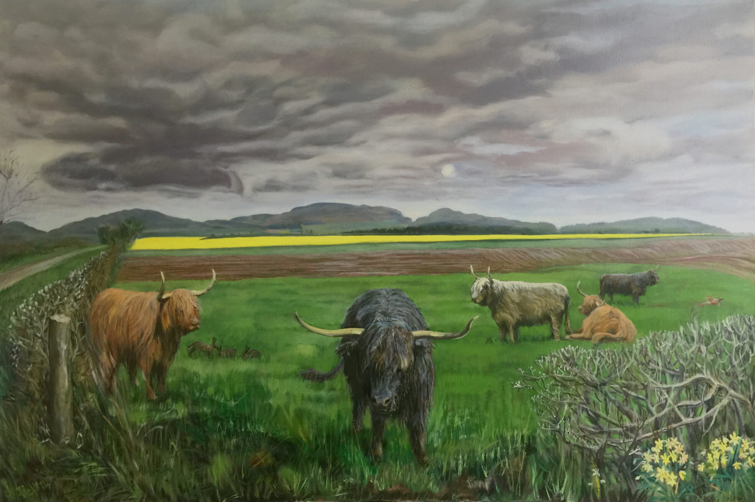
Highland cattle under Macbeth’s castle (2016) – Oil on canvas
The contrast of the field of yellow rapeseed flowers with the very Scottish day – driech – grey. Damp. Under the Sidlaws skyline, an ancient volcanic range, highland cattle have been placed into an arable farming scene – another contrast.
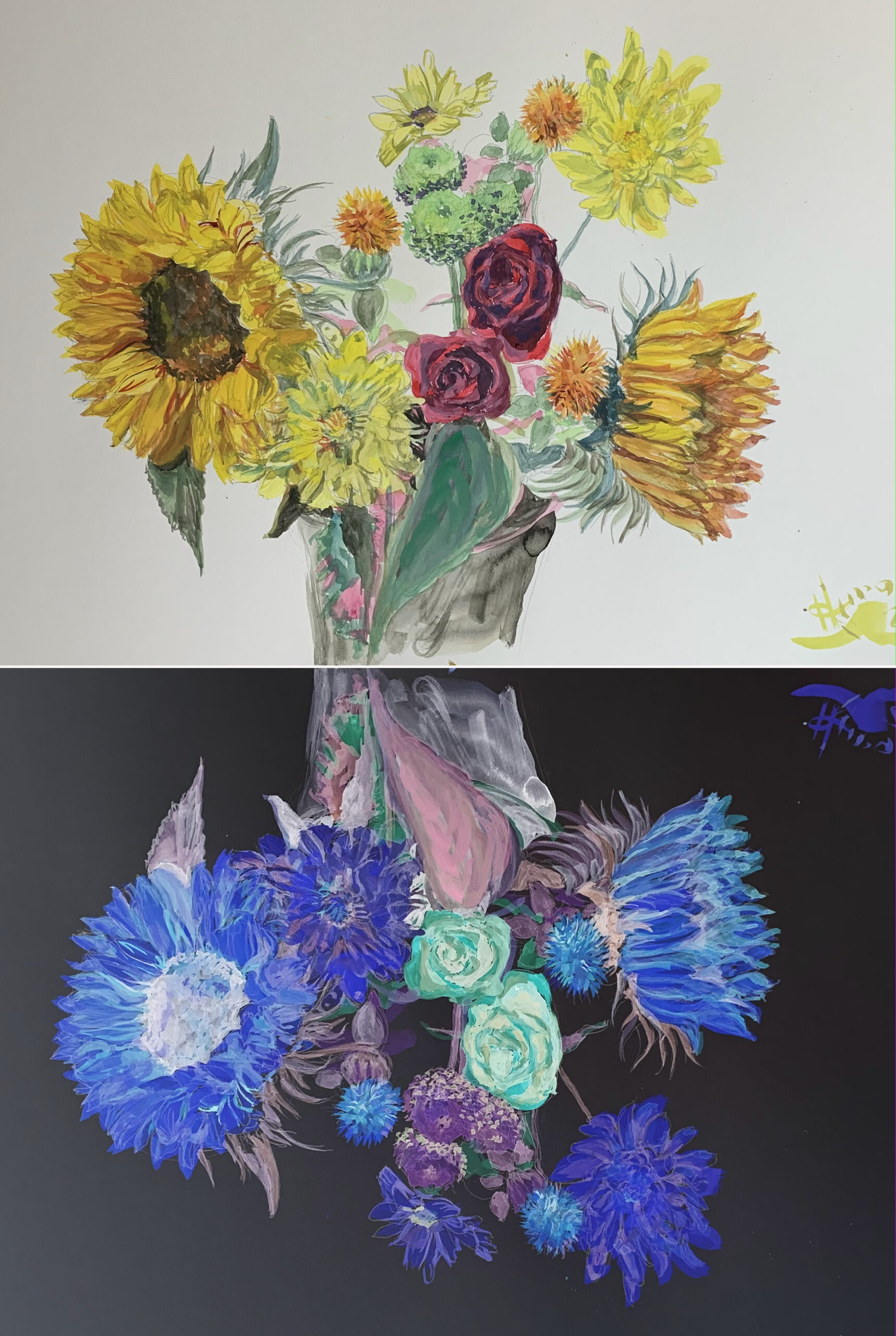
Sunflowers and roses reflected (2025) – Gouache on paper into a digitised image
Sunflowers vie with red roses, colours contrasting; red on the colour wheel is the direct contrast of the green foliage. An inversion of all the colour values makes a dark reflection which highlights the methods and sculpture of the original in novel ways, the contrast making a striking display.
The beauty and discrepency of marriage (2024) – Monoprint
The contestation of marriage partners manipulating each other is contrasted with the partnership of love as great king, head over heels in love and delight, welcomes his bride from far away lands, as told in the ancient song Psalm 45.
Tears turn to joy – from the Spanish Wake (2024) – Linocut
The sadness of the mother bereaved of her babe contrasts starkly with the dancer in the street festival who is celebrating the babe’s arrival in heaven.
Inevitable – marriage at the end of time (2024) – Installation with mixed media
The eye focuses on the world (see picture below). The whole depicts a great king and his inevitable marriage with his bride. The boats are pushing out the bride and groom, who float towards each other. Heavenly horses and figures are seen. All this translucent spiritual happening delights to be engaged with the world and its affairs (pictured below), which is of course the smaller part.
(Part) Inevitable – marriage at the end of time (2024) – Wallpaper Cutout
The lashes separate differing kinds of marriage and partnership, while to the right are the pairs of animals mirroring this. To the left are the works of humankind. Of particular interest is the contrasting closed and open figures that make a complex matrix of all that is portrayed.
Curatorial Review
Sunflowers and Roses Reflected (2025) presents a bouquet of sunflowers and roses that are realistically painted and vibrant. They are set against a digital reflection on the artwork’s lower half, in which their colours are inverted. This inversion of colour creates an immediate contrast to the work while allowing the viewer to see more details within the bouquet as the black background exposes the smaller details of the flowers…
Interview with Dr Helen Imogen Field
You mention (and shown through the works in this publication) that you use various types of mediums like painting, printmaking and digital. How do you decide which medium is best suited to a particular piece of work or project?
For a major competition my most practiced medium is oils, closely followed by acrylic. Otherwise I often work in a medium as an experiment that I take through several projects (botanic drawings in gouache to life drawing from models). I need a push to try new things; the latest is combinations of ink and pastel, using a chinese calligraphy brush for a variety of lines; pastel adds pizzazz (working on pastel paper which takes the water without distortion). I set tasks like “15 minutes to a finished oil” as the fast works are very fresh.
Your academic background is in biochemistry, how do you think your scientific background has influenced your artistic practice and process?
The science helps me firstly because of learning to accurately draw what I saw under the microscopy; understand the colour theory which underpins impressionism (like dots on a TV screen) – the colour wheel is sciency and very useful to artists. The paints that mix to form different colours you just have to learn. Van Gogh chose to use strokes rather than dots, and I had not made the link between Seurat, colour theory and impressionism before – they were all experimenting with it. Learning to use the colour wheel to ‘soften’ a mix of the 6 primary/secondary colours is a recent lesson as my work was getting garish.
Particularly after learning Counselling, I love Betty Edwards’s work. She demonstrates how important it is for people to express themselves visually, to understand themself, as much by making marks as doing drawings; this is a field I’d like to develop for supporting mental health. Betty’s work convincingly addresses how the brain perceives the drawing, how your vision can affect your work, and how your brain can change things as they go in (including visual things). It’s why a crazy or unfinished painting can have more impact than a beautifully finished one, as it gets your brain busy. I hope that schools go back to allowing kids to be creative. It is so good for us all.
You have described contrast- light and dark, colour, or conceptual as key to your work. What has drawn you to this idea and how does it reflect upon your life experiences?
When at the Art Student’s League of New York we had endless conversations about Light; we were doing portraits as a class. It is light that causes shadows; if there were no shadows and no shades of colour it would be hard to make anything out at all (to see). In the same way, enhancing the shadows in a painting makes the light parts shout. Colour (good old colour wheel again) has the same effect – John Constable always added a red jacket to his landscapes, as red complements the green – the contrast gives your brain a reference point for the green.
Contrast gives a focal point; in The Night Watch (Rembrandt)the focal point is where the greatest light hits the greatest dark – in the centre of the painting (the rest is largely brown, but then coloured paint was expensive in those days and Rembrandt became very poor.
Contrast created digitally, like the colour inversion, can add or subtract from your painting creating a new work. When looking at photographs a great deal is gained by improving the contrasts and colours (away from greys), making the whole easier to see and more attractive.
Ceramics seem to have been an artistic turning point for you- how did working with ceramic media reveal new artistic or personal insights?
Thank you for noticing this. It was after leaving art (painting) for a while and learning at Bible College and Counselling that I found a simple drawing came out almost the way I imagined it, and often added insight that I had not expected. A picture I drew for my counsellor allowed her to interpret a situation correctly (anger hides a frightened person). On ceramics during this time, because I cannot produce two of a kind, I started carving little pictures, and thinking of different designs I found that the meditations of the morning would come out on the pots. They are always done freehand, along with some motifs I developed in childhood (horses, birds). Looking for a thread in all my diverse work I realised my strength was in drawing (accurately). There is not much drawing in Art Schools, I discover, so I was delighted to be taken in this year by the Royal School of Drawing for a year long stint of hard work in the drawing department.
In your work Sunflowers and Roses Reflected (2025), do the sunflowers or roses represent any symbolism?
No, but I think sunflowers always references Van Gogh. He trained as a pastor then became a brilliant artist; it’s a pity his brother (art dealer) did not believe in his work and sell it for him. It must be very discouraging and without God telling you, how could he know that he’d be famous in the future. So maybe the rose is a tribute to Van Gogh. I love how he developed impressionism with short strokes, and was so accurate in his colour transcription, taking the countryside to a new, brighter level.
In The beauty and discrepency of marriage (2024) you chose monoprint as the medium. How does this printmaking technique help to enhance the story of Psalm 45?
The monoprint relies, in this case, on the drawing. Simply drawing the subject of a poem (like the Psalm) allows one to reflect on it. Because I wanted to put something from my experience into this image, the image came to mind quite precisely, drawing on celtic designs and church tombstones – it occured to me that marriage (on earth) is pointing to something greater than we can possibly imagine, and I wanted to capture the beauty of that notion coming out of the pain that besets most marriages from time to time. A monoprint feels nice to the touch and has a uniformity that unites the two concepts in this picture.
From all the Hymns in the Psalms, what brought you to be inspired by Psalm 45 and how do you interpret it in a more contemporary context?
I hated abstract art and made myself study this; in doing so, a book on the schools of Modern Art showed me how it all developed and what the thinking and pressures were, from post-impressionism to the present day. My appreciation of abstract leaped up and freed me from the accuracy of form, which allows me to develop conceptual designs.
Psalm 45 is a beautiful Psalm about a woman who has to desert her native land to come to a king – who, if she commits is guaranteed besotted by her. This is what Marie-Antoinette had to do (and Judwiga, who left her true love to marry a Lithuanian heathen king, in order to bring Christianity to that land). My heart goes out to those who leave all they love for an uncertain future. I love that she was called Queen of Ophir and dressed in gold and a coat of many colours. I love that she had a mission to leave all her traditions and ways (her tribe) behind and start againg, alongside the powerful king. This king sounds to me like the one in Revelation, who rides a white horse and has a sword that comes from his mouth (his words), and who has king of kings and lord of lords tattooed to his thigh (depicted in the Inevitable artwork). I was interest in the imagery of Revelation because Kandinsky was fascinated with the 4 horses of the apocalypse, which motif became more and more abstract in his artwork (see above). Kandinsky was my starting point for trying to understand and delight in abstract artwork. Which learning really helps me understand that art is about how the artist is struggling to communicate their concept to the viewer, reaching out and barely understood. Art is powerful and a responsibility to produce, in the same way that “life and death are in the tongue”.
For today – this Psalm has always been seen as about the Messiah, that is the king who will save Israel (from her enemies). When Jesus came he was a disputed Messiah, yet he said that He is, and taught from the scriptures (old testament) that the Messiah would come first as a sacrificial lamb and then as King. TO cover the period in between he founded the church on a bunch of less educated non-religious men (alhtough after the Holy Spirit came there were 3000 converts who dispersed into the surrounding area; it is said that 2 thirds of Jerusalem converted (believed that Jesus was the Messiah) before the persecution started – then came St Paul who developed the teaching. His revelations, and those of John (the disciple who leaned on Jesus’s breast and calls himself the beloved disciple) the fisher of men – show clearly that Jesus will return to save His People (New) Israel (Israel was the name God gave to Jacob, before his family went to Egypt). They/we will meet him in the air with new and transformed bodies, like Jesus’s resurrected body. He will take us to live in the heavenly homes He has prepared for us after ascending back to the Father. This meeting is the one described in Psalm 45, for it is the King who is Jesus (who has all authority in heaven and earth, under God the Father alone, like Joseph under Pharoah) meeting his Bride who is the “Church”, that is Jesus’s own united global single hearted community of those who love him and “know their shepherd’s voice”, who treat him as Master. Since Revelation is so full of woe and gloom and suffering, this dramatic reversal is something we can hold onto to save ourselves from the terrors. And the Promises of God are all true, in Jesus. Many have lived by them and tell amazing stories…. deep dive.
Do you have any upcoming projects that you’re excited to share?
I am finishing a landscape for the Scottish Landscape Award competition that takes the “Spirit of Edinburgh” as a theme and includes the Covenanters (in the clouds and meeting in the fields). This is a fascinating movement and I enjoyed Melvyn Bragg’s podcast on it. The Covenanters followed the teaching that we (the church in Scotland) was one of the lost tribes of Israel, something I came across when quite young. We know from the bible that God is planting ‘foreign’ branches into his base olive tree, because the original branches refused to believe (Jesus said that our work is to believe – what He said – which includes what is in the Bible). Thus the story of the Hebrew Abraham leads to the Israelites rescued from Egypt (with 10 plagues and the crossing of the Red Sea, at a location whose place names are clearly named and easy to find) – from Israelites to the promised land of Canaan, to the Jews (one tribe of the twelve tribes of Israel, as most tribes were exiled) – through Jesus Christ (a Jew), to the Christian Church. When I was young I wanted to be Jewish but as a Christian now they are almost family.
Drawing intensely 3 days a week with the Royal School of Drawing will develop my craft in a way that may make my visual work a lot more exciting and powerful. I want to share the stories like the above, as they will save humanity.